
G10.IGCSE_C16. Scatter Diagram and Correlation
Presentation
•
Mathematics
•
10th Grade
•
Practice Problem
•
Medium
Math Department
Used 4+ times
FREE Resource
10 Slides • 28 Questions
1
16. Scatter diagrams and correlation
By Math Department
IGCSE 0580
2
A scatter plot (or scatter diagram or scatter graph) explores the relationship between two sets of data. Plotting each pair of numbers as a dot allows you to see whether a general pattern emerges.
Scatter plots are examples of bivariate data sets because they link two variables. Other data sets, such as the heights of people in a group, are univariate because they contain only one variable.
What are scatter plots?
3
Multiple Choice
Which student scored twice as high on the Science test as they did on the Maths test?
A
B
C
D
4
Multiple Choice
Which student scored the highest mark on the Maths test?
A
B
C
D
5
Multiple Choice
Luke’s math result was very good but his English result was very poor. Which dot is most likely to represent his results?
A
B
C
D
6
Multiple Choice
Areej got a very poor maths result but a very good English result. Which dot is most likely to represent her results?
A
B
C
D
7
Multiple Choice
Stefan’s mark for Maths was the same as his mark for English. Which dot is most likely to represent her results?
A
B
C
D
8
9
10
11
Drag and Drop
b) Ellen collected two sets of data and found a strong negative relationship between the two sets of data. This is represented in scatter plot
c). Liam plotted two sets of data and found there was no relationship between the two sets of data. This is represented in scatter plot
d) Ning collected two sets of data and found there was a weak negative relationship between them. This is represented in scatter plot
e) Louis found a weak positive relationship between two sets of data when he plotted them on a scatter plot. This is represented in scatter plot
12
Multiple Choice
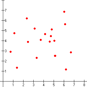
What is the type of correlation?
Negative
no correlation
positive
13
Multiple Choice
14
Multiple Choice
15
Multiple Choice
16
Multiple Choice
What phrase best describes the correlation illustrated?
No correlation
Strong negative
Weak positive
Strong positive
17
Multiple Choice
Choose all the statements which correctly describe this scatter plot.
There is a strong positive relation between the two sets of marks.
Students who did well in history did not do as well in art.
There is no relationship between the two sets of data.
Students who did well in history also did well in art.
18
Lines of best fit
When points on a scatter plot show a linear correlation, you can use a line to model the data. This line is called the line of best fit or trend line and is drawn through the data so that there are an equal number of points above and below it.
19
Lines of best fit
20
Multiple Choice
Which is the best line of best fit?
Red
Blue
Green
Purple
21
Multiple Choice
What relationship is suggested by the scatter diagram?
Line of best fit
As age increases, weight increases
As age increases, weight decreases
No relationship between age and weight
22
Multiple Choice
23
Multiple Choice
Using the graph, if someone got a mark of 10 in the general knowledge test, what would you predict their IQ to be?
110
114
111
121
24
Multiple Choice
Use the line of best fit to estimate the chemistry mark for a student who obtained a mark of 90 in mathematics.
40
60
80
100
25
Lines of best fit are used to estimate what might happen between known data values (interpolation) and to predict what might happen beyond known data values (extrapolation).
Interpolation and extrapolation
26
Multiple Choice
Sam graphed this data on a scatter plot and drew a line of best fit. She used the line to estimate the weight for a height of 2.5 m. Sam was:
interrogating
interpolating
extrapolating
exonerating
27
Multiple Choice
Adam graphed this data on a scatter plot and drew a line of best fit. He used the line to estimate the mass for a height of 6.4 m. This is called:
interrogating
interpolating
extrapolating
exonerating
28
Multiple Choice
By extrapolation, which of the following height ranges would be the best prediction for a nutrient concentration of 80 mg/L?
Between 35 and 40 cm
Between 40 and 45 cm
Between 45 and 50 cm
Between 50 and 55 cm
29
When drawing the line by eye, ensure that there are an equal number of points above and below the line. Also attempt to position the line so the average distance from the line to points above is the same as the average distance to the points below.
Draw the line by eye
30
Multiple Choice
Which graph shows the best trend line for this data?
31
The equation of the line
32
Math Response
Given: y = 10 – 4x
What is the value of x when y = 42?
33
Multiple Choice
The gradient for the trend line in graph A is 4. Select the best estimate below for the gradient of graph B.
8
-8
2
-2
34
Multiple Choice
Y = 2.65T – 8.1
The equation above represents the line of best fit for data relating temperature (T in °C) of a hothouse and the yield of seedlings (Y in kg) over a certain range of temperature settings.
Select the TRUE statement.
As the temperature goes up, the yield goes up.
As the temperature goes up, the yield goes down.
As the temperature goes up, the yield stays the same.
There is no correlation between them.
35
Multiple Choice
Y = 2.65T – 8.1
The equation above represents the line of best fit for data relating temperature (T in °C) of a hothouse and the yield of seedlings (Y in kg) over a certain range of temperature settings.
Use the equation to estimate the yield for a temperature of 10°C.
16.5
18.4
20.1
26.5
36
Multiple Choice
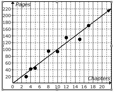
Complete the equation for the line of best fit, correct to one decimal place.
y=−13.3x+51.6
y=−13.3x−51.6
y=13.3x−51.6
y=13.3x+51.6
37
Multiple Choice
The equation for a line of best fit is: v = –8.3p + 5.6
This line shows that the two variables have:
a positive correlation
a negative correlation
no correlation
38
Multiple Choice
Use the point (90, 70) to complete the equation for the line of best fit. Enter your answer as a decimal.
Let M be mathematics mark and C be chemistry mark. If C = 0.75M+ P, then the value of P is ....
0.5
1.5
2.5
3.5
16. Scatter diagrams and correlation
By Math Department
IGCSE 0580
Show answer
Auto Play
Slide 1 / 38
SLIDE
Similar Resources on Wayground
30 questions
Naming Geometric Solids & Choosing Volume Formulas
Presentation
•
10th Grade
32 questions
Executive Branch
Presentation
•
10th Grade
35 questions
Comparing Functions Review Game
Presentation
•
10th Grade
36 questions
Characteristics of Exponential Functions
Presentation
•
9th Grade
34 questions
Laws of Exponents:Product and Quotient Rule
Presentation
•
10th Grade
33 questions
Lesson 8.2 extension - using trig
Presentation
•
10th Grade
32 questions
MYPYRAMID - Chapter 8
Presentation
•
10th Grade
30 questions
Rotations on a Coordinate Plane
Presentation
•
10th Grade
Popular Resources on Wayground
10 questions
5.P.1.3 Distance/Time Graphs
Quiz
•
5th Grade
10 questions
Fire Drill
Quiz
•
2nd - 5th Grade
20 questions
Equivalent Fractions
Quiz
•
3rd Grade
22 questions
School Wide Vocab Group 1 Master
Quiz
•
6th - 8th Grade
20 questions
Main Idea and Details
Quiz
•
5th Grade
20 questions
Context Clues
Quiz
•
6th Grade
20 questions
Inferences
Quiz
•
4th Grade
12 questions
What makes Nebraska's government unique?
Quiz
•
4th - 5th Grade
Discover more resources for Mathematics
25 questions
Complementary and Supplementary Angles
Quiz
•
7th - 10th Grade
10 questions
Factor Quadratic Expressions with Various Coefficients
Quiz
•
9th - 12th Grade
19 questions
Explore Probability Concepts
Quiz
•
7th - 12th Grade
43 questions
STAAR WEEK 1
Quiz
•
9th - 12th Grade
10 questions
Exploring Abiotic and Biotic Factors in Ecosystems
Interactive video
•
6th - 10th Grade
10 questions
Exploring Tree Diagrams in Probability
Interactive video
•
6th - 10th Grade
20 questions
Simple Probability
Quiz
•
10th Grade
11 questions
Solving Quadratic Equations by Factoring
Quiz
•
9th - 12th Grade