
CIrcle Graphs/Pictographs
Authored by Eric Balak
Mathematics
5th - 6th Grade
CCSS covered
Used 215+ times


AI Actions
Add similar questions
Adjust reading levels
Convert to real-world scenario
Translate activity
More...
Content View
Student View
15 questions
Show all answers
1.
MULTIPLE CHOICE QUESTION
30 sec • 1 pt

What percentage does the entire circle graph represent?
100%
50%
25%
15%
2.
MULTIPLE CHOICE QUESTION
3 mins • 1 pt
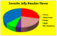
According to this graph, what is the most popular flavor of Jolly Rancher?
3.
MULTIPLE CHOICE QUESTION
5 mins • 1 pt

According to this circle graph, what is the least popular flavor of Jolly Rancher?
4.
MULTIPLE CHOICE QUESTION
5 mins • 1 pt

Which table represents the data in the graph?


5.
MULTIPLE CHOICE QUESTION
2 mins • 1 pt

80 sixth grade students picked their favorite elective. Which is closest to the total number of students that picked band and choir?
80
4
40
20
Tags
CCSS.HSN.VM.C.6
6.
MULTIPLE CHOICE QUESTION
2 mins • 1 pt

If 200 people were surveyed, approximately how many people like pepperoni and cheese as their topping?
100 people
150 people
50 people
75%
7.
MULTIPLE CHOICE QUESTION
2 mins • 1 pt

The results of a class survey about students' favorite sports are shown. Which sports could be combined to make up 50% of the graph?

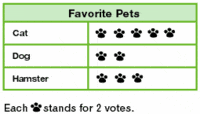

Access all questions and much more by creating a free account
Create resources
Host any resource
Get auto-graded reports

Continue with Google

Continue with Email

Continue with Microsoft
or continue with

%20(1).png)
Apple

Others
By signing up, you agree to our Terms of Service & Privacy Policy
Already have an account?

