Exploring Dot Plots, Histograms, and Box Plots
Interactive Video
•
Mathematics
•
6th - 10th Grade
•
Practice Problem
•
Medium
Standards-aligned

Olivia Brooks
Used 38+ times
FREE Resource
Standards-aligned
10 questions
Show all answers
1.
MULTIPLE CHOICE QUESTION
30 sec • 1 pt
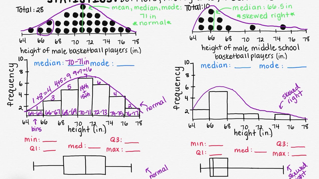
What is the primary advantage of using dot plots for data representation?
They are easier to create than histograms.
They provide a clear view of each data point's distribution.
They do not require knowledge of quartiles.
They can accurately calculate mean values.
2.
MULTIPLE CHOICE QUESTION
30 sec • 1 pt
What characteristic of dot plots makes them unique compared to histograms and box plots?
Ability to show exact values for each data point.
More accurate representation of skewed data.
Simpler calculation of mean values.
Easier identification of quartiles.
3.
MULTIPLE CHOICE QUESTION
30 sec • 1 pt
How can you identify a normal distribution in a histogram?
By counting the number of peaks.
By the length of the bars.
By observing a symmetrical bell-shaped curve.
By noticing a skewed distribution of data.
Tags
CCSS.6.SP.A.3
4.
MULTIPLE CHOICE QUESTION
30 sec • 1 pt
What indicates a skewed right distribution in a box plot?
All data points are on the right side.
The right side of the box is stretched out.
The median is closer to the top of the box.
The left side of the box is stretched out.
5.
MULTIPLE CHOICE QUESTION
30 sec • 1 pt
How is a skewed right distribution identified in a histogram?
When all bars are of equal height.
When there is a tail on the right side.
When the left side has longer bars.
When the bars form a symmetrical shape.
6.
MULTIPLE CHOICE QUESTION
30 sec • 1 pt
Why can't the mean be accurately calculated using a histogram?
Because histograms do not show individual data points.
Because histograms only display the median.
Because histograms only show the mode.
Because histograms are only used for skewed data.
Tags
CCSS.6.SP.B.4
CCSS.HSS.ID.A.1
7.
MULTIPLE CHOICE QUESTION
30 sec • 1 pt
In the context of histograms, what are 'bins'?
The lines dividing the histogram into four parts.
The peaks of each bar representing the mode.
The individual data points within each range.
Ranges of values each bar represents.
Tags
CCSS.6.SP.B.4
CCSS.HSS.ID.A.1
Access all questions and much more by creating a free account
Create resources
Host any resource
Get auto-graded reports
Continue with Google

Continue with Email
Continue with Classlink
Continue with Clever
or continue with
Microsoft
%20(1).png)
Apple
Others
Already have an account?
Popular Resources on Wayground

7 questions
History of Valentine's Day
Interactive video
•
4th Grade
15 questions
Fractions on a Number Line
Quiz
•
3rd Grade
20 questions
Equivalent Fractions
Quiz
•
3rd Grade
25 questions
Multiplication Facts
Quiz
•
5th Grade
22 questions
fractions
Quiz
•
3rd Grade
15 questions
Valentine's Day Trivia
Quiz
•
3rd Grade
20 questions
Main Idea and Details
Quiz
•
5th Grade
20 questions
Context Clues
Quiz
•
6th Grade
Discover more resources for Mathematics
20 questions
Writing Algebraic Expressions
Quiz
•
6th Grade
20 questions
Ratios/Rates and Unit Rates
Quiz
•
6th Grade
14 questions
Volume of rectangular prisms
Quiz
•
7th Grade
20 questions
Laws of Exponents
Quiz
•
8th Grade
20 questions
Graphing Inequalities on a Number Line
Quiz
•
6th - 9th Grade
20 questions
One Step Equations
Quiz
•
6th Grade
20 questions
Exponent Properties
Quiz
•
9th Grade
10 questions
Solving One Step Inequalities
Quiz
•
6th Grade