Graphing Data Interpretation
Interactive Video
•
Mathematics
•
6th - 7th Grade
•
Practice Problem
•
Hard

Sophia Harris
FREE Resource
Read more
6 questions
Show all answers
1.
MULTIPLE CHOICE QUESTION
30 sec • 1 pt
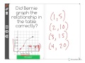
What do the x-values in the table represent?
Number of weeks
Number of miles
Number of days
Number of hours
2.
MULTIPLE CHOICE QUESTION
30 sec • 1 pt
What do the y-values in the table represent?
Number of days
Number of weeks
Number of hours
Number of miles
3.
MULTIPLE CHOICE QUESTION
30 sec • 1 pt
Which point is plotted first on the graph?
(1, 5)
(3, 15)
(2, 10)
(4, 20)
4.
MULTIPLE CHOICE QUESTION
30 sec • 1 pt
What is the purpose of connecting the plotted points with a line?
To highlight the origin
To show the trend of the data
To mark the end of the graph
To separate the x and y axes
5.
MULTIPLE CHOICE QUESTION
30 sec • 1 pt
What mistake did Bernie make in his graph?
He used the wrong x-values
He used the wrong y-values
He plotted extra points
He started the line at the wrong point
6.
MULTIPLE CHOICE QUESTION
30 sec • 1 pt
What were the incorrect points plotted by Bernie?
(3, 20) and (4, 22.5)
(2, 15) and (3, 22.5)
(1, 10) and (2, 22.5)
(4, 20) and (5, 22.5)
Access all questions and much more by creating a free account
Create resources
Host any resource
Get auto-graded reports
Continue with Google

Continue with Email
Continue with Classlink
Continue with Clever
or continue with
Microsoft
%20(1).png)
Apple
Others
Already have an account?
Similar Resources on Wayground
Popular Resources on Wayground

15 questions
Fractions on a Number Line
Quiz
•
3rd Grade
20 questions
Equivalent Fractions
Quiz
•
3rd Grade
25 questions
Multiplication Facts
Quiz
•
5th Grade
22 questions
fractions
Quiz
•
3rd Grade
20 questions
Main Idea and Details
Quiz
•
5th Grade
20 questions
Context Clues
Quiz
•
6th Grade
15 questions
Equivalent Fractions
Quiz
•
4th Grade
20 questions
Figurative Language Review
Quiz
•
6th Grade
Discover more resources for Mathematics
20 questions
Exponents
Quiz
•
6th Grade
22 questions
distributive property
Quiz
•
7th Grade
15 questions
Distributive Property & Review
Quiz
•
6th Grade
20 questions
Writing Algebraic Expressions
Quiz
•
6th Grade
20 questions
Ratios/Rates and Unit Rates
Quiz
•
6th Grade
20 questions
Writing and Graphing Inequalities
Quiz
•
6th Grade
10 questions
Unit Rate
Quiz
•
6th Grade
20 questions
Graphing Inequalities on a Number Line
Quiz
•
6th - 9th Grade