Box Plots and Frequency Heatmaps
Interactive Video
•
Mathematics, Business, Design
•
9th - 12th Grade
•
Practice Problem
•
Hard

Patricia Brown
FREE Resource
Read more
10 questions
Show all answers
1.
MULTIPLE CHOICE QUESTION
30 sec • 1 pt
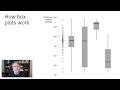
What is the primary use of a box plot?
To compare distributions of multiple data sets
To highlight outliers in a single data set
To display individual data points
To show time series data
2.
MULTIPLE CHOICE QUESTION
30 sec • 1 pt
In a box plot, what does the median represent?
The point where half the data points are above and half are below
The highest value in the data set
The average of all data points
The most frequently occurring value
3.
MULTIPLE CHOICE QUESTION
30 sec • 1 pt
What do the 'whiskers' in a box plot indicate?
The range of the upper and lower 25% of data
The range of the middle 50% of data
The range of the entire data set
The average deviation from the median
4.
MULTIPLE CHOICE QUESTION
30 sec • 1 pt
Why might box plots not be suitable for all audiences?
They require a statistical background to understand
They are too colorful
They only show one data set at a time
They are not visually appealing
5.
MULTIPLE CHOICE QUESTION
30 sec • 1 pt
What is a limitation of box plots?
They are difficult to create
They assume a normal distribution
They do not show the median
They cannot show multiple data sets
6.
MULTIPLE CHOICE QUESTION
30 sec • 1 pt
What is a frequency heatmap?
A plot that displays time intervals
A graph that shows the relationship between two variables
A map showing geographical data
A chart that shows the frequency of data points using color intensity
7.
MULTIPLE CHOICE QUESTION
30 sec • 1 pt
How do frequency heatmaps improve upon box plots?
They are easier to create
They show non-normal distributions more clearly
They use less data
They are more colorful
Access all questions and much more by creating a free account
Create resources
Host any resource
Get auto-graded reports
Continue with Google

Continue with Email
Continue with Classlink
Continue with Clever
or continue with
Microsoft
%20(1).png)
Apple
Others
Already have an account?
