Understanding Histograms and Data Patterns
Interactive Video
•
Mathematics, Science, Physical Ed
•
5th - 6th Grade
•
Practice Problem
•
Hard

Thomas White
Used 5+ times
FREE Resource
Read more
10 questions
Show all answers
1.
MULTIPLE CHOICE QUESTION
30 sec • 1 pt
What is the primary purpose of a histogram?
To compare different categories
To show changes over time
To display the frequency of data within certain ranges
To show the relationship between two variables
2.
MULTIPLE CHOICE QUESTION
30 sec • 1 pt
In the video, what type of data is used as an example for creating a histogram?
Student heights
Number of books read
Test scores
Number of push-ups completed
3.
MULTIPLE CHOICE QUESTION
30 sec • 1 pt
What does the x-axis represent in a histogram?
The average of data values
The total number of data points
The range of data values
The frequency of data
4.
MULTIPLE CHOICE QUESTION
30 sec • 1 pt
Why do the bars in a histogram touch each other?
To highlight the highest frequency
To indicate zero frequency
To separate different data sets
To show continuity of data
5.
MULTIPLE CHOICE QUESTION
30 sec • 1 pt
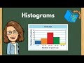
What color bar represents the students who completed between 20 and 29 push-ups?
Red
Orange
Blue
Green
6.
MULTIPLE CHOICE QUESTION
30 sec • 1 pt
What can be inferred if a range in a histogram has a zero frequency?
No data points fall within that range
The data is incorrect
The range is not needed
The range is the most common
7.
MULTIPLE CHOICE QUESTION
30 sec • 1 pt
What is the significance of the yellow bar in the histogram example?
It shows the least number of students
It highlights the average performance
It represents the most common range
It indicates an error in data
Access all questions and much more by creating a free account
Create resources
Host any resource
Get auto-graded reports
Continue with Google

Continue with Email
Continue with Classlink
Continue with Clever
or continue with
Microsoft
%20(1).png)
Apple
Others
Already have an account?
