Box Plot Analysis and Interpretation
Interactive Video
•
Mathematics
•
6th - 8th Grade
•
Practice Problem
•
Hard

Thomas White
FREE Resource
Read more
10 questions
Show all answers
1.
MULTIPLE CHOICE QUESTION
30 sec • 1 pt
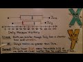
What are the five key values shown in a box plot?
Least value, greatest value, lower quartile, upper quartile, median
Mean, mode, range, variance, standard deviation
Minimum, maximum, average, sum, product
First quartile, second quartile, third quartile, fourth quartile, fifth quartile
2.
MULTIPLE CHOICE QUESTION
30 sec • 1 pt
How can two box plots be compared numerically?
By their data sources and authors
By their labels and titles
By their centers, spread, and variability
By their colors and shapes
3.
MULTIPLE CHOICE QUESTION
30 sec • 1 pt
What does a longer IQR in a box plot indicate?
More variability within the data
A higher median value
A lower median value
Less variability within the data
4.
MULTIPLE CHOICE QUESTION
30 sec • 1 pt
In the comparison of April and May box plots, which month had a greater median?
April
May
Neither had a median
Both had the same median
5.
MULTIPLE CHOICE QUESTION
30 sec • 1 pt
Which month had a greater variability in the top 50% of hours worked?
April
Neither had variability
Both had the same variability
May
6.
MULTIPLE CHOICE QUESTION
30 sec • 1 pt
In the comparison of June and July box plots, which month had a greater median?
Both had the same median
Neither had a median
July
June
7.
MULTIPLE CHOICE QUESTION
30 sec • 1 pt
What does a lower IQR in a box plot suggest about the data?
The data has more outliers
The data is more spread out
The data has fewer outliers
The data is closer together
Access all questions and much more by creating a free account
Create resources
Host any resource
Get auto-graded reports
Continue with Google

Continue with Email
Continue with Classlink
Continue with Clever
or continue with
Microsoft
%20(1).png)
Apple
Others
Already have an account?
