Understanding Dot Plots and Histograms
Interactive Video
•
Mathematics
•
6th - 7th Grade
•
Practice Problem
•
Hard

Patricia Brown
FREE Resource
Read more
10 questions
Show all answers
1.
MULTIPLE CHOICE QUESTION
30 sec • 1 pt
What is the primary objective of learning about dot plots and histograms?
To memorize data values
To construct these plots and calculate central tendency
To create complex mathematical models
To learn about data encryption
2.
MULTIPLE CHOICE QUESTION
30 sec • 1 pt
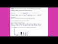
In a dot plot, where are the data values placed?
On the diagonal
On the x-axis
On the z-axis
On the y-axis
3.
MULTIPLE CHOICE QUESTION
30 sec • 1 pt
What does each dot represent in a dot plot?
A frequency interval
A single value in the data set
A statistical error
A group of values
4.
MULTIPLE CHOICE QUESTION
30 sec • 1 pt
How should dots be aligned in a dot plot?
Vertically
Diagonally
Randomly
Horizontally
5.
MULTIPLE CHOICE QUESTION
30 sec • 1 pt
What is a histogram primarily used for?
To measure time
To calculate averages
To display frequency
To show data encryption
6.
MULTIPLE CHOICE QUESTION
30 sec • 1 pt
In a histogram, what do the rectangles represent?
Data values
Frequency
Time intervals
Statistical errors
7.
MULTIPLE CHOICE QUESTION
30 sec • 1 pt
Why must rectangles in a histogram be touching?
To show continuity of data
To separate different data sets
To make the graph look better
To indicate data errors
Access all questions and much more by creating a free account
Create resources
Host any resource
Get auto-graded reports
Continue with Google

Continue with Email
Continue with Classlink
Continue with Clever
or continue with
Microsoft
%20(1).png)
Apple
Others
Already have an account?
Popular Resources on Wayground

15 questions
Fractions on a Number Line
Quiz
•
3rd Grade
10 questions
Probability Practice
Quiz
•
4th Grade
15 questions
Probability on Number LIne
Quiz
•
4th Grade
20 questions
Equivalent Fractions
Quiz
•
3rd Grade
25 questions
Multiplication Facts
Quiz
•
5th Grade
22 questions
fractions
Quiz
•
3rd Grade
6 questions
Appropriate Chromebook Usage
Lesson
•
7th Grade
10 questions
Greek Bases tele and phon
Quiz
•
6th - 8th Grade
Discover more resources for Mathematics
20 questions
Writing Algebraic Expressions
Quiz
•
6th Grade
20 questions
Ratios/Rates and Unit Rates
Quiz
•
6th Grade
14 questions
Volume of rectangular prisms
Quiz
•
7th Grade
15 questions
Graphing Inequalities
Quiz
•
7th - 9th Grade
20 questions
Graphing Inequalities on a Number Line
Quiz
•
6th - 9th Grade
20 questions
One Step Equations
Quiz
•
6th Grade
12 questions
One-Step Equations
Quiz
•
6th Grade
6 questions
Equations from models
Quiz
•
6th Grade