Creating Species Accumulation Graphs in Excel
Interactive Video
•
Biology
•
9th - 10th Grade
•
Practice Problem
•
Hard

Patricia Brown
FREE Resource
Read more
10 questions
Show all answers
1.
MULTIPLE CHOICE QUESTION
30 sec • 1 pt
What is the primary purpose of the tutorial?
To explain how to create a species accumulation curve in Excel
To teach how to draw a bar graph in Excel
To demonstrate how to use Excel for data entry
To show how to calculate average species richness
2.
MULTIPLE CHOICE QUESTION
30 sec • 1 pt
In the dummy data set, what do the columns represent?
Different experiments
Different time periods
Different species
Different sites
3.
MULTIPLE CHOICE QUESTION
30 sec • 1 pt
How is cumulative species richness calculated for each site?
By multiplying the number of species by the number of sites
By subtracting previously recorded species from the total
By counting the number of new species in each site
By adding the total number of species in all sites
4.
MULTIPLE CHOICE QUESTION
30 sec • 1 pt
What happens to the cumulative species richness when a new species is found at a site?
It is reset to zero
It decreases
It increases
It remains the same
5.
MULTIPLE CHOICE QUESTION
30 sec • 1 pt
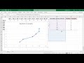
What type of plot is used to visualize the species accumulation data?
Scatter plot
Pie chart
Line plot
Bar plot
6.
MULTIPLE CHOICE QUESTION
30 sec • 1 pt
What common mistake is addressed when plotting the data?
Using the wrong type of chart
Inverting the axes
Forgetting to label the axes
Not including a legend
7.
MULTIPLE CHOICE QUESTION
30 sec • 1 pt
What should be done to the graph's heading and guide lines?
They should be italicized
They should be bolded
They should be removed
They should be highlighted
Access all questions and much more by creating a free account
Create resources
Host any resource
Get auto-graded reports
Continue with Google

Continue with Email
Continue with Classlink
Continue with Clever
or continue with
Microsoft
%20(1).png)
Apple
Others
Already have an account?
