Understanding Dot Plots and Distributions
Interactive Video
•
Mathematics
•
6th - 8th Grade
•
Practice Problem
•
Easy

Thomas White
Used 2+ times
FREE Resource
Read more
10 questions
Show all answers
1.
MULTIPLE CHOICE QUESTION
30 sec • 1 pt
What is a dot plot primarily used for?
To find the median of a data set
To compare two different data sets
To calculate the average of a data set
To represent data using a number line with symbols
2.
MULTIPLE CHOICE QUESTION
30 sec • 1 pt
In the context of dot plots, what is an outlier?
A value that is the average of the data set
A value that is significantly higher or lower than most of the data
A value that is the median of the data set
A value that is the mode of the data set
3.
MULTIPLE CHOICE QUESTION
30 sec • 1 pt
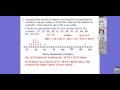
How do you determine if a data point is an outlier using the IQR?
By multiplying the IQR by 1.5 and comparing it to quartiles
By subtracting the IQR from the mean
By dividing the IQR by 2 and comparing it to the range
By adding the IQR to the median
4.
MULTIPLE CHOICE QUESTION
30 sec • 1 pt
What does it mean if a dot plot is skewed to the left?
More than half of the data points are less than the mean
More than half of the data points are greater than the mean
The data points form a perfect bell curve
The data points are evenly distributed around the mean
5.
MULTIPLE CHOICE QUESTION
30 sec • 1 pt
What is a symmetrical distribution in a dot plot?
When the data points are clustered at the mean
When the data points are all on one side of the mean
When the data points form a straight line
When the data points are evenly distributed around the mean
6.
MULTIPLE CHOICE QUESTION
30 sec • 1 pt
In a dot plot, what does a skewed right distribution indicate?
More than half of the data points are less than the mean
The data points are evenly distributed around the mean
More than half of the data points are greater than the mean
The data points form a perfect bell curve
7.
MULTIPLE CHOICE QUESTION
30 sec • 1 pt
What can be inferred from a symmetrical dot plot of track team distances?
Distances are skewed to the left
Distances are evenly distributed around the mean
Most team members ran the same distance
All team members ran more than the mean distance
Access all questions and much more by creating a free account
Create resources
Host any resource
Get auto-graded reports
Continue with Google

Continue with Email
Continue with Classlink
Continue with Clever
or continue with
Microsoft
%20(1).png)
Apple
Others
Already have an account?
Popular Resources on Wayground

8 questions
Spartan Way - Classroom Responsible
Quiz
•
9th - 12th Grade
15 questions
Fractions on a Number Line
Quiz
•
3rd Grade
14 questions
Boundaries & Healthy Relationships
Lesson
•
6th - 8th Grade
20 questions
Equivalent Fractions
Quiz
•
3rd Grade
3 questions
Integrity and Your Health
Lesson
•
6th - 8th Grade
25 questions
Multiplication Facts
Quiz
•
5th Grade
9 questions
FOREST Perception
Lesson
•
KG
20 questions
Main Idea and Details
Quiz
•
5th Grade
Discover more resources for Mathematics
12 questions
Review: Surface Area of Rectangular and Triangular Prisms
Quiz
•
6th Grade
20 questions
Scatter Plots and Line of Best Fit
Quiz
•
8th Grade
36 questions
6th Grade Math STAAR Review
Quiz
•
6th Grade
12 questions
8th U6 L4 - Fitting a Line to Data
Quiz
•
8th Grade
14 questions
Volume of rectangular prisms
Quiz
•
7th Grade
25 questions
Scatter Plots and Line of Best Fit
Quiz
•
8th Grade
14 questions
finding slope from a graph
Quiz
•
8th Grade
20 questions
Graphing Inequalities on a Number Line
Quiz
•
6th - 9th Grade