- Resource Library
- Math
- Data And Graphing
- Stem And Leaf Plot
- Understanding Dot Plots And Stem And Leaf Plots
Understanding Dot Plots and Stem-and-Leaf Plots
Interactive Video
•
Mathematics
•
9th - 10th Grade
•
Practice Problem
•
Hard

Thomas White
FREE Resource
Read more
15 questions
Show all answers
1.
MULTIPLE CHOICE QUESTION
30 sec • 1 pt
What is the main focus of this video tutorial?
Learning about Excel macros
Exploring Excel's financial functions
Creating complex Excel formulas
Understanding dot plots and stem and leaf plots
2.
MULTIPLE CHOICE QUESTION
30 sec • 1 pt
What is a key feature of a dot plot?
It visually represents the spread and distribution of data
It displays data in a pie chart format
It highlights the maximum value in a dataset
It shows the average of data points
3.
MULTIPLE CHOICE QUESTION
30 sec • 1 pt
What is not required for this class according to the video?
Understanding dot plots
Reading stem and leaf plots
Comparing sales data
Creating dot plots
4.
MULTIPLE CHOICE QUESTION
30 sec • 1 pt
How can dot plots be useful in comparing data?
They automatically calculate data trends
They convert data into a bar chart
They provide a detailed statistical analysis
They allow for direct comparison of multiple datasets
5.
MULTIPLE CHOICE QUESTION
30 sec • 1 pt
In a dot plot, what do the dots represent?
The average value
The number of occurrences
The sum of values
The maximum value
6.
MULTIPLE CHOICE QUESTION
30 sec • 1 pt
What is the purpose of setting up categories in a dot plot?
To highlight outliers
To organize data for comparison
To calculate the mean
To create a pie chart
7.
MULTIPLE CHOICE QUESTION
30 sec • 1 pt
What is a common use of dot plots in the context of the video?
To analyze financial trends
To create Excel macros
To calculate statistical variance
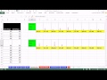
To compare sales reps' call data
Access all questions and much more by creating a free account
Create resources
Host any resource
Get auto-graded reports
Continue with Google

Continue with Email
Continue with Microsoft
or continue with

%20(1).png)
Apple
Others
Already have an account?
