- Resource Library
- Math
- Data And Graphing
- Scatter Plot Correlation
- Understanding Scatter Plots And Correlation
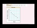
Understanding Scatter Plots and Correlation
Interactive Video
•
Mathematics
•
9th - 10th Grade
•
Practice Problem
•
Hard

Thomas White
FREE Resource
Read more
9 questions
Show all answers
1.
MULTIPLE CHOICE QUESTION
30 sec • 1 pt
What is the primary purpose of a scatter plot?
To list data in a tabular form
To display data in a pie chart format
To calculate the average of a data set
To show the relationship between two data sets
2.
MULTIPLE CHOICE QUESTION
30 sec • 1 pt
In the smoothie example, what does the x-axis represent?
Grams of sugar
Number of smoothies
Amount of protein
Calories
3.
MULTIPLE CHOICE QUESTION
30 sec • 1 pt
How many calories are in the smoothie with 56 grams of sugar?
270 calories
320 calories
200 calories
150 calories
4.
MULTIPLE CHOICE QUESTION
30 sec • 1 pt
What is the correlation when both x and y increase together?
Negative correlation
No correlation
Positive correlation
Inverse correlation
5.
MULTIPLE CHOICE QUESTION
30 sec • 1 pt
What type of correlation is shown when one variable increases and the other decreases?
Direct correlation
No correlation
Negative correlation
Positive correlation
6.
MULTIPLE CHOICE QUESTION
30 sec • 1 pt
What is the first step in creating a line of fit?
Make a scatter plot of the data
Calculate the average
Identify the y-intercept
Draw a line through the data
7.
MULTIPLE CHOICE QUESTION
30 sec • 1 pt
What should be approximately equal when drawing a line of fit?
The number of data points
The number of points above and below the line
The slope and y-intercept
The x and y values
Access all questions and much more by creating a free account
Create resources
Host any resource
Get auto-graded reports
Continue with Google

Continue with Email
Continue with Microsoft
or continue with

%20(1).png)
Apple
Others
Already have an account?
