- Resource Library
- Math
- Probability And Statistics
- Data Visualization
- Data Visualization Techniques And Concepts
Data Visualization Techniques and Concepts
Interactive Video
•
Mathematics
•
6th - 8th Grade
•
Practice Problem
•
Hard

Thomas White
FREE Resource
Read more
8 questions
Show all answers
1.
MULTIPLE CHOICE QUESTION
30 sec • 1 pt
What is typically represented on the horizontal axis of a bar graph?
Categories
Frequencies
Percentages
Relative frequencies
2.
MULTIPLE CHOICE QUESTION
30 sec • 1 pt
In a Pareto chart, how are the bars ordered?
Alphabetically
By increasing frequency
By decreasing frequency
Randomly
3.
MULTIPLE CHOICE QUESTION
30 sec • 1 pt
What data is needed to construct a frequency bar graph?
Colors and frequencies
Colors and percentages
Relative frequencies and percentages
Frequencies and percentages
4.
MULTIPLE CHOICE QUESTION
30 sec • 1 pt
What is the main difference between a frequency bar graph and a relative frequency bar graph?
The values on the vertical axis
The labels on the horizontal axis
The width of the bars
The number of categories
5.
MULTIPLE CHOICE QUESTION
30 sec • 1 pt
Which type of frequency can be used to create a Pareto chart?
Only frequencies
Only relative frequencies
Only percentage frequencies
Frequencies, relative frequencies, or percentage frequencies
6.
MULTIPLE CHOICE QUESTION
30 sec • 1 pt
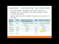
Why might relative frequency distributions be useful when comparing data sets from different years?
They are easier to calculate
They provide a clearer picture when total frequencies differ
They are more visually appealing
They require less data
7.
MULTIPLE CHOICE QUESTION
30 sec • 1 pt
What is necessary to construct a pie chart?
Percentage frequencies
All of the above
Relative frequencies
Absolute frequencies
Access all questions and much more by creating a free account
Create resources
Host any resource
Get auto-graded reports
Continue with Google

Continue with Email
Continue with Microsoft
or continue with

%20(1).png)
Apple
Others
Already have an account?
