- Resource Library
- Math
- Probability And Statistics
- Data Visualization
- Understanding Data Visualization Techniques
Understanding Data Visualization Techniques
Interactive Video
•
Mathematics
•
9th - 10th Grade
•
Hard

Thomas White
FREE Resource
Read more
9 questions
Show all answers
1.
MULTIPLE CHOICE QUESTION
30 sec • 1 pt
What is the main focus of the video tutorial?
Introduction to calculus
Exploring geometric shapes
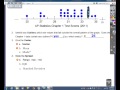
Understanding dot plots and stem plots
Learning about algebraic equations
2.
MULTIPLE CHOICE QUESTION
30 sec • 1 pt
What is a dot plot used for?
To display qualitative data
To show the relationship between two variables
To calculate the mean of a dataset
To represent quantitative data visually
3.
MULTIPLE CHOICE QUESTION
30 sec • 1 pt
In the context of describing distributions, what does 'socks' stand for?
Shape, Outliers, Center, Spread
Size, Order, Color, Shape
Scale, Origin, Contrast, Saturation
Speed, Orientation, Clarity, Symmetry
4.
MULTIPLE CHOICE QUESTION
30 sec • 1 pt
Which of the following is NOT a shape of distribution discussed in the video?
Uniform
Symmetric
Triangular
Bimodal
5.
MULTIPLE CHOICE QUESTION
30 sec • 1 pt
How can you identify an outlier in a dataset?
By looking for values that fall outside the overall pattern
By checking for symmetry in the data
By calculating the median
By finding the mean of the data
6.
MULTIPLE CHOICE QUESTION
30 sec • 1 pt
Which measure of center is considered the 'average'?
Median
Mode
Mean
Range
7.
MULTIPLE CHOICE QUESTION
30 sec • 1 pt
What does the range of a dataset represent?
The average value of the data
The middle value of the data
The most frequently occurring value
The difference between the highest and lowest values
Access all questions and much more by creating a free account
Create resources
Host any resource
Get auto-graded reports
Continue with Google

Continue with Email
Continue with Microsoft
or continue with

%20(1).png)
Apple
Others
Already have an account?
