

Wayground
Interpreting Graphs of Proportional Relationships - Printable Mathematics Worksheets - Wayground

Interpreting Graphs of Proportional Relationships

10 questions

7th - 7th Grade

Mathematics

Interpreting Graphs of Proportional Relationships is a Grade 7 mathematics worksheet that helps students recognize and explain proportional relationships in real-world graphs. Across 10 questions, students analyze gas costs, miles driven over time, and cookie prices to determine whether data are proportional, identify a straight line through the origin, and interpret ordered pairs such as (10, 30), (5, 250), and (1, 0.50) in context. The worksheet uses five multiple-choice questions plus drag-and-drop, hotspot, dropdown, math-response, and multiple-select items. Students identify the unit rate on a graph, explain what the origin represents, calculate a unit rate, and connect proportional graphs to the equation y = kx and the point (1, r). This free printable worksheet includes a complete answer key and is suitable for guided practice, independent work, or a short assessment of graph interpretation skills.

Worksheet settings

Font size

S
M
L
XL
Worksheets

Interpreting Graphs of Proportional Relationships

Total questions: 10

Name
Class
Date
1.

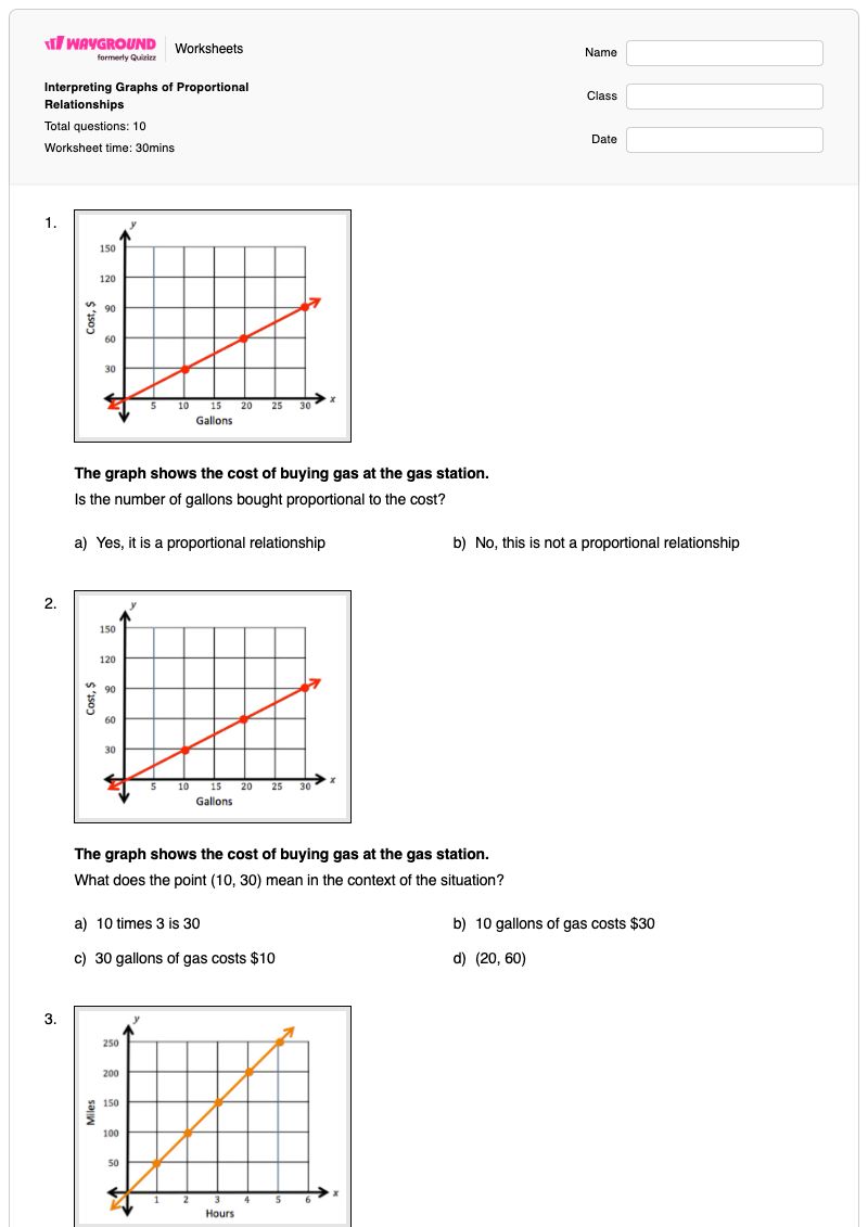
The graph shows the cost of buying gas at the gas station.

Is the number of gallons bought proportional to the cost?

a)

Yes, it is a proportional relationship

b)

No, this is not a proportional relationship

2.

The graph shows the cost of buying gas at the gas station.

What does the point (10, 30) mean in the context of the situation?

a)

10 times 3 is 30

b)

10 gallons of gas costs $30

c)

30 gallons of gas costs $10

d)

(20, 60)

3.

The graph shows the number of miles a car has driven over time.

Is the number of miles driven proportional to the amount of time? How do you know?

​ (a)   , I know this because there ​ (b)   and ​ (c)  

Choose from the below words
Yes
is a straight line
it goes through the origin.
No
is a vertical line
it goes on the graph.
4.

The graph shows the number of miles a car has driven over time.

What does the point (5, 250) mean in the context of the situation?

a)

To drive 5 miles it takes 250 hours.

b)

In 5 hours a car can drive 250 miles.

c)

The top of the graph.

5.

The graph shows the number of miles a car has driven over time.

What does the point (1, 50) mean in the context of the situation?

a)

For every hour the car can travel 50 miles.

b)

For every mile the car can travel for 50 miles.

c)

The start of the graph.

6.

The graph shows the number of miles a car has driven over time.

Identify the point on the graph that shows the unit rate.

7.

The graph displays the cost to buy cookies at a local bakery.

What does the point (0, 0) mean in the context of the situation?

a)

When 0 cookies are purchased $0 are spent

b)

The beginning of the graph

8.

The graph displays the cost to buy cookies at a local bakery.

What does the point (1, 0.50) mean in the context of the situation?

You purchased ​ (a)   ​ cookie it cost ​ (b)   ​

Choose from the below words
$0.50
1
$1.00
9.

The graph displays the cost to buy cookies at a local bakery.

What is the unit rate for the cost of cookies?

10.

Select all that apply:

If two sets of data are proportional to one another:

a)

the value of every ratio y/x will not be equal

b)

the graph that represents the data will be a straight line that passes through the origin.

c)

the graph will contain the points (0, 0) and (1, r) where r is the unit rate.

d)

there will exist a constant, k, for which you can replace in the equation y = kx

Answer Key

Interpreting Graphs of Proportional Relationships

Total questions: 10

1.
a)

Yes, it is a proportional relationship

2.
b)

10 gallons of gas costs $30

3.
Yes, is a straight line, it goes through the origin.
4.
b)

In 5 hours a car can drive 250 miles.

5.
a)

For every hour the car can travel 50 miles.

6.
7.
a)

When 0 cookies are purchased $0 are spent

8.
1, $0.50
9.

.5.5

10.
b)

the graph that represents the data will be a straight line that passes through the origin.

, c)

the graph will contain the points (0, 0) and (1, r) where r is the unit rate.

, d)

there will exist a constant, k, for which you can replace in the equation y = kx

FAQs

What does this worksheet cover?

This Grade 7 worksheet focuses on interpreting graphs of proportional relationships through 10 mixed-format questions. Students decide whether graphs represent proportional data, explain the meaning of ordered pairs in gas, driving, and cookie-price contexts, identify the unit-rate point, and connect proportional graphs to y = kx.

How can I use this worksheet to teach interpreting proportional graphs?

Introduce the worksheet by reviewing that a proportional graph is a straight line through the origin, then model how to read an ordered pair as an input-output statement, such as gallons and cost or hours and miles. Have students complete the graph-identification items first, discuss why (0, 0) matters, and then use the unit-rate hotspot, dropdown, and math-response items to connect the point (1, r) with the constant of proportionality.

What mistakes should I watch for when students complete this worksheet?

Watch for students reversing the coordinates in statements such as (5, 250), confusing the input with the output, or treating any straight line as proportional without checking whether it passes through the origin. Students may also misidentify the unit-rate point, interpret (0, 0) as merely the graph’s beginning instead of zero cost for zero cookies, or select the incorrect proportionality statements in the multiple-select item.

How do I assign and grade this worksheet?

This worksheet is available as a printable PDF and as a digital quiz on Wayground, with a complete answer key for checking responses. Printable submissions can be graded by scanning student work with the Wayground for Teachers app, while the digital version supports online completion and grading.

How can I differentiate this worksheet for my students?

Use the worksheet’s Advanced Settings to adjust font spacing or increase the font size so the graph-interpretation prompts and response choices are easier to follow. You can also enable a dyslexia-friendly font or translate the worksheet into another language to support access to the gas, driving, and cookie graph questions.

Where can I find more worksheets like this on Wayground?

Wayground offers a broad collection of free printable worksheets and practice problems across subjects, with downloadable PDFs and answer keys to help students build essential skills and concepts. Browse more resources at https://wayground.com/en-us/worksheets.