wayground logo

Free Printable Worksheets

NEW

Font size

S
M
L
XL
Worksheets

Art Theory Quiz for Secondary One

Total questions: 50

Worksheet time: 26mins

Name
Class
Date
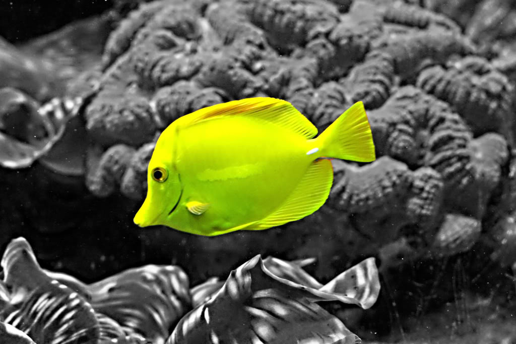
1.
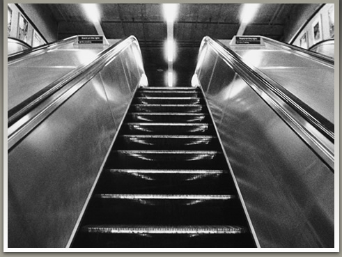
This image shows an example of
a)
High contrast
b)
Low contrast
c)
Juxtaposition
d)
Symmetrical balance
2.
Spoonbridge & Cherry in Minneapolis shows an example of:
a)
Exaggerated proportions
b)
Symmetrical balance
c)
Low contrast
d)
Exaggerated scale
3.
This image shows an example of:
a)
Exaggerated scale
b)
Juxtaposition
c)
High contrast
d)
Exaggerated proportions
4.
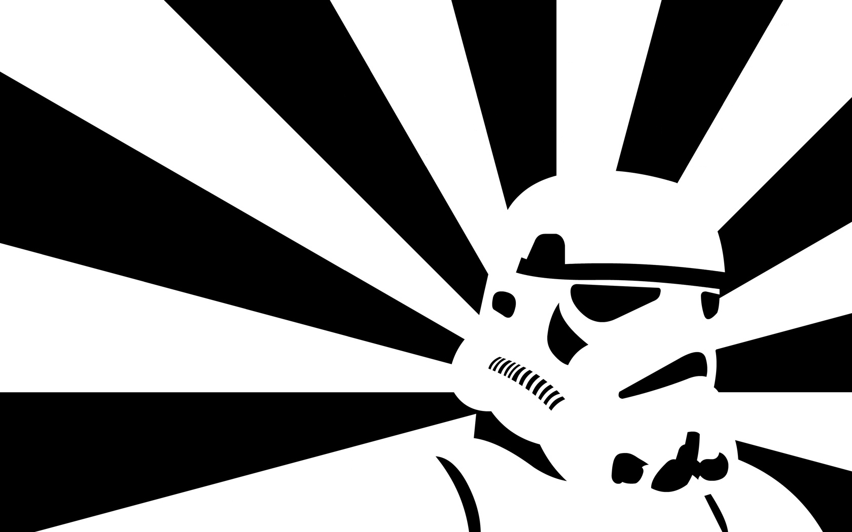
This image shows an example of:
a)
asymmetrical balance
b)
symmetrical balance
c)
radial balance
d)
physical balance
5.
The way an artwork is arranged is called:
a)
design
b)
composition
c)
frame
d)
photo
6.
A repeated design is called a:
a)
principle
b)
pattern
c)
element
d)
shape
7.
This painting shows which principle?
a)
Emphasis
b)
Symmetry
c)
Movement/Rhythm
8.
What is the emphasis of this photograph?
a)
The green apples around the pepper
b)
The red pepper in the center
c)
The little man peeking through the apples
9.
Did this architect use pattern for this design?
a)
yes
b)
no
10.
Is this portrait by Chuck Close symmetrical or asymmetrical?
a)
Asymmetrical
b)
Symmetrical
11.
This painting by Eleni Pratsi is a good example of using different what?
a)
Textures
b)
Sizes
c)
Forms
12.
Which principles did Andy Warhol use in his screen print of Marilyn Monroe?
a)
Emphasis
b)
 Color
c)
Variety & Repetition
13.
This image is a good example of which element?
a)
movement
b)
pattern
c)
line
d)
form
14.
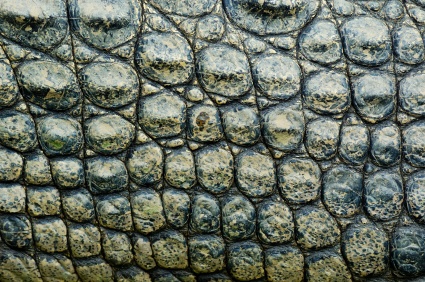
The image is a good example of which element?
a)
pattern
b)
texture
c)
shape
d)
emphasis
15.
This image is a good example of which principle?
a)
value
b)
space
c)
movement
d)
contrast
16.
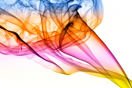
This image is a good example of which element?
a)
pattern
b)
unity
c)
space
d)
color
17.
This image is a good example of what principle?
a)
space
b)
emphasis
c)
line
d)
texture
18.

What type of colours does Romero Britto use?

a)

Vibrant colours and bold patterns.

b)

Dark colours.

c)

Light colours.

d)

Light colours and red lines.

19.

Romero Britto's works are a symbol of...

a)

Cubism.

b)

Impressionism.

c)

Romanticism.

d)

Pop Art.

20.

Who is the artist that painted this mural on the Berlin Wall?

a)

Andy Warhol

b)

Romero Britto

c)

Keith Haring

d)

Frida Kahlo

21.
Which American graffiti artist used his art to speak out against social injustice?
a)
Andy Warhol
b)
Georgia O'Keeffe
c)
Frida Kahlo
d)
Keith Haring
22.
Who created this artwork?
a)
Frida Kahlo
b)
Andy Warhol
c)
Keith Haring
d)
Mary Cassatt
23.
This artist has his signature used in a unique way in over 90% of the work he produces.
a)
Romero Britto
b)
Keith Haring
c)
Kadir Nelson
d)
Roy Lichtenstein
24.

_____________’s artwork was very simplified easy and quick to draw with bright color and bold lines. His figures appeared to vibrate or move.

a)

Kandinsky

b)

Haring

c)

Op Art

25.

__________________ -work inspired by television commercials, cartoons, comics, and advertisements, cars, and celebrities.

a)

Realism

b)

Pop Art

c)

Op Art

d)

Abstract

26.

Name the style of art of the image above?

a)

Pop Art

b)

Op Art

c)

Abstract

27.
This artwork is an example of work created by:
a)
Pablo Picasso.
b)
Andy Warhol.
c)
Chuck Close.
d)
Keith Haring. 
28.
Romero Britto was born in...
a)
Brazil,
b)
Mexico.
c)
South Africa.
d)
United States.
29.

Romero Britto's paintings express...

a)

happiness and hope.

b)

happiness and hungry.

c)

happiness and sadness.

30.
......... is the creation of action. In art it causes the eye of the viewer to travel within and across the boundary of the work.
a)
Value
b)
Movement
c)
Motion 
d)
Tone
31.
Value is the lightness and darkness of a colour.
a)
True
b)
False
32.
........... is the way something looks or feels.
a)
Movement
b)
Value
c)
Texture
d)
Tone
33.
What are these called?
a)
Tertiary Colors
b)
Primary Colors
c)
Monochromatic Colors
d)
Complementary Colors
34.
In a typical portrait drawing, how far down the face should the eye line be drawn?
a)
1/4 way from the top of the head
b)
1/2 way from the top of the head
c)
2/3 way from the top of the head
d)
3/4 way from the top of the head
35.
This facial feature is typically the same length and vertical placement as the nose.
a)
Hair
b)
Sideburns
c)
Ears
d)
Cheeks
36.
Why is proportion important to use in an artwork?
a)
Who knows
b)
It makes it look more realistic.
c)
Looks cool
d)
More from life
37.
What has the wrong proportion in this picture?
a)
The head
b)
The legs
c)
The arms
d)
The earth
38.
What proportion is off in this drawing?
a)
Bird
b)
Man
c)
Sky
d)
Tractor
39.
What proportion is not reasonable on this body?
a)
Legs
b)
Ears
c)
Background
d)
Neck
40.

Whose work is this?

a)

Romero Britto

b)

Keith Haring

c)

Pablo Picasso

d)

Justin Lee

41.

Where is this sculpture located?

a)

Sentosa

b)

Marina Bay

c)

Boat Quay

d)

New York

42.

Who did the chalk drawings in the subway?

a)

Hokusai

b)

Romero Britto

c)

Keith Haring

d)

Keith Hairy

43.
What type of balance does this use?
a)
Symmetrical
b)
Asymmetrical
c)
Rule of 3rds
d)
There is no balance
44.
What type of balance does this use?
a)
Symmetrical
b)
Asymmetrical
c)
Rule of 3rds
d)
There is no balance
46.

What type of balance is shown?

a)

asymmetrical

b)

symmetrical

c)

radial

46.

What type of balance is shown?

a)

asymmetrical

b)

symmetrical

c)

radial

47.
A repeated shape or line
a)
emphasis
b)
pattern
c)
variety
48.
Which Principle of Design fits this definition?
"A visual element that catches the viewer's attention."
a)
Variety
b)
Proportion
c)
Emphasis
d)
Unity
49.
Which Principle of Design fits this definition?
"Works with pattern; Repeated elements do not have to be identical to each other." 
a)
Balance
b)
Repetition
c)
Pattern
d)
Variety
50.
Which Principle of Design fits this definition?
"Using multiple principles of design to hold the viewer's attention."

a)
Balance
b)
Pattern
c)
Variety
d)
Proportion