wayground logo

Free Printable Worksheets

Font size

S
M
L
XL
Worksheets

quiz

Total questions: 191

Worksheet time: 10hrs 14mins
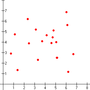
Name
Class
Date
1.
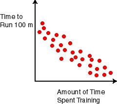
What is the type of correlation?
a)
Negative 
b)
no association
c)
positive 
2.
What type of correlation does this graph have?
a)
positive 
b)
negative
c)
none
d)
all of the above
3.
What type of correlation does this graph have?
a)
positive
b)
negative
c)
none
d)
all of the above
4.
What type of correlation does this graph show?
a)
Positive
b)
negative
c)
none
d)
all of the above
5.
What type of correlation does this graph have?
a)
positive
b)
negative
c)
none
d)
all of the above
6.
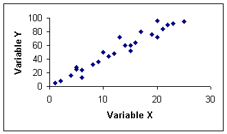
What type of correlation does this scatter plot show?
a)
positive linear association
b)
negative linear association
c)
no association
d)
nonlinear association
7.
What type of correlation does this scatter plot represent?
a)
positive linear association
b)
negative linear association
c)
no association
d)
nonlinear association
8.
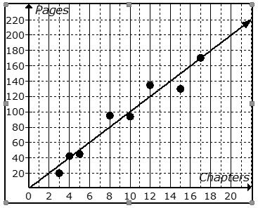
The scatter plot shows the relationship between the number of chapters and the total number of pages for several books.  Use the trend line to predict how many chapters would be in a book with 140 pages. 
a)
12 chapters
b)
19 chapters
c)
14 chapters
d)
21 chapters
9.
The scatter plot shows the relationship between the number of chapters and the total number of pages for several books. Use the trend line to predict how many pages would be in a book with 6 chapters. 
a)
100 pages
b)
170 pages
c)
60 pages
d)
20 pages
10.
You are analyzing a scatter plot that has a negative correlation. What is true of the of the x and y values?
a)
As x increases, y decreases
b)
As x increases, y increases
c)
As x decreases, y decreases
11.
About how many male math teachers were there in 2006?
a)
15
b)
30
c)
35
d)
45
12.
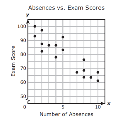
1.  Mrs. Collins made a scatterplot to show the relationship between the number of absences and a student’s final exam score. Based on this scatterplot, a student with 6 absences should get approximately what score on the final exam? 
a)
65
b)
92
c)
70
d)
76
13.
What type of association does this graph have?
a)
positive 
b)
negative
c)
none
d)
all of the above
14.
What type of association does this graph have?
a)
positive
b)
negative
c)
none
d)
all of the above
15.
What type of association does this graph have?
a)
positive 
b)
negative
c)
none
d)
all of the above
16.
The following scatter plot shows Pam's training as she prepares to run a 6 mile race at the end of the month.  Which of the following would be a reasonable approximation for the length of time it would take for her to run 6 miles? 
a)
A. 50 min
b)
B. 80 min
c)
C. 45 min
d)
D. 60 min
17.
What type of correlation (association)?
The outside temperature and the amount of layers you wear. 
a)
Positive correlation
b)
Negative correlation
c)
No correlation
d)
All of the above
18.
The number of siblings you have and your weight. 
a)
Positive correlation
b)
Negative correlation
c)
No correlation
d)
All of the above
19.
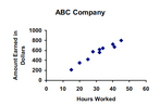
Based on the graph, if Joe earned $400, how many hours did he work?
a)
25 hours
b)
35 hours
c)
45 hours
d)
15 hours
20.
What type of correlation does this scatter plot represent?
a)
positive linear correlation
b)
negative linear correlation
c)
no correlation
d)
nonlinear correlation
21.
What type of correlation does this graph have?
a)
positive
b)
negative
c)
none
d)
all of the above
22.
As x increases, y decreases.
a)
no correlation
b)
negative correlation
c)
correlation coefficient
d)
positive correlation
23.
What is a scatter plot?
a)
A graph that shows the relationship of two data sets.
b)
A graph drawn using rectangular bars to show how large each value is.
c)
A graph that shows information that is connected in some way.
d)
A graph that shows data changing over time.
24.
What is the type of correlation?
a)
Negative 
b)
no association
c)
positive 
25.
What type of correlation does this graph have?
a)
positive 
b)
negative
c)
none
d)
all of the above
26.
What type of correlation does this graph have?
a)
positive
b)
negative
c)
none
d)
all of the above
27.
What type of correlation does this graph show?
a)
Positive
b)
negative
c)
none
d)
all of the above
28.
What type of correlation does this scatter plot show?
a)
positive linear association
b)
negative linear association
c)
no association
d)
nonlinear association
29.
1.  Mrs. Collins made a scatterplot to show the relationship between the number of absences and a student’s final exam score. Based on this scatterplot, a student with 6 absences should get approximately what score on the final exam? 
a)
65
b)
92
c)
70
d)
76
30.
Which scatter plot shows a linear relationship between x and y?
a)
Graph A
b)
Graph B
c)
Graph C
d)
Graph D
31.
What is the type of association?
a)
Negative 
b)
no association
c)
positive 
32.
What type of association does this graph have?
a)
positive 
b)
negative
c)
none
d)
all of the above
33.
Based on the graph, if Joe earned $400, how many hours did he work?
a)
25 hours
b)
35 hours
c)
45 hours
d)
15 hours
34.

About how many male math teachers were there in 2006?

a)

15

b)

25

c)

35

d)

45

35.

What type of correlation does this graph have?

a)

positive

b)

negative

c)

none

36.

What type of correlation does this scatter plot represent?

a)

Positive correlation

b)

Negative correlation

c)

No correlation

d)

All the correlation

37.

What type of correlation does this graph have?

a)

Positive

b)

Negative

c)

None

38.

Does this scatter plot demonstrate strong or weak correlation?

a)

Strong

b)

Weak

c)

Neither

39.

Are these data points strongly or weakly correlated?

a)

Strong, positive correlation

b)

Weak, positive correlation

c)

Strong, negative correlation

d)

Weak, negative correlation

40.

Are these data points strongly or weakly correlated?

a)

Strong, positive correlation

b)

Strong, negative correlation

c)

No correlation

d)

Weak, negative correlation

41.

Are these points strongly or weakly correlated?

a)

Strong, positive correlation

b)

Strong, negative correlation

c)

Weak, negative correlation

d)

No correlation

42.
What type of association does this graph have?
a)
positive 
b)
negative
c)
none
d)
all of the above
43.
The following scatter plot shows Pam's training as she prepares to run a 6 mile race at the end of the month.  Which of the following would be a reasonable approximation for the length of time it would take for her to run 6 miles? 
a)
A. 50 min
b)
B. 80 min
c)
C. 45 min
d)
D. 60 min
44.
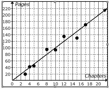
The scatter plot shows the relationship between the number of chapters and the total number of pages for several books.  Use the trend line to predict how many chapters would be in a book with 180 pages. 
a)
12 chapters
b)
15 chapters
c)
18 chapters
d)
21 chapters
45.
The scatter plot shows the relationship between the number of chapters and the total number of pages for several books.  Use the trend line to predict how many chapters would be in a book with 180 pages. 
a)
12 chapters
b)
15 chapters
c)
18 chapters
d)
21 chapters
46.
The number of siblings you have and your weight. 
a)
Positive correlation
b)
Negative correlation
c)
No correlation
d)
All of the above
47.
Find the slope for the trend line using points (2,2) and (4,3)
a)
2
b)
1/2
c)
-2
d)
-1/2
48.
What is the correlation?
a)
Negative correlation
b)
No correlation
c)
Positive correlation
d)
All of the above
49.
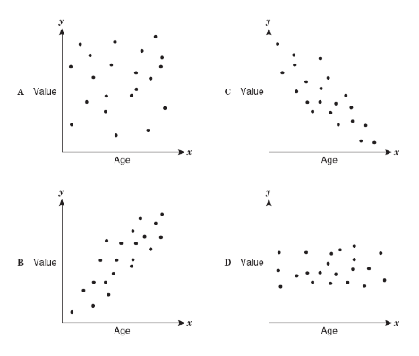
As the age of the car increases, its value decreases. Which scatterplot represents this relationship?
a)
A
b)
B
c)
C
d)
D
50.
If a scatterplot has no correlation then...
a)
...it has no ordered pairs
b)
...it has ordered pairs that have a negative pattern
c)
...its ordered pairs have no predictable pattern
d)
..it has ordered pairs that have a positive pattern
51.
Which choice best defines the term "linear function"?
a)
An equation that is the bomb diggity
b)
An equation that can be written in slope-intercept form
c)
An equation with an exponent in it
d)
An equation that has a slope but not a y-intercept
52.
a)
440 turtles
b)
40 turtles
c)
150 turtles
d)
90 turtles
53.
What is a line of best fit used for?
a)
To make predictions
b)
To make the graph look pretty
c)
To connect the points
d)
To make it look like you know what you are doing
54.
About how many male math teachers were there in 2006?
a)
15
b)
30
c)
35
d)
45
55.

Classify the scatter plot as having a positive, negative, or no correlation.

a)

Positive

b)

Negative

c)

No correlation

56.

Classify the scatter plot as having a positive, negative, or no correlation.

a)

Positive

b)

Negative

c)

No correlation

57.

Classify the scatter plot as having a positive, negative, or no correlation.

a)

Positive

b)

Negative

c)

No correlation

58.

Select the scenario that have a positive correlation.

a)

Number of hours a person has driven and the number of miles driven.

b)

The number of siblings a student has and the grade they have in math class.

c)

The age of a car and the value of the car.

59.

What is an outlier?

a)

Value that is much smaller than most of the other values in a set of data.

b)

Value that is in the middle of all the values in a set of data.

c)

Value that is much larger than most of the other values in a set of data.

60.

How many times did David make a journey of 4 miles?

a)

1

b)

3

c)

4

d)

6

61.

Which of F or C gives the best value for money?

a)

C

b)

F

62.

Which sentence describes the relationship shown in the scatter plot?

a)

As the temperature increases, the amount of sales decrease.

b)

As the temperature increases, the amount of sales increase.

c)

As the amount of sales increase, the temperature decreases.

d)

No correlation

63.

Which scatter plot represents a cluster set of data?

a)
b)
c)
64.

What data points are outliers in the scatter plot?

a)

A

b)

B

c)

C

d)

D

65.
Which scatter plot shows a positive relationshp between x and y?
a)
Graph A
b)
Graph B
c)
Graph C
d)
Graph D
66.
What is the type of trend is shown?
a)
Negative 
b)
no trend
c)
positive 
67.
What type of trend does this scatter plot show?
a)
positive
b)
negative
c)
no trend
68.
The following scatter plot shows Pam's training as she prepares to run a 6 mile race at the end of the month.  Which of the following would be a reasonable approximation for the length of time it would take for her to run 6 miles? 
a)
A. 50 min
b)
B. 80 min
c)
C. 45 min
d)
D. 60 min
69.
What type of trend does this scatter plot represent?
a)
positive
b)
negative
c)
no trend
70.
The scatter plot shows the relationship between the number of chapters and the total number of pages for several books.  Use the trend line to predict how many chapters would be in a book with 180 pages. 
a)
12 chapters
b)
15 chapters
c)
18 chapters
d)
21 chapters
71.
The scatter plot shows the relationship between the number of chapters and the total number of pages for several books. Use the trend line to predict how many pages would be in a book with 19 chapters. 
a)
150 pages
b)
170 pages
c)
190 pages
d)
210 pages
72.
About how many male math teachers were there in 2006?
a)
15
b)
30
c)
35
d)
45
73.
What is the type of correlation?
a)
Negative 
b)
no association
c)
positive 
74.
What type of correlation does this graph have?
a)
positive 
b)
negative
c)
none
d)
all of the above
75.
What type of correlation does this graph have?
a)
positive
b)
negative
c)
none
d)
all of the above
76.
Which sentence describes the relationship shown on this scatter plot?
a)
As the temperature decreases, the visitors increase. 
b)
As the temperature increases, the number of visitors increases. 
c)
As the visitors increase, the temperature decreases. 
d)
No correlation
77.
Mrs. Collins made a scatterplot to show the relationship between the number of absences and a student’s final exam score. Based on this scatterplot, a student with 6 absences should get approximately what score on the final exam? 
a)
65
b)
92
c)
70
d)
76
78.
Select the statement that best describes the line.
a)
The line is the line of best fit.
b)
The line is NOT a line of best fit because it does not pass through two points.
c)
The line is NOT a line of best fit because it does not go through the middle of the data set.
d)
The line is NOT a line of best fit because it does not go through the origin.
79.
Which of the following lines represents the line of best fit for the scatter plot?
a)
A
b)
B
c)
C
d)
D
80.
a)
y= 1/2x+8
b)
y= -1/2x+8
c)
y= 1/4x+8
d)
y= -1/4+8
81.
a)
y= -5/8x+6
b)
y= 5/8x+6
c)
y=-8/5x+6
d)
y= 8/5x+6
82.
The scatter plot shows the relationship between the number of chapters and the total number of pages for several books.  Use the trend line to predict how many chapters would be in a book with 180 pages. 
a)
12 chapters
b)
15 chapters
c)
18 chapters
d)
21 chapters
83.
Which of the following could be a possible line of best fit for the data?
a)
y = -5/2x + 20
b)
y = -x + 19
c)
y = x + 20
d)
y = 2/3x + 15 
84.
a)

41

b)

57

c)

68

d)

75

85.
a)

21

b)

72

c)

16.4

d)

14.8

86.
a)

The data appears linear with positive association.

b)

The data appears linear with negative association.

c)

The data appears non-linear with positive association.

d)

The data appears non-linear with no association.

87.
a)

12 states

b)

22 states

c)

18 states

d)

15 states

88.
a)

X shows weak association while Y shows strong association

b)

X is non-linear while Y is linear

c)

X shows negative association while Y shows positive association

d)

X shows no association while Y shows negative association

89.
a)

As the hours spent practicing soccer increases, the hours spent

studying math increases.

b)

As the hours spent practicing soccer decreases, the hours spent

studying math decreases.

c)

As the hours spent practicing soccer increases, the hours spent

studying math decreases.

d)

There is no association between the hours spent practicing soccer

and the hours spent studying math.

90.
a)

1,038 students

b)

30 stucdents

c)

890 students

d)

1,020 students

91.
a)

4.3

b)

420

c)

70

d)

26

92.
The scatter plot shows the relationship between the number of chapters and the total number of pages for several books.  Use the trend line to predict how many chapters would be in a book with 180 pages. 
a)
12 chapters
b)
15 chapters
c)
18 chapters
d)
21 chapters
93.
Which of the following lines represents the line of best fit for the scatter plot?
a)
A
b)
B
c)
C
d)
D
94.
The relationship of birthdays to candles
a)
Positive correlation
b)
Negative correlation
c)
No correlation
d)
all of the above
95.
a)
Linear
b)
Non-Linear
c)
No Association
96.
What is the line of best fit?
a)
f(x)= 5x+1.82
b)
cannot be determined
c)
f(x)= 1.82x + 5.02
d)
f(x)= 1.1x + 4.2
97.
What is a line of best fit used for?
a)
To make predictions
b)
To make the graph look pretty
c)
To connect the points
d)
To make it look like you know what you are doing
98.
About how many male math teachers were there in 2006?
a)
15
b)
30
c)
35
d)
45
99.
Which scatter plot shows a linear relationship between x and y?
a)
Graph A
b)
Graph B
c)
Graph C
d)
Graph D
100.
The scatter plot shows the relationship between the number of chapters and the total number of pages for several books.  Use the trend line to predict how many chapters would be in a book with 180 pages. 
a)
12 chapters
b)
15 chapters
c)
18 chapters
d)
21 chapters
101.
The scatter plot shows the relationship between the number of chapters and the total number of pages for several books. Use the trend line to predict how many pages would be in a book with 19 chapters. 
a)
150 pages
b)
170 pages
c)
190 pages
d)
210 pages
102.
Mrs. Collins made a scatterplot to show the relationship between the number of absences and a student’s final exam score. Based on this scatterplot, a student with 6 absences should get approximately what score on the final exam? 
a)
65
b)
92
c)
70
d)
76
103.
Based on the graph, if Joe earned $400, how many hours did he work?
a)
25 hours
b)
35 hours
c)
45 hours
d)
15 hours
104.
Charlie rented a moving truck. He paid a daily fee plus a per-mile fee to rent the truck. The equation below represents the daily amount Charlie paid for the truck if he drives it x miles.
y=0.5x+10
What does the slope of the graph of this equation represent?
a)
The daily fee for the moving truck
b)
The per-mile fee for the moving truck
c)
How much Charlie paid for the truck
d)
The number of miles he drove
105.
Rich is a member of a gym. He pays a monthly fee plus a per-visit fee. The equation below represents the monthly amount Rich pays for his membership to the gym per month for x visits.
y=3x+10
What does the y-intercept of the graph of this equation represent?
a)
The monthly fee
b)
How much Rich pays per visit
c)
The number of times Rich goes to the gym
d)
The total cost at the end of the month
106.
Adrianna has $20 in her savings account. Each week she will add $5 to it. Which equation represents this situation?
a)
y=25x
b)
y=20x+5
c)
y=5x+20
d)
y=5x
107.
Adrianna has $20 in her savings account. Each week she will add $5 to it. Which equation represents this situation?
a)
y=25x
b)
y=20x+5
c)
y=5x+20
d)
y=5x
108.
Which of the following could be a possible line of best fit for the data?
a)
y = -5/2x + 20
b)
y = -x + 19
c)
y = x + 20
d)
y = 2/3x + 15 
109.
The table shown is comparing a person's foot length to their height in cm. Calculate a line of best fit.
a)
f(x) = 25.05x + 5.57
b)
f(x) = 5.57x + 25.05
c)
f(x) = -5.57x + 25.05
d)
f(x) = 5.57x - 25.05
110.
The table shown is comparing a person's foot length to their height in cm. What might the height of a person be with a foot length of 30 cm?
a)
185 cm
b)
180 cm
c)
190 cm
d)
192 cm
111.
Using your linear regression, what is y when x is 30?
a)
61.59
b)
52.46
c)
57.94
d)
59.76
112.
What is the line of best fit?
a)
f(x)= 5x+1.82
b)
cannot be determined
c)
f(x)= 1.82x + 5.02
d)
f(x)= 1.1x + 4.2
113.
The equation of the trend line is y= 1/2x +1
How many laps can a bicycle make around the park in 23 minutes?
a)
44 laps
b)
12 1/2 laps
c)
23 laps
114.

11

a)

Bryan is Correct

b)

Bryan is incorrect

115.

12 a Which scatter plot has a stronger association?

a)

A

b)

B

116.

12b

Which scatter plot appears to be linear?

a)

a

b)

b

117.

10

a)

A

b)

B

c)

C

d)

D

118.

9

a)

A

b)

B

c)

C

d)

D

119.

#8

a)

#3

b)

#4

c)

#5

d)

#5

120.

#7

a)

#3

b)

#4

c)

#5

d)

#6

121.

#4

a)

Positive

b)

Negative

c)

No Association

122.

#2

a)

Postive

b)

Negative

c)

No Association

123.

#3

a)

positive

b)

Negative

c)

No association

124.
What is the type of association?
a)
Negative 
b)
no association
c)
positive 
125.
What type of association does this graph have?
a)
positive 
b)
negative
c)
none
d)
all of the above
126.
What type of association does this graph have?
a)
positive
b)
negative
c)
none
d)
all of the above
127.
The scatter plot shows the relationship between the number of chapters and the total number of pages for several books.  Use the trend line to predict how many chapters would be in a book with 180 pages. 
a)
12 chapters
b)
15 chapters
c)
18 chapters
d)
21 chapters
128.
The scatter plot shows the relationship between the number of chapters and the total number of pages for several books. Use the trend line to predict how many pages would be in a book with 19 chapters. 
a)
150 pages
b)
170 pages
c)
190 pages
d)
210 pages
129.
Ms. Long tracked the number and age of students that visited the library per month and recorded the data below. How many TOTAL students visited the library?
a)
24
b)
40
c)
42
d)
16
130.
a)
0 lbs
b)
1 lb
c)
2 lbs
d)
6 lbs
131.
What would be the correlation between study time and test grades?
a)
positive
b)
negative
c)
none
d)
cannot be determined
132.

Mrs. Collins made a scatterplot to show the relationship between the number of absences and a student’s final exam score. Based on this scatterplot, a student with 12 absences should get approximately what score on the final exam?

a)

60

b)

92

c)

70

d)

76

133.

What type of correlation does this graph have?

a)

positive

b)

negative

c)

none

d)

all of the above

134.

What type of correlation does this graph have?

a)

Negative

b)

no association

c)

positive

135.

Mrs. Collins made a scatterplot to show the relationship between the number of absences and a student’s final exam score. Based on this scatterplot, a student with 6 absences should get approximately what score on the final exam?

a)

85

b)

92

c)

70

d)

76

136.

The scatter plot shows the relationship between the number of chapters and the total number of pages for several books. Use the trend line to predict how many pages would be in a book with 19 chapters.

a)

150 pages

b)

170 pages

c)

190 pages

d)

210 pages

137.

Mrs. Collins made a scatterplot to show the relationship between the number of absences and a student’s final exam score. Based on this scatterplot, a student with 6 absences should get approximately what score on the final exam?

a)

65

b)

92

c)

70

d)

76

138.

Based on the graph, if Joe earned $400, how many hours did he work?

a)

25 hours

b)

35 hours

c)

45 hours

d)

15 hours

139.

Describe the correlation in the graph shown.

a)

Strong Negative

b)

Strong Positive

c)

Weak Negative

d)

Weak Positive

140.
The following scatter plot shows Pam's training as she prepares to run a 6 mile race at the end of the month.  Which of the following would be a reasonable approximation for the length of time it would take for her to run 6 miles? 
a)
A. 50 min
b)
B. 80 min
c)
C. 45 min
d)
D. 60 min
141.

Which scatter plot show a positive relationship?

a)

Graph A

b)

Graph B

c)

Graph C

d)

Graph D

142.

Based on the scatterplot, which of the following conclusions about the relationship between her height and weight is true?

a)

There is a negative relationship between height and weight

b)

There is a positive relationship between height and weight

c)

There is a constant relationship between height and weight

d)

There is no relationship between height and weight

143.

Estimate the correlation coefficient for this scatterplot.

a)

r = 1.2

b)

r = 0.89

c)

r = 0

d)

r = -0.89

144.

Estimate the correlation coefficient for this scatterplot.

a)

r = -0.9

b)

r = 1

c)

r = 0.9

d)

r = -1

145.

r=0.3

a)

Strong positive

b)

Weak positive

c)

Strong negative

d)

Weak negative

146.
What type of association does this graph have?
a)
positive 
b)
negative
c)
none
d)
all of the above
147.
What type of correlation (association)?
The outside temperature and the amount of layers you wear. 
a)
Positive correlation
b)
Negative correlation
c)
No correlation
d)
All of the above
148.
The number of siblings you have and your weight. 
a)
Positive correlation
b)
Negative correlation
c)
No correlation
d)
All of the above
149.
Based on the graph, if Joe earned $400, how many hours did he work?
a)
25 hours
b)
35 hours
c)
45 hours
d)
15 hours
150.
As x increases, y increases
a)
correlation coefficient
b)
causation
c)
positive correlation
d)
negative correlation
151.
Find the slope for the trend line using points (2,2) and (4,3)
a)
2
b)
1/2
c)
-2
d)
-1/2
152.
A trend line that shows the most accurate relationship between x and y describes...
a)
linear regression
b)
no correlation
c)
trend line
d)
line of best fit
153.
Which scatter plot shows a linear relationship between x and y?
a)
Graph A
b)
Graph B
c)
Graph C
d)
Graph D
154.
What is the correlation?
a)
Negative correlation
b)
No correlation
c)
Positive correlation
d)
All of the above
155.
As the age of the car increases, its value decreases. Which scatterplot represents this relationship?
a)
A
b)
B
c)
C
d)
D
156.
If a scatterplot has no association then...
a)
...it has no ordered pairs
b)
...it has ordered pairs that have a negative pattern
c)
...its ordered pairs have no predictable pattern
d)
...if it makes a lion on a graph (roar!)
157.
Which choice best defines the term "linear function"?
a)
An equation that is the bomb diggity
b)
An equation that can be written in slope-intercept form
c)
An equation with an exponent in it
d)
An equation that has a slope but not a y-intercept
158.
In a scatterplot, an outlier...
a)
...is something we didn't learn 8th grade
b)
...is a puppet with a long nose named Pinocchio
c)
...is a point that is far outside the main cluster of points/ordered pairs
d)
...is a really naughty point who doesn't tell the truth when outside
159.
Which of the following could be a possible line of best fit for the data?
a)
y = -5/2x + 20
b)
y = -x + 19
c)
y = x + 20
d)
y = 2/3x + 15 
160.
What is a line of best fit used for?
a)
To make predictions
b)
To make the graph look pretty
c)
To connect the points
d)
To make it look like you know what you are doing
161.
Which of the following could be a possible line of best fit for the data?
a)
y = 3x + 0
b)
y = 5/6x + 490
c)
y = -2x + 470
d)
non linear
162.
What is a scatter plot?
a)
A graph that shows the relationship of two data sets.
b)
A graph drawn using rectangular bars to show how large each value is.
c)
A graph that shows information that is connected in some way.
d)
A graph that shows data changing over time.
163.
Mrs. Collins made a scatterplot to show the relationship between the number of absences and a student’s final exam score. Based on this scatterplot, a student with 6 absences should get approximately what score on the final exam? 
a)
65
b)
92
c)
70
d)
76
164.
What type of association does this graph have?
a)
Positive
b)
Negative
c)
No Association
165.
What type of association does this graph have?
a)
Positive 
b)
Negative
c)
No Association
d)
Chicken
166.
What is the type of association?
a)
Negative 
b)
No Association
c)
Positive 
167.
Describe the type of association seen in this graph.
a)
Positive
b)
Negative
c)
No Association
d)
I don't know
168.
What type of association does this scatter plot show?
a)
Positive and Linear 
b)
Negative and Linear
c)
No Association
d)
Negative and Non-Linear
169.
What type of association does this scatter plot represent?
a)
Positive  and Linear 
b)
Negative and Linear 
c)
No Association
d)
Positive and Nonlinear 
170.
What type of association does this scatter plot represent?
a)
Linear 
b)
Weak Association
c)
No Association
d)
Nonlinear 
171.
About how many male math teachers were there in 2006?
a)
15
b)
30
c)
35
d)
45
172.
Which scatter plot shows a linear relationship between x and y?
a)
Graph A
b)
Graph B
c)
Graph C
d)
Graph D
173.
Describe the association?
a)
Strong Association
b)
No Association
c)
Weak Association
174.
Describe the association between the x and y variables.
a)
Strong
b)
Weak
c)
No Association
d)
I don't know
175.
Describe the association between the x and y variables.
a)
Strong
b)
Weak
c)
No Association
d)
All of the above
176.
Describe the correlation in the graph shown.
a)
Strong Negative
b)
Strong Positive
c)
Weak Negative
d)
Weak Positive
177.
Describe the correlation in the graph shown.
a)
Strong Negative
b)
Strong Positive
c)
Weak Negative
d)
Weak Positive
178.
Describe the correlation in the graph shown.
a)
Strong Negative
b)
Strong Positive
c)
Weak Negative
d)
Weak Positive
179.
When the points are located closer to one another there is a _____________
a)
Strong Correlation
b)
Weak Correlation
c)
Positive Correlation
d)
Negative Correlation
180.
What college did Ms. Reed go to in Boston?
a)
Boston College
b)
MIT
c)
Boston University
d)
Northeastern
181.
What sport is Ms. Reed best at?
a)
Volleyball
b)
Soccer
c)
Swimming
d)
Track
182.
The scatter plot shows the relationship between the number of chapters and the total number of pages for several books.  Use the trend line to predict how many chapters would be in a book with 180 pages. 
a)
12 chapters
b)
15 chapters
c)
18 chapters
d)
21 chapters
183.
The following scatter plot shows Pam's training as she prepares to run a 6 mile race at the end of the month.  Which of the following would be a reasonable approximation for the length of time it would take for her to run 6 miles? 
a)
A. 50 min
b)
B. 80 min
c)
C. 45 min
d)
D. 60 min
184.
What type of association does this graph have?
a)
positive 
b)
negative
c)
none
d)
all of the above
185.
What type of correlation (association)?
The outside temperature and the amount of layers you wear. 
a)
Positive correlation
b)
Negative correlation
c)
No correlation
d)
All of the above
186.
As x increases, y increases
a)
correlation coefficient
b)
causation
c)
positive correlation
d)
negative correlation
187.
Mrs. Collins made a scatterplot to show the relationship between the number of absences and a student’s final exam score. Based on this scatterplot, a student with 6 absences should get approximately what score on the final exam? 
a)
65
b)
92
c)
70
d)
76
188.
Which sentence describes the relationship shown on this scatterplot?
a)
As the temperature decreases, the visitors increase. 
b)
As the temperature increases, the number of visitors increases. 
c)
As the visitors increase, the temperature decreases. 
d)
No correlation
189.
What type of association does this graph have?
a)
positive
b)
negative
c)
none
d)
all of the above
190.
Which of the following describes a negative association?
a)
As x increases, y increases
b)
As x increases, y decreases
c)
As x increases, y remains constant
191.
Which scatter plot shows a linear relationship between x and y?
a)
Graph A
b)
Graph B
c)
Graph C
d)
Graph D