Wayground logo

Free Printable Worksheets

Font size

S
M
L
XL
Worksheets

Typography, 1.0

Total questions: 101

Worksheet time: 1hrs 1mins

Name
Class
Date
1.
This block of text is
a)
justified
b)
unjustified
c)
script
d)
decorative
2.
Typeface family with a formal, handwritten appearance.
a)
Serif
b)
Sans Serif
c)
Script
d)
Decorative
3.
Typeface style that is "without" little bars.
a)
Serif
b)
Sans Serif
c)
Script
d)
Decorative
4.
Typeface family that is suggested only to be used as headings or subheadings and never in large bodies of text.
a)
Serif
b)
Sans Serif
c)
Script
d)
Decorative
5.
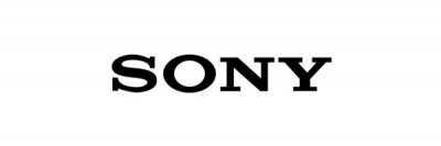
What type face style does this logo use?
a)
Serif
b)
Sans Serif
c)
Script
d)
Decorative
6.
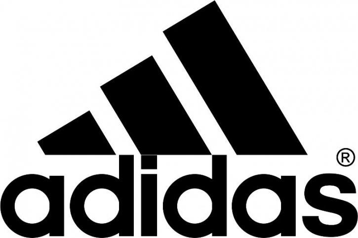
What type face style does this logo use?
a)
Serif
b)
Sans Serif
c)
Script
d)
Decorative
7.
The imaginary line on which letters seems to be sitting.
a)
Baseline
b)
Meanline
c)
Cap height
d)
Bottom line
8.
The standard height of a lowercase x.
a)
Baseline
b)
x-height
c)
Cap height
d)
Bottom line
9.
The standard height of most capital letters.
a)
Baseline
b)
Meanline
c)
Cap height
d)
Bottom line
10.
This block of text is
a)
justified
b)
ragged left
c)
ragged right
d)
decorative
11.
The part of letters such as “h” and “k” that goes above the x-height of lower case letters?
a)
Ascender
b)
Descender
c)
Cap-height
d)
x-height
12.
This block of text is
a)
justified
b)
unjustified
c)
script
d)
decorative
13.
Typeface style that is most readable on printed media.
a)
Serif
b)
Sans Serif
c)
Script
d)
Decorative
14.
Typeface style with little bars.
a)
Serif
b)
Sans Serif
c)
Script
d)
Decorative
15.
Which type of typeface is shown in the image?
a)
Serif
b)
Symbol
c)
Decorative/Ornamental
d)
Script
16.
Sarah is designing formal invitations for the school's prom. Which typeface is appropriate?
a)
Serif
b)
San Serif
c)
Symbol
d)
Script
17.
Jill is creating a FBLA flyer with an elaborate headline designed to catch the eye. Which typeface category is appropriate?
a)
Serif
b)
San Serif
c)
Decorative/Ornamental
d)
Script
18.
Which type of typeface is shown in the image?
a)
Serif
b)
San Serif
c)
Decorative/Ornamental
d)
Script
19.
A(n) ___________ is the specific size, weight and style applied to a typeface.
a)
font style
b)
font family
c)
typeface
d)
font
20.
Which type of typeface is shown in the image?
a)
Serif
b)
Symbol
c)
Decorative/Ornamental
d)
Script
21.
Serifs should be used in the _______ of text in a printed publication.
a)
body
b)
heading
c)
title
d)
footer
22.
Which type of typeface is shown in the image?
a)
Serif
b)
San Serif
c)
Decorative/Ornamental
d)
Script
23.
A __________ is the basic design of a character
a)
font style
b)
font
c)
font size
d)
typeface
24.
Which type of typeface is shown in the image?
a)
Serif
b)
San Serif
c)
Decorative/Ornamental
d)
Script
25.
________________ is the style, arrangement, and appearance of text
a)
Desktop Publishing
b)
Typesetting
c)
Typography
d)
Typeface
26.
Which type of typeface is shown in the image?
a)
Serif
b)
San Serif
c)
Decorative/Ornamental
d)
Script
27.
Publications are created to convey a message to the intended audience, called the _____ audience.
a)
intended
b)
focus
c)
optimal
d)
target
28.
Which type of typeface is shown in the image?
a)
Serif
b)
San Serif
c)
Decorative/Ornamental
d)
Script
29.
Which type of typeface is shown in the image?
a)
Serif
b)
San Serif
c)
Decorative/Ornamental
d)
Script
30.
The ____________ refers to the slant, weight and special effects applied to the text.
a)
font style
b)
font
c)
typeface
d)
typeface style
31.
Adjusting the space between words and letters for a line of type or entire paragraph is called?
a)
tracking 
b)
paragraphing
c)
kerning
d)
leading
32.
Variations in the condensing and extending of the type is called
a)
posture
b)
weight
c)
width
d)
angle
33.
Another term for Slab serif is 
a)
Roman
b)
Egyptian
c)
San Serif
d)
Times new Roman
34.
Capital letters that are the same size as the x-height of the typeface are called
a)
small caps
b)
all caps
c)
uppercase
d)
mini caps
35.
The form and shape of a group of characters is called the 
a)
type style
b)
type family
c)
font
d)
typeface
36.
____________ typefaces are commonly used in headings, posters, and advertising designs.
a)
Serif
b)
Script
c)
Sans Serif
d)
Decorative
37.
What is the space between lines of type called
a)
Line length
b)
kerning
c)
leading
d)
tracking
38.
Which category of type is described as characters that look like  hand lettering in a variety of forms?
a)
Script
b)
Decorative
c)
San Serif
d)
Serif
39.
The individual characters of a font is/are called?
a)
type
b)
letters
c)
glyphs
d)
punctuation
40.
Variations in the thickness and thinness of a stroke is called?
a)
posture
b)
weight
c)
width
d)
angle
41.
Which of the following terms is French for "little feet"
a)
San Serif
b)
Serif
c)
Slab Serif
d)
Stroke
42.
Arial is an example of __________________ type.
a)
Modern
b)
old style
c)
script
d)
sans serif
43.

What type of font is this?

a)

Serif

b)

San Serif

c)

Script

d)

decorative/ornamental

44.

What type of font is this?

a)

Serif

b)

Sanserif

c)

Script

d)

Decorative/ornamental

45.

What is a "typeface"?

a)

Character

b)

Letter spacing

c)

Collection of letters

d)

Line spacing

46.

What is a "font"?

a)

The collection of letters

b)

the individual letter

c)

the font style

d)

the font family

47.

"Bold" is an example of....

a)

Typeface

b)

Font

c)

Font family

d)

Font style

48.

Typography is the art of

a)

design of letters and characters

b)

line spacing

c)

font design

49.

A font that has a clear, identifiable theme is

a)

Objective

b)

Non Objective

c)

Whimsical

50.

A font that clearly has a style, but no identifiable theme is

a)

objective

b)

non objective

c)

whimsical

51.

A font where each letter is different in style is

a)

objective

b)

non objective

c)

whimsical

52.
Jacob wants each character in the word "Gothic" to receive an equal amount of horizontal space. Which type of font should he use?
a)
proportional
b)
leading
c)
monospaced
d)
tracking
53.
A person who designs the form and arrangement of type to make the written word more legible and aesthetically pleasing. 
a)
Typographer
b)
Navigator
c)
Cartographer
d)
Chiropractor
54.
An example of a descender would be the letter
a)
p.
b)
d.
c)
a.
d)
l.
55.
Type that makes something look more attractive and/or ornamental.
a)
decorative
b)
cursive
c)
curly
d)
swirly
56.
When space is adjusted between letters of characters in a piece of text, that is called 
a)
kerning.
b)
leading.
c)
aligning.
d)
spacing.
57.
When letters are consistently spaced apart, this is called 
a)
tracking.
b)
kerning.
c)
spacing.
d)
decorative.
58.
What is typography?
a)
Typography is the art and technique of letters & characters.
b)
Typography is the study of how graphics relate to one another.
c)
Typography refers to the irregular or uneven vertical margin of a block of type.
d)
Images that depict the object they represent.
59.
Times New Roman Italic
Times New Roman Bold
Times New Roman 24pt
Times New Roman Light
(is the.......)
a)
Typeface
b)
Font
c)
Script
d)
Name
60.
a)
ascender
b)
descender
c)
stem
d)
leg
61.
Theses are an example of...
a)
Serif Typefaces
b)
San Serif Typefaces
c)
Fonts
d)
Modern Typeface
62.
a)
base line
b)
descender line
c)
ascender line
d)
mean line
63.
a)
stem
b)
ascender 
c)
descender
d)
arm
64.
The __________ is the line upon which most letters "sit" and below which descenders extend. 
a)
X-Height
b)
Cap Height
c)
Baseline
d)
Ascender
65.
________ refers to the height of a capital letter above the baseline for a particular typeface.
a)
X-Height
b)
Cap Height
c)
Baseline
d)
Ascender
66.
An ____________ is the portion of a minuscule letter in a Latin-derived alphabet that extends above the mean line of a font.
a)
X-Height
b)
Descender
c)
Baseline
d)
Ascender
67.
A _____________ is the portion of a letter that extends below the baseline of a font. 
a)
X-Height
b)
Descender
c)
Baseline
d)
Ascender
68.
The overall height of capital letters in the formation of words
a)
Type Size
b)
Ascender
c)
Descender
d)
Counter
69.
The downward tail for letters like g, q, and y
a)
Type Size
b)
Ascender
c)
Descender
d)
Counter
70.
Casual letters, unpublished manuscripts, and basic paragraph styles tend to fall into this category
a)
Left Alignment
b)
Center Alignment
c)
Right Alignment
d)
Justified Alignment
71.
This is used quite a bit for corporate business letters, return address labels, business cards
a)
Left Alignment
b)
Center Alignment
c)
Right Alignment
d)
Justified Alignment
72.
These are all styles of type categories to create a specific image or message.
a)
Type Alignment
b)
Serif
c)
San-Serif
d)
Script, symbols and decorative type
73.
What type of font is this? 
a)
Serif 
b)
Sans Serif 
c)
Script 
d)
Display 
74.
What type of font is this? 
a)
Serif 
b)
Sans Serif 
c)
Display 
d)
Script
75.
What type of font is this? 
a)
Serif 
b)
Sans Serif 
c)
Script 
d)
Display 
76.
What type is used for formal settings, such as wedding invitations or fancy events?
a)
Sans Serif 
b)
Serif 
c)
Script 
d)
Display
77.
What type of font is decorative, but is sometimes hard to read? 
a)
Serif 
b)
Sans Serif 
c)
Display 
d)
Block 
78.
This is the Em dash.
a)
-
b)
–
c)
—
d)
~
79.
Paragraph indents are about ____ spaces.
a)
2 spaces or an Em space
b)
1 space or an En space
c)
5 spaces
d)
5 spaces or about 2 Em spaces
80.

Setting words in ALL CAPITALS helps people to read faster.

a)

True

b)

False

81.

Kerning is the process of removing or adding tiny amounts of space between characters to create visually consistent letterspacing.

a)

True

b)

False

82.
According to the Non-designer's Design book author, you should never use the underline button.
a)
True
b)
False
83.
Professional typographic techniques are tiny steps that ensure a more favorable impact in a graphic design.
a)
True
b)
False
84.

What type of serif typeface is shown here?

a)

Old Style

b)

Transitional

c)

Modern

85.

What type of serif typeface is shown here?

a)

Modern

b)

Old Style

c)

Transitional

86.

Name the typeface classification of the word, "STOP."

a)

Roman

b)

Sans Serif

c)

Manuscript

d)

Novelty

87.

What type characteristic is considered to make type easier to read?

a)

Serifs

b)

Italics

c)

Curls

d)

Similarity to Handwriting

88.

A person who works with and designs using type.

a)

Typeface

b)

Characters

c)

Typography

d)

Typographer

89.

Definition:

The overall space between characters (sometimes called character spacing)

a)

Kerning

b)

Hierarchy

c)

Leading

d)

Tracking

90.

Definition:

The space between specific characters

a)

Kerning

b)

Hierarchy

c)

Leading

d)

Tracking

91.

Flow and Arrangement of text in a paragraph

a)

centered text

b)

justified text

c)

alignment

d)

indention

92.

Justified text has both left and right margins aligned.

a)

TRUE

b)

FALSE

93.

Which of the following typeface match the Serif classification?

a)

Authoritative

b)

Modern

c)

Formal

d)

Elegant

94.

Large capital letters in the first line of a paragraph which fill additional lines below is considered:

a)

Hyphenation

b)

Indentation

c)

Drop Caps

95.

Paragraph tools include: alignment, hyphenation, indentation, paragraph spacing, and drop caps.

a)

True

b)

False

96.

Typeface, Font Size, Leading and Skewing are all examples of what tool?

a)

Page Tools

b)

Paragraph Tools

c)

Character Tools

97.

Options that allow a designer to stretch characters is known as:

a)

Skew

b)

Vertical & Horizontal Scale

c)

Baseline Shift

98.

The purpose of the _____________ typography is to draw attention to the most important information in a design.

a)

display

b)

type

99.

According to the segment, which letters most commonly need to have kearning adjusted?

a)

O, N, C, B

b)

W, Y, V, T, L

c)

A, X, W, L

100.

Which of the following is NOT an example of a way designers can visually represent paragraphs?

a)

Indents

b)

Hanging indentation

c)

Line Spacing

d)

Tracking

101.
Gutenberg created the first type face (font). What was the name?
a)
White letter
b)
Red letter
c)
Black letter