
 Worksheets
Typography
Total questions: 38
Worksheet time: 19mins


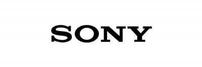
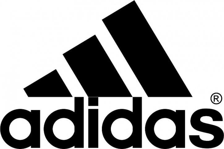


A serif font
is very fancy and hard to read.
has small lines or "tails" at the beginning and end of the letters.
does not have small lines or "tails."
looks like cursive letters.
Sans serif means
without serifs
sandy tails
with serifs
fancy letters
Display fonts are best used for
professional documents like a resume or article.
documents on a computer screen.
small amounts of text like a title or header.
anywhere you want to use them.
The font itself can send a certain message to the viewer.
True
False
When creating a document like a flyer or business card you should
use a lot of fonts
use only one plain font
stick to two fonts
Which image shows a serif font?


_______________ is the ability for a length of text to be read easily and quickly.
Legibility
Readability

The line upon which letters sit.
baseline
x-height
cap-height
Which of the following best represents the horizontal stroke connecting two vertical strokes?
Ascenders
Stem
Crossbar
Cross stroke

What does the image show?
Shoulder
Spine
Arm
Tail

What does the image show?
Shoulder
Spine
Arm
Tail
What is the vertical spacing between lines of text (from baseline to baseline) called?
Kerning
Leading
A piece of a letter that extends below the baseline.
Ascender
Descender
What is typography?
A term used when referring to printing text
The selection and arrangement and type of fonts used
A specific font family
The color choice of the text
The length of a line of text and is counted in numbers of characters (including spaces).
Kerning
Leading
Measure
Rag
For best legibility the measure should lie between
45 and 80 characters
45 and 75 characters
35 and 80 characters
25 and 50 characters
The adjustment of space between the letters of a word or within an entire block of text.
Kerning
Leading
Measure
Tracking
The space between bodies of text of two adjacent pages
Rag
Gutter
Widow
Orphan
What is an example of a conflicting font look?
Fonts that are opposing or contrasting
Similar Font Families with little variation
Two Font Families with little variation
Similar Font Families with lots of variation
What is an example of a contrasting font look?
Fonts that are opposing or contrasting
Similar Font Families with little variation
Two Font Families with little variation
Similar Font Families with lots of variation
Six ways To contrast type
Size, Weight, Structure, Form, Direction, and Scale
Size, Weight, Structure, Form, Direction, and Color
Size, Weight, Structure, Form, Direction, and Texture
Size, Weight, Structure, Form, Hue, and Color

Limit your font choices to________________
1 to 2 fonts
2 to 3 fonts
3 to 4 fonts
4 to 5 fonts
Define a Point Size
1 inch
72 points
2 inches
How tall the letters are
If you letters are 2 inches tall what is the point size?
100 pts
72 pts
144 pts
12 pts

