
Font size
 Worksheets
Chapter 2 Review
Total questions: 70
Worksheet time: 1hrs 16mins


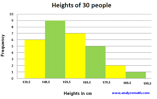


How many people have a shoe size of 6?
17
18
19
15.4
Which of the following graphs may be used when you have qualitative data?
frequency polygon
pie chart
bar graph
histogram
A histogram is like a bar graph, except that... (check all that apply.)
The bars touch
It is for quantitative data
The bars are arranged in ascending order
It is for qualitative data
The horizontal axis of a histogram comes from this column:
Class
Frequency
Midpoint
Cumulative Frequency
Class Endpoints
The vertical axis of a histogram comes from this column:
Class
Frequency
Midpoint
Cumulative Frequency
Class Endpoints
The horizontal axis of a frequency polgyon comes from this column:
Class
Frequency
Midpoint
Cumulative Frequency
Class Endpoints
The vertical axis of a frequency polgyon comes from this column:
Class
Frequency
Midpoint
Cumulative Frequency
The horizontal axis of an ogive comes from this part of the frequency table:
Class
Frequency
Midpoint
Cumulative Frequency
Class Endpoints
The vertical axis of an ogive comes from this column:
Class
Frequency
Midpoint
Cumulative Frequency
Class Endpoints
Where do you find the left anchor of a frequency polygon?
w below the first midpoint
w above the last midpoint
w below the first endpoint
w above the last endpoint
Where do you find the right anchor of a frequency polygon?
w below the first midpoint
w above the last midpoint
w below the first endpoint
w above the last endpoint
Where do you find the anchor of an ogive?
At the beginning of the first class
At the end of the first class
At the beginning of the last class
At the end of the last class
True or False: You can use a broken-axis symbol on the vertical axis of graphs of univariate data.
True
False
True or False: For the graphs that use f on the vertical axis, you can use rf instead if you want.
True
False

What is wrong with this histogram? Check all that apply.
The vertical axis label is not descriptive
The bars are different widths
The horizontal axis describes quantitative data
There is no broken-axis symbol

What is wrong with this histogram? Check all that apply.
The bars aren't touching
The bars are not arranged in descending order
There is no broken-axis symbol
It is from a sample

What is wrong with this frequency polygon? Check all that apply.
The anchors are missing
The area below the line isn't shaded
The x-axis isn't hashed consistently
The title is missing

What is wrong with this frequency polygon? Check all that apply.
The area under the line isn't shaded
The horizontal axis is inconsistently hashed
The vertical axis is inconsistently hashed
The title is missing

What is wrong with this ogive? Check all that apply.
There are two zeroes that don't line up
The vertical axis label isn't descriptive
There is no right anchor
The horizontal and vertical axes are hashed differently
I have bars, but don't call me a bar graph. I'm a...
Histogram
Pareto Chart
Stem-and-Leaf Plot
Ogive

What's wrong with this histogram? Check all that apply.
There is no broken-axis symbol
The bars are touching
The vertical axis label should be cf
The bars are not arranged in descending order
__________ identify the frequency of events or categories in decreasing order of frequency of occurrence
Time-series graphs
Bar graphs
Pareto charts
Ogives
Circle Graphs
__________ display how a total is dispersed into several categories. They are very appropriate for qualitative data or any data where percentage of occurrence makes sense.
Time-series graphs
Bar graphs
Pareto charts
Ogives
Pie Graphs
__________ display how data change over time. They are best if the units of time are consistent in a given plot
Time-series graphs
Bar graphs
Pareto charts
Ogives
Pie Graphs
__________ display cumulative frequencies. They are especially useful for quickly determining the number of data values above or below a specified level.
Time-series graphs
Bar graphs
Pareto charts
Ogives
Circle Graphs


A survey of 1000 adults uncovered some interesting housekeeping secrets. When unexpected company comes, where do we hide the mess? The survey showed that 64 % of the adults toss their mess in the closet, 24 % shove things under bed, 8 % put things in the bathtub, and 4 % put the mess in the freezer. Make a circle graph to display this information.


What type of graph is shown?
Frequency Histogram
Relative Frequency Histogram
Ogive
Line graph
An ogive is a graph that displays relative frequencies.
True
False

What type of graph is shown?
Scatter Plot
Dot Plot
Time Series Chart
Pareto Chart

Attached is a time series graph of the population change in a British town over several decades. Between what two decades did the population stay approximately the same?
1981-1991
1951-1961
1921-1931
1931-1941

According to the ogive, what is the approximate number of college students who were surveyed?
80
100
120
350

What is the maximum value in this stemplot?
37
91
49
73

Is 23 a value in this stemplot?
Yes, 2|3 represents 23.
No, 2|3 does not represent 23
Greg wants to construct a frequency distribution for the political affiliation of the employees at Owen's Hardware Store. Which type of graph would be best to display this information?
Frequency Histogram
Pie graph
Stemplot
Ogive
Which of the following graphs is not used to represent qualitative data?
Pie chart
Bar chart
Histogram
Pareto chart
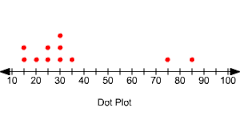
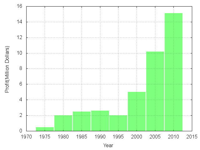

What is a benefit of choosing a dotplot rather than a histogram to display data?
A histogram shows individual values and the shape of the distribution.
A dotplot is better for large data sets.
A dotplot is the only type of graph that shows the shape of the distribution.
A dotplot shows individual values and the shape of the distribution.
Which graphs can you use for quantitative variables? Check all that apply.
Bar Graph
Histogram
Dot plot
Pie chart
Stem and leaf plot

What shape does the distribution of foreign born residents in the states have?
Skewed left
Skewed right
Bimodal
Approximately symmetric
Uniform

Is this a bar graph or a histogram?
Bar graph
Histogram

Below is a stemplot of the percent of residents aged 25 to 34 in each of the states.
What could be a key for this graph?
11 | 4 = 114%
1 | 44 = 1.44%
11 | 4 = 11.4%
1 | 44 = 14.4%
11 | 44 = 11.44%



