wayground logo

Free Printable Worksheets

Font size

S
M
L
XL
Worksheets

Mixed Review Of Statistics

Total questions: 41

Worksheet time: 1hrs 9mins

Name
Class
Date
1.
How many total people were surveyed about what ice cream flavor they would pick?
a)
107
b)
92
c)
70
d)
269
2.
What is the relative frequency of people that purchased no food?
a)
10%
b)
60%
c)
15%
d)
30%
3.
The table shows the different types of engineers and the subject they liked most.  What percentage of people surveyed were chemical engineers who preferred math?
a)
16.5%
b)
33.1%
c)
17.6%
d)
15.5%
4.

How many people were surveyed? BE CAREFUL AND LOOK AT THE TABLE COMPLETELY.....MAYBE DRAW IT TOO....

a)

52

b)

60

c)

150

d)

77

5.
How many people purchased no food and no drink?
a)
60
b)
10
c)
20
d)
200
6.

A set of closely grouped data.

a)

Cluster

b)

Outlier

c)

Gap

d)

Correlation

7.

A value much greater or much less than the others in a data set.

a)

Outlier

b)

Cluster

c)

Gap

d)

Frequency

8.

A line on a scatter plot that helps show the correlation between data sets more clearly. (Mark all that apply.)

a)

Trend Line

b)

Line of Reflection

c)

Line of Best Fit

d)

Frequency

9.

The ratio of the frequency in a particular category divided by the total number of data values.

a)

Joint Relative Frequency

b)

Conditional Relative Frequency

c)

Marginal Relative Frequency

d)

Relative Frequency

10.

The frequency of a specific data value divided by the total number of data values in the set.

a)

Relative Frequency

b)

Conditional Relative Frequency

c)

Marginal Relative Frequency

d)

Joint Relative Frequency

11.

A comparison between two data sets when one set of data values increases while the other decreases.

a)

Negative Correlation

b)

Positive Correlation

c)

No Correlation

d)

Trend

12.

Involves the comparison of two variables.

a)

Bivariate Data

b)

Outlier

c)

Cluster

d)

Frequency

13.

The table shows the results of a survey about favorite types of stores. Determine the relative frequency for each store.

a)

clothing: 38%

electronics: 22%

pet: 10%

candy: 30%

b)

clothing: 19%

electronics: 11%

pet: 5%

candy: 15%

c)

clothing: 50%

electronics: 25%

pet: 5%

candy: 20%

d)

clothing: 35%

electronics: 23%

pet: 15%

candy: 27%

14.
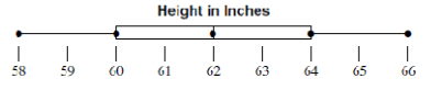
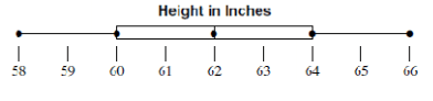
What is the interquartile range?
a)
4
b)
6
c)
2
d)
8
15.
What value is the lower quartile?
a)
66
b)
58
c)
60
d)
64
16.
What do you do if there are two numbers in "the middle" when you are finding the median?
a)
Pick your favorite number
b)
Add the two numbers in the middle & then divide by two.
c)
They are both the median
d)
None of the above
17.

4. Which of the following lists all the five numbers needed to make a box plot?

a)

Mean, Median, Mode, Range, and Total

b)

Minimum, Quartile 1, Median, Quartile 3, and Maximum

c)

Smallest, Q1, Q2, Q3, and Q4

d)

Minimum, Maximum, Range, Mean, and Median

18.

Find the median of these numbers:

2, 5, 4, 3, 7, 5, 5,

a)

4

b)

5

c)

3

d)

6

19.

What is the term for the median of the lower half of the data?

a)

Upper Quartile

b)

Lower Quartile

c)

Median

d)

Minimum

20.
What percent of students have a height between 58 inches and 60 inches?
a)
25%
b)
50%
c)
75%
d)
100%
21.
What percentage of the data is between 90 and 140?
a)
25 %
b)
50%
c)
75%
d)
100%
22.

What does a quartile mean?

a)

One fourth of the data.

b)

One half of the data.

c)

Some data only.

d)

All of the data.

23.
What is the maximum value?
a)
58
b)
66
c)
64
d)
60
24.
Which data set shows a greater spread?
a)
Chess Club
b)
Checkers Club
c)
They have the same spread.
d)
You cannot tell from the box plots. 
25.

Which has a greater interquartile range?

a)

Airplane A

b)

Airplane B

c)

Both the same

26.
Which scatter plot shows a linear relationship between x and y?
a)
Graph A
b)
Graph B
c)
Graph C
d)
Graph D
27.
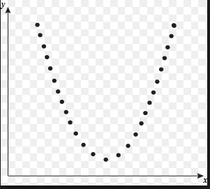
What type of association does this scatter plot represent?
a)
positive linear association
b)
negative association
c)
no association
d)
nonlinear association
28.
As the age of the car increases, its value decreases. Which scatterplot represents this relationship?
a)
A
b)
B
c)
C
d)
D
29.
What type of association does this scatter plot represent?
a)
positive linear association
b)
negative linear association
c)
no association
d)
nonlinear association
30.

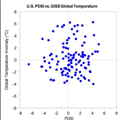
Describe the correlation in the graph shown.

a)

Strong Negative

b)

Strong Positive

c)

Weak Negative

d)

Weak Positive

31.
What is a line of best fit used for?
a)
To make predictions
b)
To make the graph look pretty
c)
To connect the points
d)
To make it look like you know what you are doing
32.

Is this line an accurate line estimate of best fit for the data?

a)

Yes

b)

No

33.

Is this line an accurate line estimate of best fit for the data?

a)

Yes

b)

No

34.
Find the slope from the table:
a)
-2/5
b)
5/-2
c)
5/2
d)
2/5
35.

The table shows the height of a tree for various years after it was planted. Using the line of best fit, how tall would the tree be 30 years after it was planted?

a)

22 feet

b)

23 feet

c)

36 feet

d)

37 feet

36.

What is the equation of the line of best fit?

a)

y = -25x + 170

b)

y = -5/8x + 170

c)

y = 25x + 170

d)

y = 5/8x + 170

37.

What is the equation of the line of best fit?

a)

y = 3/2x

b)

y = 30x

c)

y = 30x + 300

d)

y = 3/2x + 300

38.
Given the list of ordered pairs, what is the x-intercept?
(8,10),  (3, -4),  (0, 8), (4, -3), (9, 0)
a)
(8,10)
b)
8, 3, 0, 4, 9
c)
(0,8)
d)
(9,0)
39.
From the equation y = 3x + 18,  what is the value of the x-intercept?
a)
-6
b)
6
c)
18
d)
3
40.
What is the y-intercept?
a)
7
b)
0
c)
1
d)
2
41.
If a scatterplot has no correlation then...
a)
...it has no ordered pairs
b)
...it has ordered pairs that have a negative pattern
c)
...its ordered pairs have no predictable pattern
d)
...if it makes a lion on a graph (roar!)