Worksheets
Periodic Assessment (Term 2.1 Data)
Total questions: 27
Worksheet time: 45mins
3, 5, 7, 9, 11, 8, 3

Find the mean age. You may want to write out the table with an extra column.
2.6
6.5
5.7
5.5
Find the mode
7
5
8
6

Find the estimated mean from the following table...
You may need to copy the table out and add columns...
28.5
31.5
30.5
29.5
Find the modal group from the following table...
20 < x < 40
0 < x < 20
60 < x < 80
80 < x < 100
FInd the value of x: 72, 56, x, 77, 69 Average = 71
(a)
What angle would you use to represent 40 red cars out of 90 cars in total on a pie chart?
40 degrees
160 degrees
4 degrees
90 degrees

The pie chart shows the colours of 32 beads. How many green beads are there?
90
8
11
9
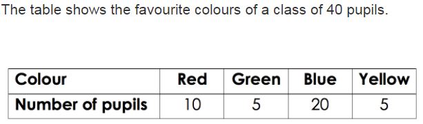
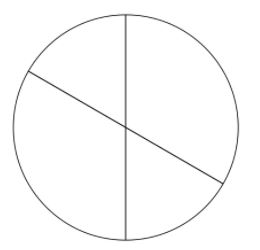
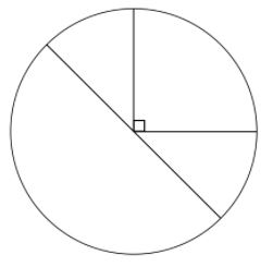
Which pie chart represents the same data as the table?
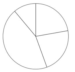
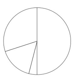

There are 360 animals total. How many are NOT fish?
40
300
320
280

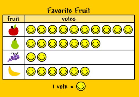
Based on this pictogram, what is the most favourite fruit?
Apple
Guava
Grape
Banana
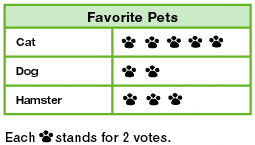
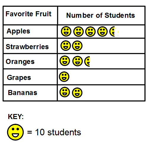

How many apples were sold in March ?
25
21
2.5

The number of pupils who like turtle is ______ less than those who like dog.
2
1
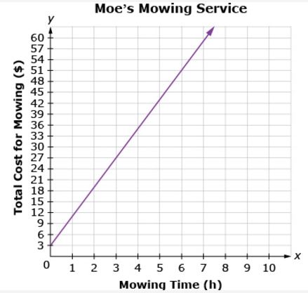

At what rate did the temperature decrease between the 20th and 25th minutes of the experiment?
10°C in 5 min
10°C in 10 min
5°C in 5 min
5°C in 10 min
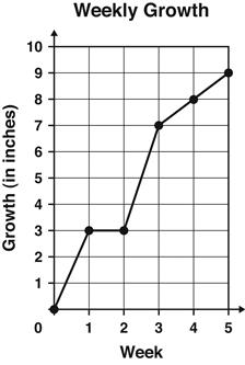
The graph shows the number of inches a plant grew each week.
Between which 2 weeks did the plant grow the MOST?
Week 1 and Week 2
Week 2 and Week 3
Week 3 and Week 4
Week 4 and Week 5

The scatter graph shows the relationship between the age of a car and its value.
Describe the correlation shown on the diagram.
Positive
Negative
No Correlation

The scatter graph shows the relationship between the age of a car and its value.
Another car is 6 years old. Estimate the value of this car.
£6000
£2000
£4000
£3000

The scatter graph shows the relationship between the height and arm span of some students.
Another student has a height of 145 cm. Use the graph to estimate their arm span.
140 cm
120 cm
110 cm
180 cm
Which line best fits the scattered plot?


What type of correlation is shown?
(a)