wayground logo

Free Printable Worksheets

NEW

Font size

S
M
L
XL
Worksheets

Statistic

Total questions: 43

Worksheet time: 1hrs 26mins

Name
Class
Date
1.

What type of graph is this?

a)

Bar Graph

b)

Line Plot

c)

Pictograph

d)

Tally Chart

2.

How many people were polled in this survey?

a)

5 people

b)

40 people

c)

100 people

d)

145 people

3.

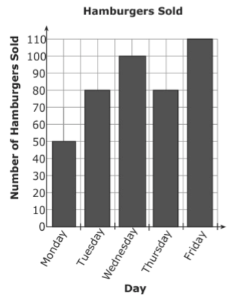
The bar graph shows the number of hamburgers sold at Bob’s Burger Shack. On which days were more than 80 hamburgers sold?

a)

Wednesday and Friday

b)

Tuesday and Thursday

c)

Monday, Tuesday, and Thursday

d)

Tuesday, Wednesday, Thursday, and Friday

4.
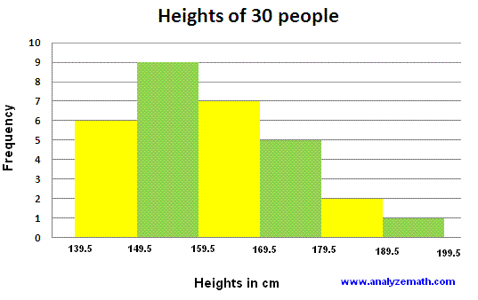
What type of graph is this?
a)
Bar Graph
b)
Histogram
c)
Line Plot
5.
Which interval has 400 employees?
a)
33-43
b)
0-10
c)
77-87
d)
66-76
6.
What is an interval?
a)
A single number
b)
A range of numbers
c)
A percentage
d)
A total amount
7.

Students were surveyed about their favorite sports to play in phys.ed. The results are represented in this circle graph. If 48 students were surveyed, how many chose soccer?

Part/total= %/100

a)

10

b)

12

c)

15

d)

14

8.
What is the mode?
a)
# happening the most
b)
the average
c)
biggest - smallest
d)
the middle #
9.
How do you find the mean?
a)
order least to greatest, then slash from each side until you reach the middle
b)
add the numbers in your data set, then divide by the amount you added
c)
look for the number that repeats the most
d)
highest number minus the lowest number
10.
How do you find the median?
a)
order least to greatest, then slash from each side until you reach the middle
b)
add the numbers in your data set, then divide by the amount you added
c)
look for the number that repeats the most
d)
highest number minus the lowest number
11.
This type of summary graph is called a
a)
Histogram
b)
Dot plot
c)
Stem and leaf
d)
Bar graph
12.
Using the data from this stem and leaf plot, which class would have the highest median score
a)
Class A
b)
Class B
13.
How do you find the mode?
a)
order least to greatest, then slash from each side until you reach the middle
b)
add the numbers in your data set, then divide by the amount you added
c)
look for the number that repeats the most
d)
highest number minus the lowest number
14.
You can determine a histogram from a bar graph as
a)
histograms have spaced between the columns, bar graphs do not
b)
histograms do not have any spaced between the columns, bar graph do
15.
Which box and whisker plot shows more "spread out" data?
a)
Top plot
b)
Bottom plot
16.

True of false, 75% of the data values are greater than 18?

a)

True

b)

False, 75% of the values are greater than 16

c)

False, 50 % of the values are greater than 18

d)

False, 25% of the values are greater than 18

17.

What percent of the data is between 25 and 30 on the number line?

a)

25%

b)

`50%

c)

75%

d)

100%

18.

Which class has the highest test score?

a)

1st Period

b)

2nd Period

19.
What percent of people chose vanilla as their favorite ice cream? 
a)
25%
b)
324%
c)
3.24%
d)
90%
20.
20 people said they liked carrots out of 80 people surveyed. What percent like carrots? 
a)
20%
b)
25%
c)
16%
d)
None of these
21.
What percent of people chose snickers as their favorite candy?
a)
about 33%
b)
about 20%
c)
about 3%
d)
None of these
22.
What is the total percent of a pie or circle graph?
a)
10%
b)
50%
c)
100%
d)
1000%
23.

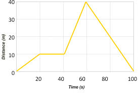
How long did it take this object to travel back to its reference/starting point?

a)

20 s

b)

30 s

c)

60 s

d)

100 s

24.
At 60 seconds, how far had this object traveled? 
a)
0 m
b)
10 m
c)
20 m
d)
40 m
25.

What is happening at D?

a)

Stationary

b)

Accelerating

c)

Fast steady speed; moving away from the starting position

d)

Slower steady speed; moving away from the starting position

26.
What is happening at C?
a)
Stationary
b)
Accelerating
c)
Fast steady speed; moving away from the starting position
d)
Slower steady speed; moving away from the starting position
27.
Which runner had a head start?
a)
A
b)
B
c)
C
28.

In which of the following graphs below are both runners moving at the same speed?

a)
b)
c)
d)
29.

Segment B-C The bus is _________________.

a)

at rest

b)

returning (to original position)

c)

moving forward

30.
The graph shows Ashley riding her bike to Maria's house. 
What was occurring from point B to point C?
a)
She was increasing her speed.
b)
She stopped for 4 minutes
c)
She was decreasing in speed
31.

How long did Bob take to complete the race?

a)

17 seconds

b)

12 seconds

c)

14 seconds

d)

15 seconds

32.
Find the median:
3, 5, 7, 4, 3, 1
a)
3 and 4
b)
There isn't one
c)
3.5
d)
3
33.
On the semester final, Joe scored 85, Jill scored 89, and Bill scored a 99.What was the average score for these students? _________
a)
91
b)
273
34.
When finding the median, what do you do if there are two middle numbers?
a)
Add them together and divide by 2
b)
Write them both as the answer
c)
Give up
d)
Pick one
35.
The mode score on the 6th grade math test was 94! Which of these interpretations must be correct?
a)
99 was the highest score on the test.
b)
More students received a 94 than any other score
c)
No student scored below a 50
d)
A score of 91 was slightly below average.
36.
Lizzy had test scores of:   72, 94, 108, 60
What is the RANGE of her test scores?
a)
12
b)
72
c)
48
d)
98
37.

What is the lower Quartile (Q1) of the set of data:

2, 4, 6, 6, 7, 8, 10

a)

2

b)

6

c)

4

d)

8

38.

Explain why this graph may be misleading?

a)

the x-axis does not have equal intervals

b)

San Francisco is not a real city

c)

you cannot have percents in a line graph

d)

the y-axis does not have equal intervals

39.
Three students were surveyed on what their favorite class was.  Two of the students answered "Math" and one student answered "Science."  Explain why the statement is misleading, "Math is the favorite subject for the majority of students."
a)
The sample size is too small
b)
the sample size is not random
c)
students are likely to choose Math because it is awesome
40.
The graph shows the results of a survey to determine student's favorite pets. Why is this graph misleading?
a)
The slices are the wrong color
b)
The slices are not the correct size
c)
The percents do not add up to 100
d)
Not misleading
41.
What is misleading about this graph?
**choose the best answer
a)
Nothing is misleading about this graph.
b)
The democrats are too high.
c)
The y-axis does not start at zero, so it makes the democrats look much higher than the other two parties.
42.

What percentage of the data is between 85-100?

a)

25 %

b)

50%

c)

75%

d)

100%

43.

What percentage of the students don't pass the test?

a)

25 %

b)

50%

c)

75%

d)

100%

e)

0%