wayground logo

Free Printable Worksheets

Font size

S
M
L
XL
Worksheets

Data Analysis Review

Total questions: 56

Worksheet time: 9hrs 20mins

Name
Class
Date
1.
How do you find range?
a)
Subtract the highest and lowest value
b)
Add all the numbers and divide
c)
Find the middle
d)
It is the highest number
2.
What is the range of the data?
a)
4
b)
8
c)
6
d)
2
3.

Use these test grades to answer the following question.

What is the median test grade?

(a)  

4.

Use these test grades to answer the following question.

What is the mode of the test grades?

(a)  

5.

Use these test grades to answer the following question.

What is the range of the test grades?

(a)  

6.

Use these test grades to answer the following question.

Which grade is the outlier?

(a)  

7.

Would the shape of the data be:

a)

Uniform

b)

Symmetrical

c)

Skewed left

d)

Skewed right

8.

An absent student took the test and made a 50. What affect, if any, will this have on the mean test grade?

a)

Increase the mean

b)

Decrease the mean

c)

no affect

d)

This is not the correct answer. Don't pick this answer.

9.

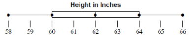
The box plot shows the data distribution for a recent math quiz. What is the median of the data?

(a)  

10.

The box plot shows the data distribution for a recent math quiz. What is the IQR of the data?

(a)  

11.

What was the lowest and highest attendance?

a)

0 and 36

b)

4 and 32

c)

8 and 28

d)

0 and 28

12.

What is the mean of the data set below?


33, 23, 45, 21, 18, 19, 23

a)

26

b)

21

c)

27

d)

23

13.

Nam owns a used car lot. He checked the odometers of the cars and recorded how far they had driven. The histogram displays the data. Based on the information shown in the bar graph, which value is most likely the difference between the number of cars that drove between 250 and 300 km and the number of cars that drove between 150 and 200 km.

a)

4

b)

6

c)

2

d)

3

14.

A teacher measures the time it takes for each student in class to complete a quiz. The first quartile value of the teacher’s data is 22 minutes. The third quartile value is 43 minutes. Which statement must be true?

a)

About 25% of the students completed the quiz in 43 minutes or less.

b)

About 50% of the students completed the quiz in 22 minutes or more.

c)

Exactly 25% of the students completed the quiz in more than 43 minutes.

d)

Exactly 50% of the students completed the quiz in 32 minutes or less.

15.

What is the value of the third quartile shown on the box-and-whisker plot above?

a)

6

b)

10

c)

8.5

d)

12

16.

According to the plot shown, what is the interquartile range?

a)

4

b)

11

c)

8.5

d)

6

17.

Based on this two way table, how many total students were surveyed?

a)

188

b)

102

c)

86

d)

64

18.

Based on this two-way table, how many students ride the bus?

a)

30

b)

34

c)

64

d)

188

19.

What percentage of bus riders are girls?

a)

33.33%

b)

53.13%

c)

18.09%

d)

34.04%

20.
Which is NOT ture?
a)
The spreads of the low temperatures for Reybold and Picktown are not the same
b)
Neither box plot is symmetrical
c)
The median low temeratures for Reybold and Picktown are different
d)
The lower extreme for Picktown is approximately 5 degrees lower than the lower extreme for Reybold
21.
Which has a larger IQR?
a)
Zach
b)
Steven
c)
They have the same IQR
22.
What percent of the data is between 25 and 30 on the number line?
a)
25%
b)
`50%
c)
75%
d)
100%
23.
11. What percentage of the data is between 90 and 140?
a)
25 %
b)
50%
c)
75%
d)
100%
24.
Roger bowled 7 games last weekend. His scores are: 155, 165, 138, 172, 127, 193, 142. What is Roger's median score?
a)
127
b)
155
c)
156
d)
193
25.
What value is the lower quartile?
a)
66
b)
58
c)
60
d)
64
26.
Ervin bowled 7 games last weekend. His scores are: 155, 165, 138, 172, 127, 193, 142. What is the range of Ervin's scores?
a)
193
b)
127
c)
60
d)
66
27.
The data set below has an outlier of 42.
2, 5, 12, 15, 19, 4, 6, 11, 16, 18, 12, 12, 42
What effect does removing the outlier have on the distribution of the data?
a)
The mean will decrease
b)
The median will decrease
c)
The mean will increase
d)
The median will increase
28.
What is the interquartile range?
a)
4
b)
6
c)
2
d)
8
29.
Which car club has the higher median?
a)
Cruisers
b)
Car Hops
30.
Which measure of center best represents this set of data?
12, 13, 11, 16, 31, 14, 10, 15
a)
Mean
b)
median
c)
mode
31.

Which scatterplot suggests a linear relationship between x and y?

a)
b)
c)
d)
32.
Which of the following lists all parts of the five number summary?
a)
Mean, Median, Mode, Range, and Total
b)
Minimum, Quartile 1, Median, Quartile 3, and Maximum 
c)
Smallest, Q1, Q2, Q3, and Q4
d)
Minimum, Maximum, Range, Mean, and Median
33.
Which city has a higher median?
a)
Millersburg
b)
Arcadia
34.

Which profession had the greatest range of salaries?

a)

Nuclear engineer

b)

Police officer

c)

Musician

d)

Impossible to tell

35.

Describe the correlation of the scatter plot.

a)

positive correlation

b)

negative correlation

c)

no correlation

36.

Describe the correlation of the scatter plot.

a)

positive correlation

b)

negative correlation

c)

no correlation

37.

Describe the correlation of the scatter plot.

a)

positive correlation

b)

negative correlation

c)

no correlation

38.

Which statement below best describes the data in the scatterplot?

a)

As a car's mileage increases, the car's value increases

b)

As a car's mileage increases, the car's value decreases

c)

As a car's value decreases, the car's mileage stays the same

d)

None of the above

39.

How many people scored 35-50?

a)

8

b)

4

c)

2

d)

6

40.

How many total people took the test?

a)

18

b)

17

c)

16

d)

15

41.
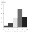
The histogram shows the birth weights of 100 new born babies.  How many babies weighed 8 pounds or more?
a)
22
b)
23
c)
30
d)
45
42.
Describe the data distribution shape of the graph.
a)
Skewed right
b)
Skewed left
c)
Uniform
d)
Symmetrical
43.
What is the shape of the data?
a)
skewed left
b)
skewed right
c)
symmetric
d)
round
44.
Describe the histogram:
a)
Left Skewed
b)
Symmetrical
c)
Right Skewed
d)
Uniform
45.
How would you describe this distribution?
a)
Left skewed
b)
Uniform
c)
Right Skewed
d)
Symmetrical
46.
About 50 % of the data values are greater than what value?
a)
12
b)
15
c)
22
d)
31
47.
Which value is in the top 25% of the data?
a)
16
b)
22
c)
29
d)
36
48.
What is the relative frequency (to the nearest percent) of boys among those who cannot bike to school? 
a)
4%
b)
14%
c)
13%
d)
29%
49.
What percentage of girls have blonde hair?
a)
30%
b)
32%
c)
29%
d)
40%
50.
What percentage of SUV's are driven by women?
a)
56.25%
b)
75%
c)
83.25%
d)
86.5%
51.
What percentage of males drive sports cars?
a)
35%
b)
16.25%
c)
65%
d)
25%
52.
A survey explored the relationship between gender and band class. Which is a reasonable conclusion?
a)
There are more band members than non-band members
b)
There are more boys in the class than girls
c)
There are more boys in band than not in band
d)
More than half of the bands members in the class are girls
53.
According to the two-way table, a person who plays an instrument is most likely to:
a)
Not play an instrument
b)
Not play a team sport
c)
Play a team sport
d)
All of the above
54.
According to the table, what is the relative frequency of Students ages 14 - 17 who skip breakfast?
a)
About 27%
b)
About 35%
c)
About 15%
d)
About 30%
55.
What type of association does this graph have?
a)
positive
b)
negative
c)
none
d)
all of the above
56.
What type of association does this graph show?
a)
Positive
b)
negative
c)
none
d)
all of the above