
 Worksheets
Data
Total questions: 135
Worksheet time: 8hrs 32mins

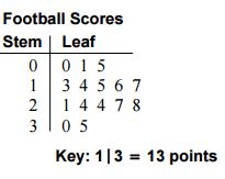
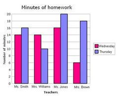


How many baseball teams scored 0 runs per inning?
4
3
2
1

The double dot plots show the average wait times, in minutes, for two popular rides at an amusement park. Which ride typically has a longer wait time?
No inference can be made from the graph.
Topsy Turvy
The wait times are the same for both rides.
Rocket Blast
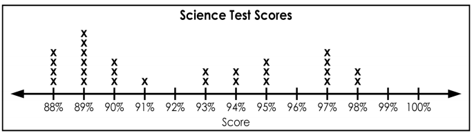

Terry made the dot plot above to chart the amount of time, in minutes, that it took students to eat breakfast in the morning. How many students took 5 or more minutes to eat their breakfast?
11
12
14
16

How many senior boys play football but do not wrestle?
26
8
104
16

How many senior boys play football or wrestle?
26
44
28
104

A ________ is a type of graph that show the frequency distribution of data within equal intervals (thus, there are no spaces between the bars).
Dot Plot
Line Graph
Histogram
Box Plot
The _____ is a standardized way of displaying the distribution of data based on the minimum, first quartile, median, third quartile, and maximum of the data set.
Dot Plot
Histogram
Box Plot
Line Graph
Five Number Summary
A _______ shows the number of values within an interval and not the actual values.
Dot Plot
Histogram
Bar Graph
Box Plot
You could change the intervals of the _____ to see which gives a better description of the data.
Histogram
Dot Plot
Line Graph
Box Plot
Changing the scales in a graph can make the data look very different
True
False
When comparing two or more sets of data, the scales must be consistent.
True
False

What data display is the best to to show a person's age and income?
Scatter Plot
Bar Graph
Circle Gaph
Stem and Leaf Plot
What data display is the best to show a person's height compared to their shoe size?
Scatter Plot
Circle Graph
Stem-Leaf Plot
Historgram
What data display is the best to show the population of the United States divided into age groups?
Histogram
Dot Plot
Scatter Plot
Box Whisker Plot
What does the squiggly line sometimes used at the beginning of they -axis of a coordinate plane let the reader know?
A range of numbers was skipped
The title of the y-axis
The interval of the y-axis
The initial number being used on the y-axix

What type of Data Display is this?
Histogram
Pie Chart
Stem & Lead Plot
Scatter Plot

What type of Data Display is this?
Line Plot
Pie Chart
Histogram
Stem & Leaf Plot

What type of Data Display is this?
Line Plot
Scatter Plot
Bar Graph
Pie Chart

What type of Data Display is this?
Line Graph
Histogram
Scatter Plot
Bar Graph

What type of Data Display is this?
Bar Graph
Pie Chart
Stem & Leaf Plot
Scatter Plot

What type of Data Display is this?
Stem & Leaf Plot
Histogram
Line Plot
Bar Graph

Bar graphs are a good data display because...
They make comparisons between different variables very easy to see.
They are good at showing specific values of data, meaning that given one variable the other can easily be determined.

Line graphs are a good data display because...
They represent a percentage of the whole data set.
They enable the viewer to make predictions about the results of data not yet recorded & show the change over time.

Pie charts are a good data display because...
They show the correlation of points
They show the percentages of the whole data set

Histograms are good data displays because...
They allow you to group your data values into a range of numbers
They allow you to make a prediction of a future measurement

Scatter plots are a good data display because...
They show the percentage of the whole data set.
They allow you to see a correlation from a set of imperfect data points.

Stem and leaf plots are a good data display because...
They break down large numbers into groupings
They show the correlation of a data set (positive or negative)
(a) are very similar to bar graphs.
(a) plots can have a positive or negative correlation.
(a) charts are used for categorical/qualitative data.
What type of graph is displayed?
Histogram
Line Graph
Dot Plot
Box Plot
Scatter Plot
A _______ is a graphic display using a simple scale to compare the frequency within categories or groups.
Histogram
Line Graph
Box Plot
Dot Plot
A ________ is a type of graph that show the frequency distribution of data within equal intervals (thus, there are no spaces between the bars).
Dot Plot
Line Graph
Histogram
Box Plot
The _____ is a standardized way of displaying the distribution of data based on the minimum, first quartile, median, third quartile, and maximum of the data set.
Dot Plot
Histogram
Box Plot
Line Graph
Five Number Summary
A _______ shows the number of values within an interval and not the actual values.
Dot Plot
Histogram
Bar Graph
Box Plot
A _______ is useful for relatively small sets of data.
Histogram
Dot Plot
Box Plot
Line Graph
Original data is not clearly shown in the _______; also, mean and mode cannot be identified.
Dot Plot
Histogram
Line Graph
Box Plot
You could change the intervals of the _____ to see which gives a better description of the data.
Histogram
Dot Plot
Line Graph
Box Plot
Graphs should sometimes include labeled axes and titles.
True
False
Changing the scales in a graph can make the data look very different
True
False
When comparing two or more sets of data, the scales must be consistent.
True
False
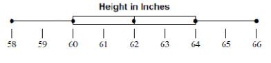
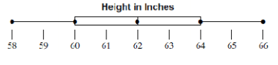
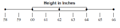
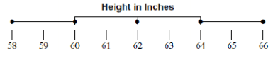


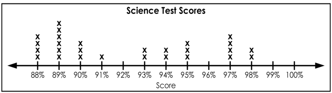


23, 34, 27, 7, 30, 26, 28, 31, 34

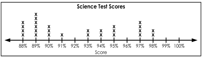
How many students scored more than 80%?
10
13
7
15


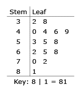
A florist records the amount of money he spent on gasoline each week to deliver orders. The list shows the data for 16 weeks.
32, 38, 40, 44, 46, 49, 53, 55, 58, 62, 65, 68, 70, 72, 81, 84
He put the data in a stem-and-leaf plot. What number did he leave out of the stem-and-leaf plot?
32
44
65
84


Find the mean?
3.3
99
97.4
98

What is the Mode?
97.4
97.2
97
96.8

What is the range?
97.2
4
3.3
3.2

How many players throw a minimum of 97.2 mph?
9
6
1
10

How does the mean number of miles driven for Driver A compare to the mean number of miles driven by driver B?
Driver A drove more than Driver B when comparing means.
A: 200
B: 191
Driver B drove more than Driver A when comparing means.
A: 189
B: 202
Driver B drove more than Driver A when comparing means.
A: 190.1
B: 200.3
Driver A drove more than Driver B when comparing means.
A: 200.3
B: 190.1

This is the test scores for two different classes. WHICH class has more students?
2009 class
2010 class
neither
Same

This is the test scores for two different classes. Which class has the greater mean?
2009 class
2010 class
neither
Same

This is the test scores for two different classes. Which class has a greater mode?
2009 class
2010 class
neither
Same

This is the heights (in inches) of the boys and girls in this class. Who has the greater mean?
Girls
Boys
Neither
Same

This is the home runs for each member of these teams. Which team has the greater max?
Mets
Phillies
Neither
Same

This is the home runs for each member of these teams. Which team has more players?
Mets
Phillies
Neither
Same

This is the home runs for each member of these teams. Which team has the greater Mode?
Mets
Phillies
Neither
Same
36, 42, 28, 52, 48, 36, 31
What is the median number of miles Jenna cycled?
9, 8, 12, 6, 10
What is the mean number of pages she wrote per day?
158cm 172cm 164cm
164cm 167cm 159cm
What is the range of the heights?
7, 14, 20, 3, 7, 14, 2, 14, 7
What is the standard deviation for the data given:
5, 10, 7, 12, 0, 20, 15, 22, 8, 2
6.89
10.1
7.26
9
Set 1: {10, 19, 38, 50, 51}
Set 2: {5, 21, 26, 39, 51}
Set 3: {9, 38, 50, 50, 51}
Set 4: {5, 28, 28, 28, 51}
Which data set has the largest standard deviation?

What is the value of the lower quartile (Q1)?
3
8
10
15


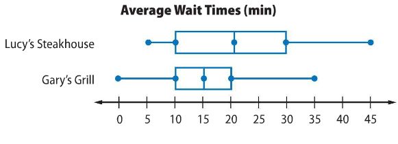
What is the shape of the data for Lucy's Steakhouse?
skewed left
skewed right
symmetrical

Describe the shape of the graph
Uniformed
Symmetrical
Skewed Right
Skewed Left
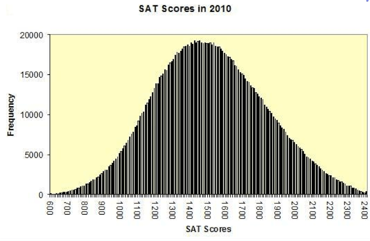
What is the shape of the distribution?
Skewed Left
Skewed Right
Symmetric
Uniform


Your teacher asked "What percentage of the students have brown hair?"
What type of relative frequency is the teacher asking for?
Conditional Relative Frequency
Joint Relative Frequency
Marginal Relative Frequency

Your teacher asked "What percentage of girls have blonde hair?"
What type of relative frequency is the teacher asking for?
Conditional Relative Frequency
Joint Relative Frequency
Marginal Relative Frequency

The table shows the results of a survey that asked students their preferred method of exercise. Which of the following display would best represent the data?
Line Graph
Box-and-Whisker Plot
Scatter Plot
Bar Graph

The following data show the salary's at a local movie theater. What is the best way for displaying this data?
Circle Graph
Pictograph
Box-and-Whisker Plot
Scatter Plot

The following data shows the distance traveled in miles over a period of time (mins). What is the best way to display this data?
Histogram
Box-and-Whisker Plot
Line Graph
Circle Graph
The list of birthday months in our class would be qualitative or quantitative data?
Qualitative Data
Quantitative Data
4 7 5 9 8 6 7 7 8 5 6 9 8 5 8 7 4 7 3 6 8 9 7 6 9
What is the mode?
12, 5, 9, 18, 22, 25, 5
9, 8, 12, 6, 10
What is the mean number of pages she wrote per day?
12, 5, 9, 18, 22, 25, 5
How many ceiling tiles are in our classroom?
Is this a Statistical or Non Statistical Question:
How long do you spend on homework a week?
Statistical Q
Non Statistical Q
find the lower quartile of the following set of scores:
12, 9, 4, 6, 5, 8, 9, 4, 10, 2
10
4
9
6
Find the upper quartile (Q3)
1, 3, 4, 5, 6, 8, 11, 13, 17
Find the IQR (Q3 - Q1) of the data
20, 22, 25, 29, 31


Boys: {2, 1, 3, 1, 2, 2}
Girls: {4, 1, 3, 2, 2, 4}
What is the difference in the interquartile range between the girls and boys?

