
NEW
Font size
 Worksheets
Bar Graphs
Total questions: 57
Worksheet time: 1hrs 6mins

The graph shows how employees at Disney World travel to work. How many employees ride bikes, ride the bus, or walk to work?
300
450
325
375

The teacher wants to have 40 more pencils than erasers. How many more pencils does the teacher need to buy?
20
10
30
60
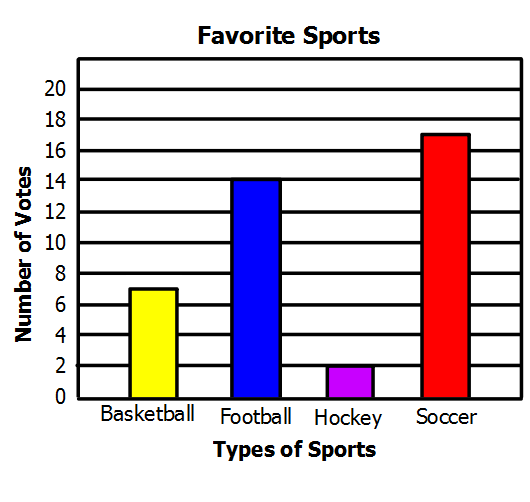
How many more students like soccer than basketball?
24
15
10
17

How many students like vanilla and chocolate?
8
32
30
28

How many people were polled in this survey?
5 people
40 people
100 people
145 people

The bar graph shows the approximate number of visitors at a state park. What fraction of the total number of visitors visited in 2012? Express in simplest form.
50/200
25/100
1/4
1/5

The bar graph shows the approximate number of visitors at a state park. What percentage of visitors went to a state park in 2011? Hint: Percent proportion
20%
40%
60%
80%

The bar graph shows the approximate number of visitors at a state park. What fraction of the total visitors visited in 2008 and 2009 combined? Express in simplest form.
3/20
13/40
7/40
65/100

The graph represents the number of tickets sold for
the school play for 5 days.
True or False: The number of tickets sold on
day 2 was half the number of
tickets sold on day 1. (Hint: pay very close attention to the vertical axis, not the size of the bars.)
True
False

The graph represents the number of tickets sold for
the school play for 5 days.
True or False: The number of tickets sold on
day 5 was 50% greater than the number
of tickets sold on day 1.
True
False

The graph represents the number of tickets sold for
the school play for 5 days.
True or False: Combined tickets sales for days
1 and 3 accounted for 50% of
the ticket sales for the week.
True
False

What type of graph is this?
Bar Graph
Line Plot
Pictograph
Tally Chart
How many people were polled in this survey?
5 people
40 people
100 people
145 people
How many more students like soccer than basketball?
24
15
10
17

Jack made this graph to show the number of movies that were rented from his store during four months. Which whole number shows how many more movies were rented in December than in September?
20
35
45
80

What is the difference between the amount of 3rd graders who own a dog than a snake or hamster combined?
8
2
6
4
The graph shows how employees at Disney World travel to work. How many employees ride bikes, ride the bus, or walk to work?
300
450
325
375

Look at the Bar Graph, "Student Grades". What grade did the most students get?
A
B
C
D

Kendra earned money by babysitting for 4 months.
In which month did she make the most money?
September
October
November
December

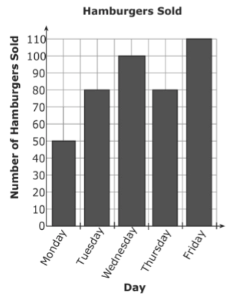
The bar graph shows the number of hamburgers sold at Bob’s Burger Shack. On which days were more than 80 hamburgers sold?
Wednesday and Friday
Tuesday and Thursday
Monday, Tuesday, and Thursday
Tuesday, Wednesday, Thursday, and Friday

According to the graph, which animal has a life span that is longer than a giraffe's but shorter than a lion's?
Tiger
Chipmunk
Camel
Mouse

A brown paper bag is filled with color tiles for a science experiment. How many tiles are in the bag?
48
20
25
50

How many more yellow tiles is there than blue?
2
6
3
9

What percent of the tiles are green?
12
24
50
86
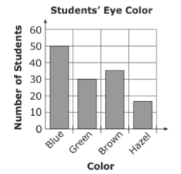
Miss Lee's science class collected data on the color of 3rd grade student's eyes. The students created a bar graph with this information. How many more students had blue eyes than green eyes?
80
50
30
20
Jack made this graph to show the number of movies that were rented from his store during four months. Which whole number shows how many more movies were rented in December than in September?
20
35
45
80
The bar graph shows the number of hamburgers sold at Bob’s Burger Shack. On which days were more than 80 hamburgers sold?
Wednesday and Friday
Tuesday and Thursday
Monday, Tuesday, and Thursday
Tuesday, Wednesday, Thursday, and Friday

The graph shows the number of cars sold from January to April. How many more cars were sold in March than in January?
2,000
5,000
7,000
8,000
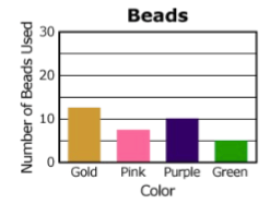
The graph shows the number of colored beads used to make a necklace. How many purple and green beads were used in all?
23
20
18
15


How many tiles are red or blue?
8
20
16
28
What percent of the tiles are green?
12
24
50
86
How many more yellow tiles is there than blue?
2
6
3
9
A brown paper bag is filled with color tiles for a science experiment. How many tiles are in the bag?
48
20
25
50

Look at the bar graph, "Nicest Fruit". What does the x-axis show?
Types of fruit
The number of people.

Look at the bar graph, "Nicest Fruit". What does the y-axis show?
Types of fruit
Number of people.

Look at the bar graph, "Nicest Fruit". What scale does the bar graph use?
1
2
5
10

Look at the Bar Graph "Student Grades". Which grade did the smallest number of students get?
A
B
C
D
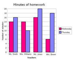
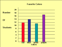

Look at the Bar Graph, "Student Grades". What grade did the most students get?
A
B
C
D


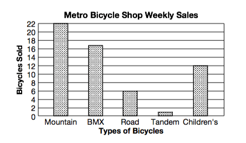
Graphs help us represent data
True
False

Which cereal received the least amount of votes?
Corn Flakes
Cheerios
Life
Kix
How many people voted altogether?
10
12
15
16

How many birthdays are there is December?
7
6
8
5

Look at the bar graph, "Nicest Fruit". What does the y-axis show?
Types of fruit
Number of people.
Look at the bar graph, "Nicest Fruit". What does the x-axis show?
Types of fruit
The number of people.
Look at the Bar Graph "Student Grades". Which grade did the smallest number of students get?
A
B
C
D

