wayground logo

Free Printable Worksheets

NEW

Font size

S
M
L
XL
Worksheets

Typography TEST REVIEW

Total questions: 50

Worksheet time: 34mins

Name
Class
Date
1.
What is the difference between a serif and sans-serif font?
a)
Serif fonts are characterized by small lines at the end of the characters, whereas sans-serif fonts do not have these lines
b)
Serif fonts are easier to read
c)
Serif fonts are more modern
d)
Serif fonts are more decorative
2.
What is a font size?
a)
The width of a font
b)
The thickness of a font
c)
The height of a font
d)
The size of a font
3.
What is the difference between a typeface and a font?
a)
A typeface is a family of fonts, while a font is a specific style within the typeface
b)
A typeface is a specific style, while a font is a family of styles
c)
A typeface is a specific style, while a font is a specific size
d)
A typeface is a specific size, while a font is a family of sizes
4.
What does italicizing a font do?
a)
It changes the font to a slanted version
b)
It changes the font to a bold version
c)
It changes the font to a condensed version
d)
It changes the font to a reversed version
5.
What is the name of the typeface that appears to be written in cursive?
a)
Sans Serif
b)
Serif
c)
Script
d)
Monospace
6.
What is the term used to describe a typeface with no serifs?
a)
Sans Serif
b)
Serif
c)
Script
d)
Monospace
7.
Which type of typeface is characterized by thick and thin strokes and often has a traditional, historical feel?
a)
Serif
b)
Sans Serif
c)
Script
d)
Display
e)
Monospace
8.
Which type of typeface is characterized by flowing, decorative strokes?
a)
Serif
b)
Sans Serif
c)
Script
d)
Display
e)
Monospace
9.
Which type of typeface is characterized by highly decorative and often bold letterforms?
a)
Serif
b)
Sans Serif
c)
Script
d)
Display
e)
Monospace
10.
Which typeface is characterized by a uniform line width, usually with a typewriter-style appearance?
a)
Serif
b)
Sans Serif
c)
Script
d)
Display
e)
Monospace
11.
Which type of typeface is often used for body copy, such as in books and magazines?
a)
Serif
b)
Sans Serif
c)
Script
d)
Display
e)
Monospace
12.
Which type of typeface is often used for headlines and titles, as well as logos?
a)
Serif
b)
Sans Serif
c)
Script
d)
Display
e)
Monospace
13.
What is the most common use for sans serif typefaces?
a)
Headlines
b)
B. Website design
c)
Books
d)
Print documents
14.
What is the primary purpose of a display typeface?
a)
A. To be used at small sizes
b)
B. To be used in larger sizes
c)
C. To be used in web design
d)
D. To be used in print documents
15.
What is the primary purpose of a script typeface?
a)
A. To be used in larger sizes
b)
B. To be used in web design
c)
C. To be used in books
d)
D. To be used for decorative purposes
16.
What is the primary purpose of a monospace typeface?
a)
A. To be used for decorative purposes
b)
B. To be used in web design
c)
C. To be used in larger sizes
d)
D. To even out the spacing between characters
17.
What is the history of the serif typeface?
a)
A. It originated in the Roman Empire
b)
B. It originated in the Greek Empire
c)
C. It originated in the Egyptian Empire
d)
D. It originated in the Chinese Empire
18.
What are the characteristics of a sans serif typeface?
a)
A. Rounded edges
b)
B. Curvy edges
c)
C. Straight edges
d)
D. Extended lines
19.
What typeface is used for displaying programming code?
a)
Serif
b)
Sans Serif
c)
Script
d)
Display
e)
Monospace
20.
What typeface is often used for scripts and formal calligraphy?
a)
Courier
b)
Arial
c)
Times New Roman
d)
Brush Script
21.
How does typography influence user experience on a website?
a)
Typography has no influence on user experience on a website.
b)
Typography makes it difficult for users to navigate a website, thus negatively affecting user experience.
c)
Typography helps make a website more organized, thus positively affecting user experience.
d)
Typography does not apply to web design
22.
Which of the following should you consider when pairing fonts for a website?
a)
Color palette and contrast
b)
Line length and readability
c)
Font style and size
d)
All of the above
23.
What should be considered when choosing a font for a website?
a)
The type of content on the website
b)
The size of the font
c)
The color of the font
d)
All of the above
24.
Which of the following is the best way to use typography to communicate the personality of a website?
a)
Use large, bold fonts
b)
Use bright, vibrant colors
c)
Use font sizes that vary in size
d)
Use font styles that reflect the website's intended audience
25.
What are some techniques that can be used to make the typography of a website stand out?
a)
Using bold and italic fonts
b)
Utilizing unique font sizes
c)
Incorporating creative color schemes
d)
All of the above
26.
This block of text is
a)
justified
b)
unjustified
c)
script
d)
decorative
27.
Typeface style that is "without" little bars.
a)
Serif
b)
Sans Serif
c)
Script
d)
Decorative
28.
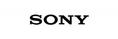
What type face style does this logo use?
a)
Serif
b)
Sans Serif
c)
Script
d)
Decorative
29.
Typeface style that is most readable on printed media.
a)
Serif
b)
Sans Serif
c)
Script
d)
Decorative
30.
Typeface style with little bars.
a)
Serif
b)
Sans Serif
c)
Script
d)
Decorative
31.

Typography is the _____ and process of arranging ____ on a page.

a)

form; color

b)

art; type

c)

size; font

d)

flow; letters

32.

Readability measures

a)

the ability of a large body of type to be read without tiring the reader’s eyes.

b)

the ease and speed with which short phrases can be read accurately.

33.

Newspaper and magazines have columns because of

a)

Center Alignment

b)

Right Alignment

c)

Justified Alignment

d)

Left Alignment

34.

What term refers to the particular weight within a typeface?

a)

type design

b)

cap height

c)

font

d)

x height

35.

Good typography is good user experience.

a)

True

b)

False

36.
Serif or Sans Serif?
a)
Serif
b)
Sans Serif
37.
Serif or Sans Serif?
a)
Serif
b)
Sans Serif
38.
Select the correct order of visual hierarchy:
a)
Level 1: body text
Level 2: subheadings
Level 3: headings
b)
Level 1: headings
Level 2: subheadings
Level 3: body text
c)
Level 1: subheadings
Level 2: headings
Level 3: body text
39.

To get a title to stand out when you are using one font on a page, you should make it ____________.

a)

bold

b)

smaller

c)

white

d)

script

40.

Display fonts are best used for

a)

professional documents like a resume or article.

b)

documents on a computer screen.

c)

small amounts of text like a title or header.

d)

anywhere you want to use them.

41.

The font itself can send a certain message to the viewer.

a)

True

b)

False

42.

Identify the Typography for the text:

𝚂𝚝. 𝙻𝚘𝚞𝚒𝚜 𝙲𝚘𝚕𝚕𝚎𝚐𝚎 𝚅𝚊𝚕𝚎𝚗𝚣𝚞𝚎𝚕𝚊

a)

Monospaced

b)

Proportional

43.

Look at the picture. Identify the typeface(s) (fonts) as either Serif, Sans Serif or Display (decorative) fonts.

a)

Serif

b)

Sans Serif

c)

Display (decorative)

44.

True or False: Font use is an important design decision. The font should be readable and convey whatever style (message) the designer is intending.

a)

TRUE

b)

FALSE

45.

True or False: You should limit yourself to 1 or 2 font styles for a project. Using many different font styles in a single project could make your design hard to read and not effective.

a)

TRUE

b)

FALSE

46.

The creator of the infographic chose to use a variety of _______________ to present the information in a creative manner using a variety of font styles and sizes.

a)

remediation

b)

credibility

c)

alignment

d)

typography

47.

Which principle? "the type of font used is important - fonts should be clear and legible"

a)

simplicity

b)

clarity

c)

accessibility

d)

typography

48.

Serif fonts are best used for

a)

professional documents or publications like a resume or article.

b)

anything on a computer screen.

c)

old people.

d)

nothing, they are outdated.

49.

Which one of these is the name of the typeface?

a)

Bodoni Light

b)

Bodoni

c)

Bodoni Thin

d)

Bodoni Heavy

50.
BONUS: What is Ms. Williamson's favorite Disney movie?
a)
Tarzan
b)
Lilo & Stitch
c)
Cinderella
d)
Moana