
 Worksheets
circle graphs
Total questions: 20
Worksheet time: 3600secs
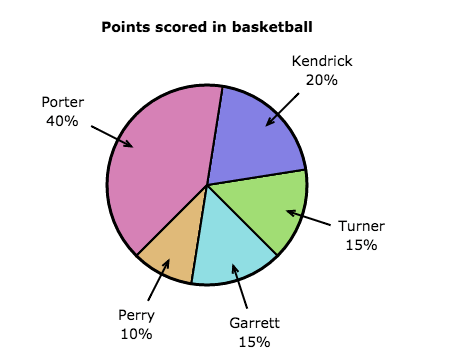


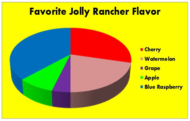

The total percent of a circle graph is?
Equivalent to the biggest section
10%
1000%
100%

According to the following circle graph, what is the least favorite beverage?
Coffee
Cola
Water
Tea

Which table represents the data in the graph?


If 200 people were surveyed, approximately how many people like pepperoni and cheese as their topping?
100 people
150 people
50 people
75%

Which graph matches the table of values (not percents)?


Which bar graph matches the circle graph?


Which circle graph best represents the same set of data as the bar graph?


What is the title of the circle graph?
Sea cumbers
Kinds of echinoderms
Sea urchings and sand dollars
Seal lillies

The pie chart shows the percent of students with different footwear. Estimate the percent of students who wear sneakers.
22%
11%
32%
30%

The circle graph shows the percentage of names. What is the percentage of people named Kaias?
60%
25%
50%
75%

The circle graph shows the percentages of how people get to work. Find the percent of people who take the train to work.
110%
90%
10%
30%
Which table represents the data in the graph?

80 sixth grade students picked their favorite elective. Which is closest to the total number of students that picked band and choir?
80
4
40
20
Data was collected on favorite veggies served at lunch. What can be said based on the graph provided?
Corn should be served at lunch
Tomatoes should be served at lunch
The cucumbers were rotten
Corn is more filling than tomatoes

1) Mr. Johnson surveyed 24 students from his class. He asked each student to rate a television show. The circle graph represents the results from the survey. Which fraction best represents those who rate the show as "above average"?



