
Font size
 Worksheets
17Q3
Total questions: 17
Worksheet time: 10mins
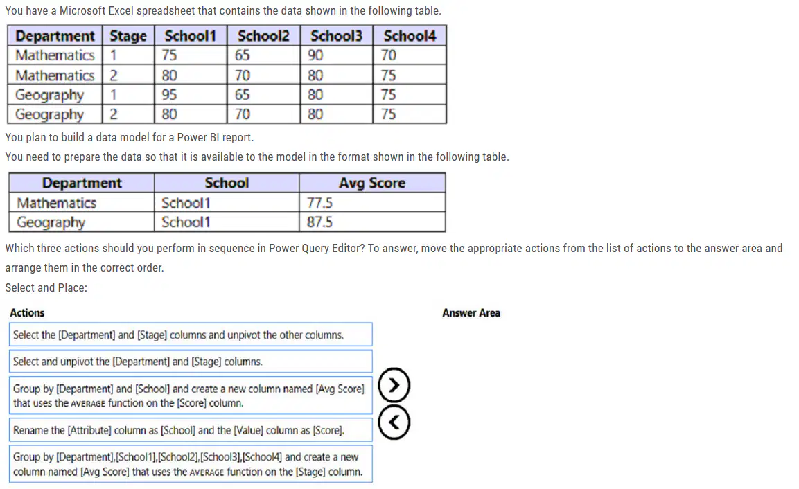
Which three actions should you perform in sequence in Power Query Editor?
Select the [Department] and [Stage] columns and unpivot the other columns
Rename the [Attribute] column as [School] and the [Value] column as [Score]
Group by the [Department],[School1],[School2],[School3],[School4] and create a new column named [Avg Score] that uses the AVERAGE function on the [Stage] column
Select the [Department] and [Stage] columns and unpivot the other columns
Rename the [Attribute] column as [School] and the [Value] column as [Score]
Group by the [Department] and [School] and create a new column named [Avg Score] that uses the AVERAGE function on the [Score] column
Select and unpivot the [Department] and [Stage] columns.
Rename the [Attribute] column as [School] and the [Value] column as [Score]
Group by the [Department],[School1],[School2],[School3],[School4] and create a new column named [Avg Score] that uses the AVERAGE function on the [Stage] column
Select and unpivot the [Department] and [Stage] columns.
Rename the [Attribute] column as [School] and the [Value] column as [Score]
Group by the [Department] and [School] and create a new column named [Avg Score] that uses the AVERAGE function on the [Score] column
You have a report that contains a bar chart and a column chart. The bar chart shows customer count by customer segment. The column chart shows sales by month.You need to ensure that when a segment is selected in the bar chart, you see which portion of the total sales for the month belongs to the customer segment.How should the visual interactions be set on the column chart when the bar chart is selected?
highlight
filter
no impact
A user creates a Power BI report named ReportA that uses a custom theme. You create a dashboard named DashboardA. You need to ensure that DashboardA uses the custom theme. The solution must minimize development effort. Which two actions should you perform? Each correct answer presents part of the solution. NOTE: Each correct selection is worth one point.
Publish ReportA to Power BI.
From ReportA save the current theme.
Publish ReportA to the Microsoft Power BI Community theme gallery.
From DashboardA, create a custom theme.
From DashboardA, upload a JSON theme.
You need to create a visualization that compares revenue and cost over time. Which type of visualization should you use?
waterfall chart
stacked area chart
line chart
donut chart

You have a report in Power BI Desktop.You add a key influencers visual as shown in the exhibit. (Click the Exhibit tab.)
Select the answer choice that completes each statement based on the information presented in the graphic.NOTE: Each correct selection is worth one point.
Identifying additional factors that increase attrition can be achieved by [turning on Cross-report]
Employee attrition [.2] times greater when employees work overtime.
Identifying additional factors that increase attrition can be achieved by [turning on Cross-report]
Employee attrition [3] times greater when employees work overtime.
Identifying additional factors that increase attrition can be achieved by [adding more fields to expand by]
Employee attrition [3] times greater when employees work overtime.
Identifying additional factors that increase attrition can be achieved by [moving fields from Explain by to Expand by]
Employee attrition [3] times greater when employees work overtime.
You build a report to help the sales team understand its performance and the drivers of sales. The team needs to have a single visualization to identify which factors affect success. Which type of visualization should you use?
Key influencers
Line and clustered column chart
Q&A
Funnel chart
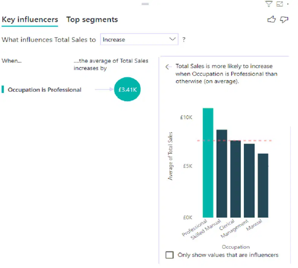
You have a table that contains the following three columns:City -✑ Total Sales✑ OccupationYou need to create a key influencers visualization as shown in the exhibit. (Click the Exhibit tab.)
How should you configure the visualization? To answer, select the appropriate options in the answer area.
Analyze: City
Explain by: Total Sales
Analyze: Total Sales
Explain by: Occupation
Analyze: Total Sales
Explain by: City
Analyze: Occupation
Explain by: City

You are using the key influencers visual to identify which factors affect the quantity of items sold in an order.You add the following fields to the Explain By field:✑ Customer Country✑ Product Category✑ Supplier Country✑ Sales Employee✑ Supplier Name✑ Product Name✑ Customer CityThe key influencers visual returns the results shown in the following exhibit.What can you identify from the visual?
Customers in Austria order 18.8 more units than the average order quantity.
Customers in Boise order 20.37 percent more than the average order quantity.
Product Category positively influences the quantity per order.
Customers in Cork order lower quantities than average.
You have a report that contains four pages. Each page contains slicers for the same four fields. Users report that when they select values in a slicer on one page, the selections are not persisted on other pages. You need to recommend a solution to ensure that users can select a value once to filter the results on all the pages. What are two possible recommendations to achieve this goal? Each correct answer presents a complete solution. NOTE: Each correct selection is worth one point.
Create a bookmark for each slicer value.
Sync the slicers across the pages.
Replace the slicers with page-level filters.
Replace the slicers with report-level filters.
You have a report that includes a card visualization. You need to apply the following conditional formatting to the card while minimizing design effort: ✑ For values that are greater than or equal to 100, the font of the data label must be dark red. ✑ For values that are less than 100, the font of the data label must be dark gray. Which type of format should you use?
Color scale
Rules
Field value
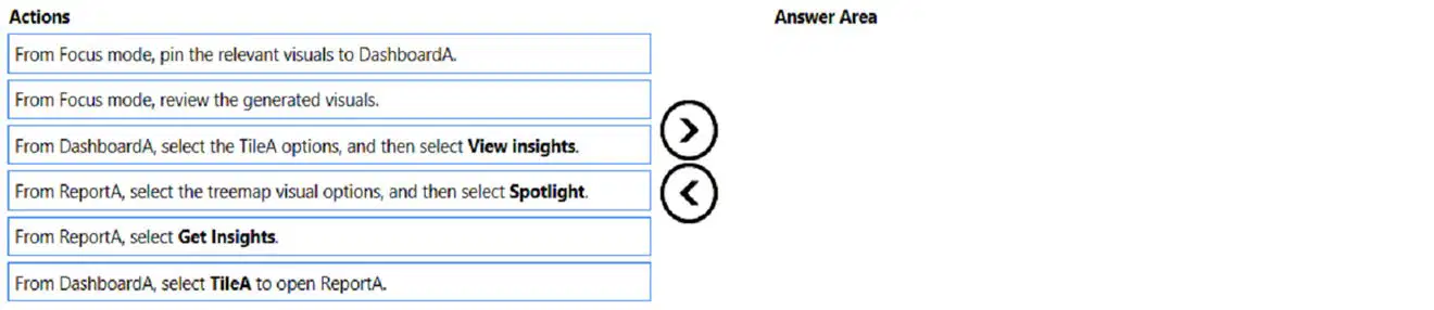
You have a Power BI dashboard named DashboardA that contains a tile named TileA. TileA contains a treemap visual from a report named ReportA.You need to provide the users of DashboardA with additional tiles that relate to the contents of TileA.Which three actions should you perform in sequence? To answer, move the appropriate actions from the list of actions to the answer area and arrange them in the correct order.
From ReportA, select Get Insights
From DashboardA, select the TileA options, and then select View Insights
From Focus mode, pin the relevant visuals to DashboardA
From Focus mode, review the generated visuals.
From DashboardA, select the TileA options, and then select View Insights
From Focus mode, pin the relevant visuals to DashboardA
From ReportA, select Get Insights
From DashboardA, select the TileA options, and then select View Insights
From Focus mode, review the generated visuals.
From ReportA, select Get Insights
From DashboardA, select the TileA options, and then select View Insights
From DashboardA select TileA to open ReportA
You are creating a dashboard by using the Power BI service. You have an existing report page that contains three charts. You need to add the charts to the dashboard while maintaining the interactivity between the charts. What should you do?
Edit interactions in the report and set all interactions to Filter.
Pin each chart as a tile.
Edit the dashboard theme and pin each chart as a tile.
Pin the report page as a live tile.
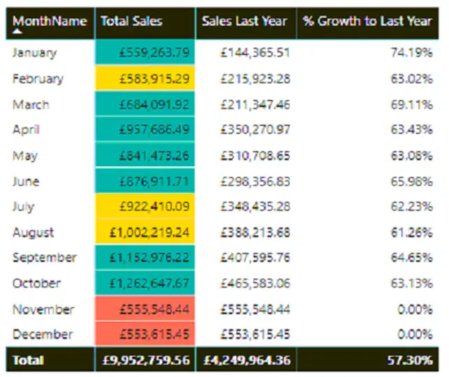
You need to create a visual as shown in the following exhibit.The indicator color for Total Sales will be based on % Growth to Last Year.The solution must use the existing calculations only.How should you configure the visual? To answer, select the appropriate options in the answer area.NOTE: Each correct selection is worth one point.
Conditional formatting: Background color
Format by: Color scale
Conditional formatting: Background color
Format by: Rules
Conditional formatting: Font color
Format by: Rules
Conditional formatting: Font color
Format by: Color scale

You are using existing reports to build a dashboard that will be viewed frequently in portrait mode on mobile phones.You need to build the dashboard.Which four actions should you perform in sequence? To answer, move the appropriate actions from the list of actions to the answer area and arrange them in the correct order.
Pin items from the reports to the dashboard.
Open the dashboard.
Edit the Dashboard mobile view.
Rearrange, resize, or remove items from the mobile layout.
Pin items from the reports to the dashboard.
Open the dashboard.
Create a phone layout for the existing reports.
Rearrange, resize, or remove items from the mobile layout.
Pin items from the reports to the dashboard.
Open the dashboard.
Create a phone layout for the existing reports.
Edit the Dashboard mobile view.
Open the dashboard.
Create a phone layout for the existing reports.
Edit the Dashboard mobile view.
Rearrange, resize, or remove items from the mobile layout.
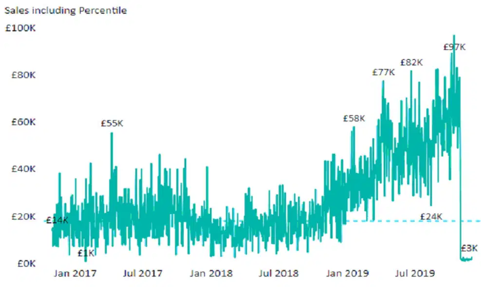
You plan to create the chart shown in the following exhibit.How should you create the dashed horizontal line denoting the 40th percentile of daily sales for the period shown?
Add a measure to the visual that uses the following DAX expression. Measure1 = PERCENTILEX.INC (Sales,sales[Total Sales],0.40)
Add a measure to the visual that uses the following DAX expression. Measure1 = PERCENTILEX.EXC (Sales,sales[Total Sales],0.40)
Add a new percentile line that uses Total Sales as the measure and 40% as the percentile.
Create a horizontal line that has a fixed value of 24,000.
You are building a Power BI report. Users will view the report by using their mobile device. You need to configure the report to display data based on each user's location. Which two actions should you perform? Each correct answer presents part of the solution. NOTE: Each correct selection is worth one point.
E. For the relevant columns, set synonyms to match common geographical terms.
In Data Category, set the geographic data category for the relevant columns.
Use the columns of the geography data type in all visuals.
Create a hierarchy for columns of the geography data type.
From Power Query Editor, detect the data types of the relevant columns.
You have a report that contains a donut chart and a clustered column chart. Interactions between the visuals use the default settings. You need to modify the report so that when you select a column in the column chart, the donut chart redraws by using the data from the selected column. What should you do?
Select the donut chart and set the column chart interaction to Filter.
Select the column chart and set the donut chart interaction to Filter.
Select the column chart and set the donut chart interaction to None.
Select the donut chart and set the column chart interaction to None.

