
Font size
 Worksheets
Year 12 GAIT 2023 T1 WK8
Total questions: 125
Worksheet time: 1hrs 22mins
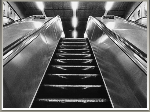
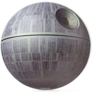
*hint- three dimensional
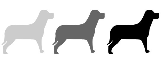

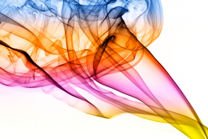
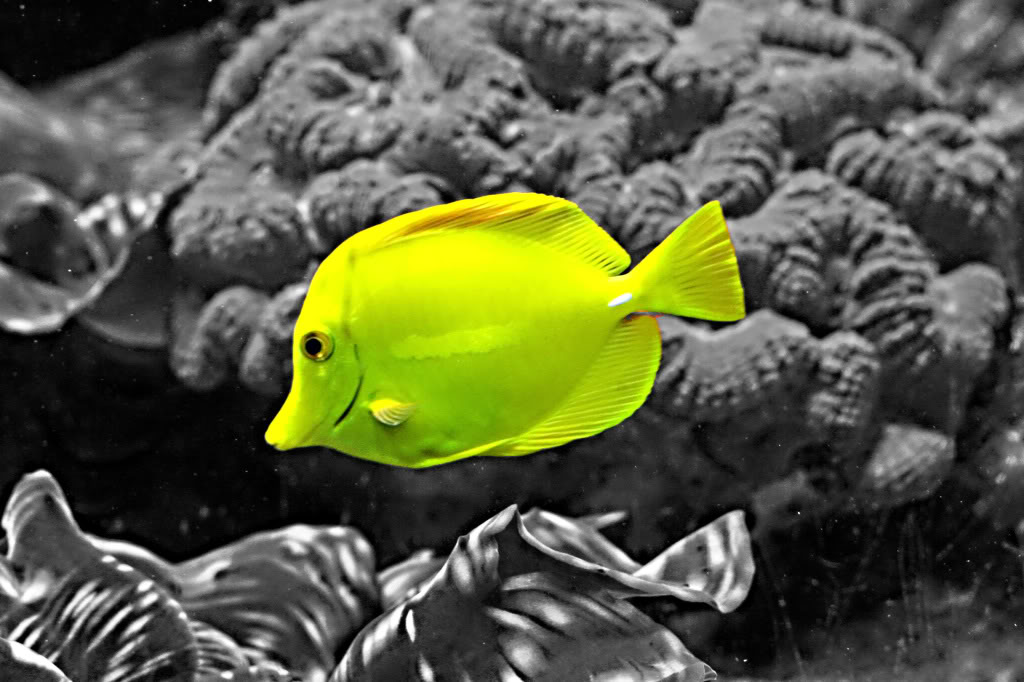

1) __________
2) asymmetrical
3) radial

Which of the following is not an example of how to create emphasis...?
Make one element larger
Make all items the same size
Use various colors
Use different styles of type
There are two types, geometric (man-made) and natural (organic). The combining of two or more shapes or a collection of lines creates it. It may be enhanced by tone, texture and colour.
Form - principle of design
Contrast - principle of design
Balance - principle of design
Proportion - principle of design
The regular repetition of elements
Balance
Contrast
Harmony
Rhythm
A repeated decorative design
Rhythm
Pattern
Balance
Style
The distribution of visual weight in an artwork
Contrast
Movement
Proportion
Balance
The difference between elements in a composition
Contrast
Balance
Unity
Harmony
The condition in which two or more things naturally go together
Harmony
Style
Unity
Proportion
An act of changing physical location or position or of having this changed
Balance
Unity
Movement
Balance
A feature or quality that is typical of designs created by a specific person or during a specific time period.
Theme
Style
Contrast
Rhythm
When the parts of a design have a sense of belonging or similarity so that they visually fit well together
Style
Unity
Harmony
Contrast
The relationship between the sizes of two or more things.
Balance
Proportion
Rhythm
Style
These describe the edges or contours of shapes
Lines
Form
Texture
Color
The shape of an object is two-dimensional (2D), and the _______ of an object is three-dimensional (3D).
Lines
Form
Color
Texture
The feel, appearance, or consistency of a surface, substance, or material.
Lines
Shape
Texture
Color
A visual element derived from reflected light.
Lines
Shape and Form
Texture
Color
Decisions that deal with the overall purpose of the design
Conceptual
Marketing
Technical
Aesthetic
Decisions that deal with who will buy/use the product as well as where/how the product will be sold and the selling price
Conceptual
Marketing
Technical
Construction
Decisions that deal with how the design will actually work
Conceptual
Marketing
Technical
Aesthetic
Decisions about how the product will be made and assembled
Conceptual
Technical
Construction
Marketing
Decisions about how the product will look
Conceptual
Marketing
Technical
Aesthetic
Select ONLY the Elements of Art
Line
Shape
Contrast
Texture
Emphasis
Select ONLY the Principles of Design
Movement
Proportion
Emphasis
Form
Space
Different sizes; Describes how the sizes of different parts of a piece of art or design relate to each other.
Value
Texture
Proportion
Line
Empty or open area; the background- can be negative or positive
Texture
Proportion
Emphasis
Space
A mark with length and direction
Shape
Value
Line
Emphasis
A flat figure (2D); can be geometric or organic.
Space
Shape
Form
Line
Holds the viewer's attention/focal point.
Value
Emphasis
Pattern
Contrast
A large difference between two things/ opposite
Form
Balance
Value
Contrast
Movement
An element that refers to the lightness or darkness of a color.
A large difference between two things; for example, rouge and smooth or white and black.
Area in a work of art that catches and holds the viewer's attention/focal point.
Used to create the impression of action in a work of art

This image is the best representation of
Contrast
Movement
Pattern
Emphasis

This image is the best representation of
Emphasis
Proportion
Color
Variety

This image is the best representation of
Shape
Line
Value
Contrast

This Image is the best representation of
Texture
Form
Proportion
Emphasis

This image is the best representation of
Form
Proportion
Shape
Space

This image is the best representation of
Pattern
Balance
Shape
Proportion
Which image best represents EMPHASIS


Which image best represents TEXTURE


Which Element of Art is NOT shown in this picture
Shape
Line
Texture
Color
Space

This Image best represents
Emphasis
Contrast
Texture
Value
What do you call the KEY components that make up an artwork
The Ingredients of Art
The Elements of Art
The Mediums of Art
The Principles of Design

What element of art is demonstrated in the picture?
Texture
Line
Form
Color

What element of art is demonstrated in the picture?
Line
Value
Space
Color

The picture shown in this question shows what element of design?
Color
Shape
Line
Texture

This is asymmetrical balance
True
False

What is the most notable Principle of Design the Artist used in this image?
Line
Proportion
Movement
Pattern
Below is an example of an organic shape


A form is an object with how many dimensions?
1
2
3
4

Picasso's painting "The Old Guitarist" is an example of
Cool Colors
Warm Colors
This type of balance is when both sides is a mirror image of each other.
Symmetrical
Asymmetrical
Radial
Informal

What does this image show?
Shape
Emphasis
Pattern
Movement
Typography is about
designing typefaces
combining graphic elements together
designing newsletters and magazines
arranging text aimed to be clear and legible


In typography, the terms "typeface" and "font" mean the same thing.
True
False
When space is adjusted between individual characters, that is called
kerning
leading
aligning
spacing
Space between baselines of text.
Leading
Tracking
Kerning
Spacing

Level 2: subheadings
Level 3: headings
Level 2: subheadings
Level 3: body text
Level 2: headings
Level 3: body text
What principle referst to the fact that objects or elements that are placed together are perceived to be more related than the ones far apart
White Space
Contrast
Proximity
Hierarchy




Which of the following best describes the method designers us to signify the importance of content and direct the eye?
Composition
Images
Size
Visual hierarchy
Setting all the text to start at the same point on the left side is the use of ____________.
contrast
alignment
proximity
repetition

Visual Heirarchy is
used to make the viewer look around the image
draw the eye to the smallest image 1st
draw the eye to the largest image
draw the eye to the most important detail 1st

Why was the above image an example of bad design?
Because of font choice.
Because of illogical layout.
Because of hard to read colours.
Because it didn't include images.

Place objects directly in the center of the frame
Place objects where the grid lines intersect
Place horizon lines on the grid lines
Make sure there is something interesting in every frame


horizontal
Horizon Line is
the sunset
the sunrise
is a horizontal line that runs across the paper or canvas to represent the viewer's eye level, or seperates where the sky meets the ground.
A form of drawing and painting in which parallel lines are represented as coming together to give the illusion of near and far
a sequence of hand drawn sketches or visual image
(a)
What is the most appropriate pre-production document to use for a product with a timeline?
Mind Map/Spider diagram
Visualisation Diagram
Mood Board
Script
Story Board
What is a visualisation diagram?
A rough sketch of what your final design will look like
A board with different ideas on
A story board detailing the development of your project
A collection of images that insired your final design
What is a particular group of people at which your project is aimed?
Yourself
The Client
Adults
Target Audience

