
 Worksheets
GAIT 2023 term 1 week 10
Total questions: 136
Worksheet time: 1hrs 17mins
What element is described as the area around or between elements in design?
Space
Shape
Texture
What principle highlights or draws your attention to some aspect of a composition or of a subject?
Emphasis
Rhythm
Movement
If elements in a composition has equal distribution of visual weight, it exemplify what principle of design?
Balance
Emphasis
Proportion
Using colors next to each on color wheel is an example of what color combination?
Analogous
Complementary
Monochromatic
Silhouette is an example of what shape?
Geometric
Structured
Organic
By joining lines you can create which of the following?
Texture
Shapes
Space
If one side of a composition is more prominent that the other side, the composition uses what form of balance?
Symmetrical
Asymmetrical
Natural
What principle of design shows relationship of sizes between different parts of composition?
Movement
Proportion
Rhythm
What principle of design is shown if a composition shows sequence of shapes through progression of steps?
Rhythm
Contrast
Proportion
What principle is being used if lines makes your eyes move to a certain area of composition?
Contrast
Movement
Rhythm
If the elements of design are the ingredients of design, what do you think is the recipe that describe how to combine elements to create a composition?
Form
Design
Principle
The element of color depends on light, because it is made of light. If Hue is mixed with white, this result to which of the following quality of color?
Tone
Shade
Tint

This picture shows what form of balance?
Symmetrical
Asymmetrical

This photo exemplify what combination of color?
Analogous
Complementary
Monochromatic
There are two types, geometric (man-made) and natural (organic). The combining of two or more shapes or a collection of lines creates it. It may be enhanced by tone, texture and colour.
Form - principle of design
Contrast - principle of design
Balance - principle of design
Proportion - principle of design

This image is a good example of which element?
color
shape
line
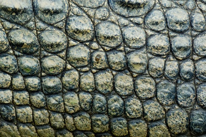
The image is a good example of which element?
color
texture
shape
mass

Texture
Shape
The primary colors FOR INK OR PAINT are..
Red, Yellow, and Orange
Orange,Green, and Purple
Blue, Red, and Yellow
Orange, Red, and Blue

What is the pattern the eye follows when scanning a page?
unity/ harmony
zpattern

Place the focal point along a line or where the lines intersect is called _____________.
Rule of Design
Rule of Thirds

repetition
Which of the following is NOT an example of how to create emphasis...?
Make one element larger
Make all items the same size
Use various colors
Use different styles of type

What is unity/harmony?
It confuses the reader to understand the whole message
¨All of the design elements are consistent with each other in shape, style and color and consistent with the overall message

What is Dominance/Emphasis?
font size differences
Always the largest element on the design
The first element the eye sees; the focal point.

This principle of design creates interest and draws the eye in. It also emphasizes the difference between elements.
Contrast
Lines
Unity / Harmony

Elements are centered or evenly divided EITHER vertically and horizontally is called ___________________.
Symmetrical balance
Asymmetrical balance
Unbalanced

Asymmetrical Balance is defined as; _________________________
One portion of the design has much more visual weight and contrasting elements than other areas of the design.
Identical or similar elements reflected on either side of the page
Balanced design using text only
Texture, Line, Value, Form, Color, Shape and Space are considered....
Principles of Design
The Cake Recipe
Elements of Design

With Positive/Negative space which one is best described as the empty space surrounding shapes or forms
Positive Space
Negative Space
A continuous mark, as that made by a pen, pencil or brush.
Emphasis
Texture
Value
Line
Shape is ___ dimensional
2
3
1

Refers to the way things feel or looks as they might feel is touched?
Color
Form
Value
Texture

Objects having 3 dimensional having length, width, and height. They can be viewed from many different sides.
Shape
Form

What type of Balance is shown here ?
Radial
Symmetrical
Asymmetrical
Select ONLY the Elements of Art
Line
Shape
Contrast
Texture
Emphasis
Select ONLY the Principles of Design
Movement
Proportion
Emphasis
Form
Space
Secondary colors are made by mixing primary colors and include...
green, orange, and violet
black and white
red, white, and blue
red, yellow, and blue
What is typography most concerned about?
making text legible and visually appealing
ensuring the design brief is met
focusing on the designer's aesthetics
making layout user-friendly
What term refers to the particular weight within a typeface?
type design
cap height
font
x height
Good typography is good user experience.
True
False
Which of the following is an acceptable font choice for a new branding project for a serious business?


What is the maximum number of fonts for a design project?
5
4
3
2
Which of the following is NOT DIRECTLY related to text hierarchy?
size
photos
navigation
white space
Is white space your friend?
Yes
No
When working on a project, we can use fonts from the same family and still have contrast in our solutions.
False
True

What type of font is this?
Serif
San Serif
Script
decorative/ornamental

What type of font is this?
Serif
Sanserif
Script
Decorative/ornamental
What is a "typeface"?
Character
Letter spacing
Collection of letters
Line spacing
What is a "font"?
The collection of letters
the individual letter
the font style
the font family
"Bold" is an example of....
Typeface
Font
Font family
Font style
Arial narrow is an example of.....
Typeface
Font
Font family
Font style

This font is
Serif
Sans serif
Script
Ornamental
A font that has a clear, identifiable theme is
Objective
Non Objective
Whimsical
A font that clearly has a style, but no identifiable theme is
objective
non objective
whimsical
A font where each letter is different in style is
objective
non objective
whimsical

What type of font is this?
Serif
Sans Serif
Decorative
Script

What is the classification of the font shown above?
Serif
Sans Serif

What is the classification of the font shown above?
Serif
Sans Serif
The space between the lines of text
Aperture
Tracking
Kerning
Leading
The space located between individual letters of a word
Aperture
Tracking
Kerning
Leading
This type does not have extensions or strokes on the ends of the letters and are used heavily for labeling, headlines and titles.
Type Alignment
Serif
Sans Serif
Script, symbols and decorative type
The space between the letters in a sentence
Tracking
Aperture
Kerning
Leading
This is used to guide the reader's eye to whatever is most important. In other words, it shows them where to begin and where to go next using different levels of emphasis.
Hierarchy
Tracking
Leading
Kerning
In general, how many different fonts should you use in a project?
One
Two
At least three
As many as you can fit on the page
Designers use typography to communicate what to an audience.
Serif
client's message
Baseline
Descenders
The space between lines of text
kerning
leading
tracking
aligning
The adjustment of spacing of large sections of type
kerning
leading
tracking
aligning
The way type is arranged on the page
kerning
leading
tracking
alignment
When type aligns even on both sides
align left
align right
center
justified
The length of the line of type
line length
point size
font
line spacing
How should you use centered text
constantly
sparingly
frequently
never
All caps are fine when it is
less than 10 words
less than one line of text
more than one line of text
multiple paragraphs of text
The space between two pairs of letter
kerning
leading
tracking
aligning
Letters that go above x-height
descenders
x-height
y-height
ascenders
The height of the lowercase letters
x-height
y-height
ascenders
descenders
Letters that drop below the baseline
x-height
baseline
descenders
ascenders

Place objects directly in the center of the frame
Place objects where the grid lines intersect
Place horizon lines on the grid lines
Make sure there is something interesting in every frame


Birds eye
Worms eye
Neutral/eye level
framing
Which of the following best describes the method designers us to signify the importance of content and direct the eye?
Composition
Images
Size
Visual hierarchy
When you group up words that go together and their related pictures- you are using_________.
proximity
contrast
emphasis
repetition
Setting all the text to start at the same point on the left side is the use of ____________.
contrast
alignment
proximity
repetition

Visual Heirarchy is
used to make the viewer look around the image
draw the eye to the smallest image 1st
draw the eye to the largest image
draw the eye to the most important detail 1st
Which graphic element is best used to direct the viewers eye and generate movement throughout a page?
Lines
Shapes
Texture
Text
Which of these images shows a Storyboard?


A storyboard is used to show the _____________ and flow of scenes in a moving image product such as a video or animation.
design ideas
work plan
sequence
research
A ________________ is for a single static scene but a storyboard will have multiple scenes that flow from one to another along a timeline.
Mind Map
Visualisation Diagram
Moodboard
Work Plan
Which of the following is a media product that you should NOT use a storyboard for?
Comic Book
Video Project
Radio Advert
Computer Game
Who is NOT the intended audience of a storyboard?
Production Crew
Editor
Viewers of final product
Actors
A storyboard includes?
Camera Angles
Timings
Detailed Dialogue
Location
Stage Directions
In which section of our Controlled Assessment could you be expected to complete a Storyboard?
Research
Planning
Creation
Evaluation

What suitable feature could be added to this Storyboard?
Camera Movement
Timings
Colour
Stage Direction

What camera movement would these arrows represent on a Storyboard?
Zoom Out
Pan Right
Zoom In
Tilt Down
What is the purpose of a storyboard?
A storyboard is a way for you to complete your work.
Use a storyboard to set up all of your ideas before starting your project.
A storyboard is the same as a whiteboard
A storyboard can only be used for research
A storyboard is used to show the _____________ and flow of scenes in a moving image product such as a video or animation.
design ideas
work plan
sequence
research
Non-Linear Type of storyboarding is applied in making Digital games.
TRUE
FALSE
Linear Type of storyboarding is applied in making movies or films.
TRUE
FALSE
Allows you to manage your project's scenes, panels and sequences, to add transitions, markers, snapshots and to track the changes made to the project. It is also where the Project Properties dialog can be accessed.
Storyboard
Play
Camera
Clips
In general, how many different fonts should you use in a project?
One
Two
At least three
As many as you can fit on the page

