
 Worksheets
MA - Presenting Information
Total questions: 25
Worksheet time: 57mins
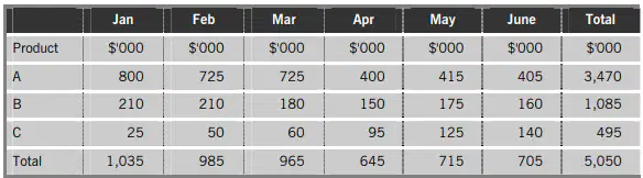
The table below shows a company's sales figures for the first six months of the year.
What kind of graph or chart would you use to show the fluctuations of total monthly sales figures across the six months?
Percentage component bar chart
Scatter diagram
Line graph
Pie chart
Which of the following would be best suited to represent the relationship between a company’s advertising expenditure and its sales revenue?
1. A pie chart
2. A bar chart
3. A scatter graph
1 only
2 only
3 only
2 and 3

The following bar chart shows the overhead expenses for a business for each quarter of 20X1
What was the reduction in overhead expenses between quarter three and quarter four?
$12,00,000
$800,000
$400,000
$40,000
The cost of materials for product A are as follows. Material W: $2,250
Material X: $3,000
Material Y: $3,600
Material Z: $150
If the material proportions were displayed on a pie chart, how many degrees would material Y represent?
1400 degrees
44 degrees
140 degrees
144 degrees

Based on the graph, which TWO of the following statements are correct? Statement 1 - At a level of activity of 30 units the total cost is $350
Statement 2 - The fixed element of the cost is $200
Statement 3 - The cost appears to be non-linear
Statement 4 - The variable element of the cost is $10 per unit
1 & 2
3 & 4
2 & 4
1 & 4
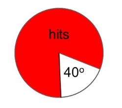
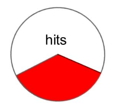
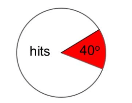
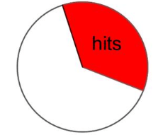
A darts player hits his target 40% of the time. Which pie chart represents his hits and misses?
People from Iceland were asked to pick their favourite from: lamb, fish and hot dog. A pie chart was made and 270 degrees represented lamb. What does this mean?
hot dogs are the least preferred food
25% of the people don't like lamb
lamb is the most preferred food
270% of the people prefer lamb

This pie chart shows the colour of hats that Tom owns. Which colour hat does he own the second most of?
red
blue
green
yellow
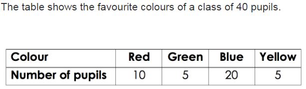
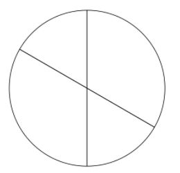
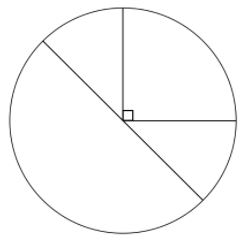
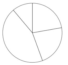
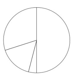
Which pie chart represents the same data as the table?
Which of the following would best present the portion of total revenue generated by geographic region for one year ?
Bar Chart
Pie Chart
Scatter Diagram
Table
Which of the following would best present quarterly sales revenue for the year ?
Table
Simple Bar Chart
Pie Chart
Scatter Diagram
Which of the following would most usefully present information about a company's sales of heating appliances according to daily temperature ?
Pie Chart
Scatter Diagram
Simple Bar Chart
Component Bar Chart
Which of the following statements about Pie Charts are true ?
1. Comparisons can be made more accurately with pie charts than with bar charts
2. They are a graphical representation of relative frequency of quantitative data
3. The are of each segment is proportional to the percentage its represnts
1,2 & 3
1 & 2 Only
2 & 3 Only
1 & 3 Only
Which section of a report sets out the purpose of the report?
Contents
Terms of reference
Recommendations
Appendices

The following information relates to the free newspapers that a sample of 200 people read in the city of Leochester.
Which is the most popular newspaper amongst women?
Post
News
Chronicle
Press

The following information relates to the free newspapers that a sample of 200 people read in the city of Leochester.
To the nearest whole per cent, what percentage of men read the Post?
20%
24%
42%
48%

The following information relates to the free newspapers that a sample of 200 people read in the city of Leochester.
What number of women surveyed do not read the News or the Chronicle?
39
29
19
49

The following information relates to the free newspapers that a sample of 200 people read in the city of Leochester.
What percentage of people does not read the Press?
98
88
79
59

The following information relates to the free newspapers that a sample of 200 people read in the city of Leochester.
To the nearest whole %, what percentage of the Chronicle’s readership is male?
66%
55%
36%
96%

The following information relates to the free newspapers that a sample of 200 people read in the city of Leochester.
For which paper does the percentage of men and women reading the paper differ the most?
Post
News
Chronicle
Press
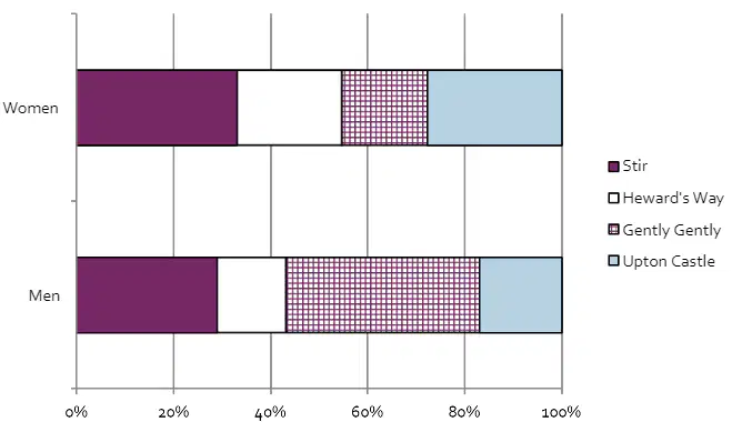
The following diagram illustrates the percentage of viewers for four popular television programmes that are broadcast at 8pm on Sunday evening. Assume that the number of male and female viewers is equal.
Which programme has the largest audience?
Stir
Heward’s Way
Gently Gently
Upton Castle
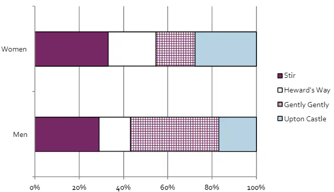
The following diagram illustrates the percentage of viewers for four popular television programmes that are broadcast at 8pm on Sunday evening. Assume that the number of male and female viewers is equal.
Which programme is least popular amongst women?
Stir
Heward’s Way
Gently Gently
Upton Castle
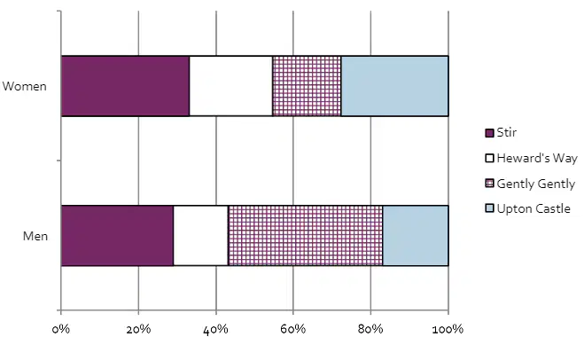
The following diagram illustrates the percentage of viewers for four popular television programmes that are broadcast at 8pm on Sunday evening. Assume that the number of male and female viewers is equal.
The same television company broadcasts Heward’s Way and Gently Gently on different
channels. Has it achieved a greater than 50% share of the male audience?
Yes
No
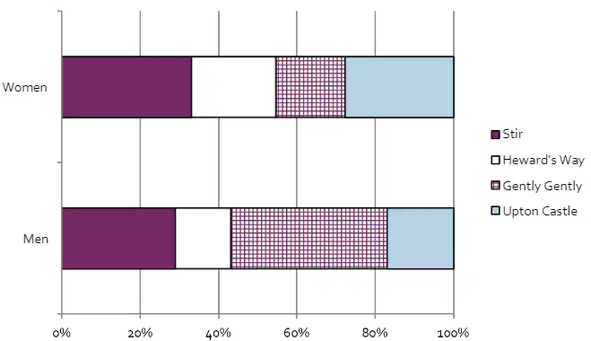
The following diagram illustrates the percentage of viewers for four popular television programmes that are broadcast at 8pm on Sunday evening. Assume that the number of male and female viewers is equal.
Which programme has the least difference in viewer numbers between the male and female
audience?
Stir
Heward’s Way
Gently Gently
Upton Castle
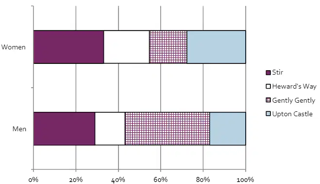
The following diagram illustrates the percentage of viewers for four popular television programmes that are broadcast at 8pm on Sunday evening. Assume that the number of male and female viewers is equal.
Advertisers who advertised in the commercial breaks in Upton Castle hoped that it would
achieve a 25% share of total audience. Did it achieve this figure?
Yes
No

