wayground logo

Free Printable Worksheets

NEW

Font size

S
M
L
XL
Worksheets

Unit 1 Stats Quiz Review

Total questions: 44

Worksheet time: 6hrs 40mins

Name
Class
Date
1.
How many employees are there that make between $33,000 and $43,000
a)
250
b)
500
c)
550
d)
750
2.
Which interval shows the greatest number of pets?
a)
15-19
b)
0-4
c)
5-9
d)
10-14
3.
Elliot says almost everyone arrived at the party after 10:00 P.M., but Nancy thinks most people came earlier. When did a majority of the people arrive? 
a)
7:00-7:59 P.M.
b)
8:00–8:59 P.M.
c)
9:00–9:59 P.M.
d)
10:00–10:59 P.M. 
4.
Is a histogram the same as a bar graph?
a)
Yes, because they both use intervals.
b)
No, because a histogram displays numerical data while a bar graph displays categorical data.
c)
Yes, because they both use bars to display data.
d)
No, because a histogram displays categorical data while a bar graph displays numerical data.
5.
What is incorrect about the following histogram?
a)
The intervals are too small
b)
The intervals overlap
c)
The graph does not start at 0
d)
The axes are not labeled.
6.
Rhaul measured the heights of the apple trees in an orchard. What percent of the trees are 5-9 feet tall?
a)
18.9%
b)
31%
c)
22.1%
d)
10%
7.
How many students have more than 1,000 songs on their MP3 player?
a)
5
b)
16
c)
10
d)
4
8.
What percent of students have less than 1,000 songs on their MP3 players?
a)
15%
b)
80%
c)
20%
d)
45%
9.
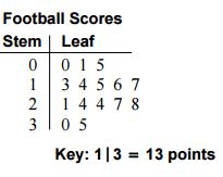
How many scores are listed in this Stem and Leaf Plot?
a)
3
b)
6
c)
9
d)
18
10.
What is the range of the data shown in the stem and leaf plot?
a)
40
b)
56
c)
136
d)
96
11.
In how many games did the team score more than 20 points?
a)
8
b)
7
c)
10
d)
9
12.
What is the median of the scores?
a)
21
b)
16
c)
17
d)
19
13.
What is the difference between the shortest and the longest distance of the baseball thrown?
a)
1,005 feet
b)
85 feet
c)
82 feet
d)
80 feet
14.
How many baseballs were thrown 50 or more feet?
a)
5
b)
4
c)
13
d)
8
15.
Each dot represents 1 day. How many days were recorded?
a)
9
b)
21
c)
20
d)
105
16.
What is the mode of the trout weight?
a)
450
b)
450.5
c)
452
d)
460
17.
How many trouts weighed MORE THAN 450 grams?
a)
8
b)
14
c)
11
d)
10
18.

Find the relative frequencies

a)

37%, 76%, 92%, 95%, 98%, 100%

b)

28%, 30%, 12%, 2%, 2%, 2%

c)

33%, 37%, 20%, 7%, 7%, 7%

d)

37%, 39%, 16%, 3%, 3%, 3%

19.
What do we call the data represented in the form of pictures?
a)
Pictograph
b)
Histrogram
c)
Frequency Table
d)
None of the above
20.
A type of bar graph used to display numerical data that has been organized into equal intervals.
a)
Line Plot
b)
Interval
c)
Frequency Table
d)
Histogram
21.
The distance between the greatest number and the least number in a set of data.
a)
Mean 
b)
Median
c)
Range
d)
Mode
22.

Pick the definition of an outlier.

a)

A value that lies outside of most other values in a data set.

b)

A value that is the largest.

c)

A value that is the smallest.

d)

A value that occurs the most.

23.
a)
Skewed Left
b)
Skewed Right
c)
Uniform
d)
Symmetric
24.

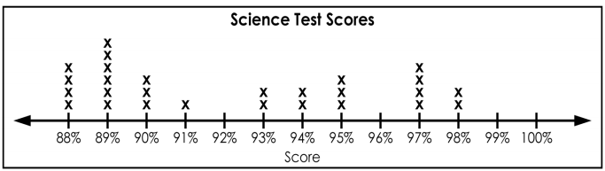
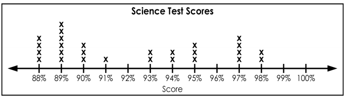
How many students received a score of 94%?

a)

94

b)

4

c)

1

d)

2

25.
What is the highest score in the class?
a)
88%
b)
100%
c)
13
d)
98%
26.
How many students received a score in the 80's?
a)
2
b)
10
c)
14
d)
27
27.
How many total students are in the science class?
a)
13
b)
6
c)
27
d)
25
28.

How many students scored more than 80%?

a)

10

b)

13

c)

7

d)

15

29.

The dotplots compare the number of hours a group of teenagers spent on two activities.

Select the answer that is NOT true.

a)

The data for exercise has a lower center than the data for video games.

b)

Both dotplots appear to be skewed right.

c)

Both dotplots appear to have outliers.

d)

The time spent on video games had a greater range than the time spent on exercise.

30.

Compare the two dotplots. Which statement is true?

a)

Boys and girls had the same spread/range in their times.

b)

Boys generally had longer times than girls.

c)

The center of the boys' times is lower than the center for the girls times.

d)

Both dotplots are skewed right.

31.

The back-to-back stemplot shows the heart rate of a group of people before and after exercise. Select the false statement below.

a)

Both pulse rate stemplots are skewed right.

b)

The pulse rates stemplot 'after exercise' has a higher center than the stemplot when resting.

c)

The stemplot for 'resting' has a larger spread/range than 'after exercise'

d)

Both stemplots appear to have outliers.

32.

What type of graph is shown here?

a)

Dotplot

b)

Histogram

c)

Boxplot

d)

Pie Chart

33.

What type of graph is shown here?

a)

Boxplot

b)

Histogram

c)

Stemplot

d)

Bar Graph

34.

What type of graph is shown here?

a)

Stemplot

b)

Histogram

c)

Circle Graph

d)

Pie Chart

35.

What type of graph is shown here?

a)

Histogram

b)

Bar Graph

c)

Box Plot

d)

Stemplot

36.

What type of graph is shown here?

a)

Histogram

b)

Bar Graph

c)

Box Plot

d)

Stemplot

37.

Bar Graphs and Pie Charts display what kind of data?

a)

Categorical

b)

Quantitative

38.

Dotplots, Stemplots, Boxplots, Histograms all display what kind of data?

a)

Categorical

b)

Quantitative

39.

Which of the variables below would be an example of a categorical variable?

a)

Number of Languages Spoken

b)

Wrist Circumference

c)

Height

d)

Handedness

40.

The columns in the table represent what?

a)

Individuals

b)

The population

c)

The sample

d)

A variable

41.

The rows in the table represent what?

a)

Individuals

b)

The population

c)

The sample

d)

A variable

42.

What does a SOCS Report include?

a)

Source
Outliers
Center
Spread

b)

Shape

Outliers

Center

Spread

c)

Shape

Outliers

Category

Source

d)

Source

Outliers

Category

Spread

43.

Mean and Median are measures of what?

a)

Variability

b)

Center

c)

Shape

d)

Outliers

44.

Symmetrical, Skewed, and Uniform are used to describe the what of a distribution?

a)

Variability

b)

Center

c)

Shape

d)

Range