
 Worksheets
Review of Good Poster Design
Total questions: 35
Worksheet time: 18mins
Mention the purpose of poster!
Arouse curiosity
Attract attention
Communicate a message
Evoking a reaction
Make impression
A good poster design consists the visual hierarchy that could provide a clear sense to its content. They are...
Primary hook
Secondary hook
Tertiary hook
Supportive elements
"This hierarchy tends to be whatever element appears to be the most clear, legible, and contrast in a composition."
The definition is perfectly depicted as...
Primary hook
Secondary hook
Tertiary hook
Supportive elements
"This hierarchy serves the visual element that works the hardest to catch the eye and establish the starting point to trigger curiosity and draw one in closer."
The definition is perfectly depicted as...
Primary hook
Secondary hook
Tertiary hook
Supportive elements
"This hierarchy will typically be a smaller element that appears close or near the main hook to support. It aims to establish flow in a composition."
The definition is perfectly depicted as...
Primary hook
Secondary hook
Tertiary hook
Supportive elements
"This hierarchy will aim to add further visual information to a composition to continue the flow of visual information."
The definition is perfectly depicted as...
Primary hook
Secondary hook
Tertiary hook
Supportive elements
Which one the preferable hierarchy?

a

b

c

Which part of this poster that represents the primary hook?


The matched word to fill the "X" mark is...
sail
nail
tail
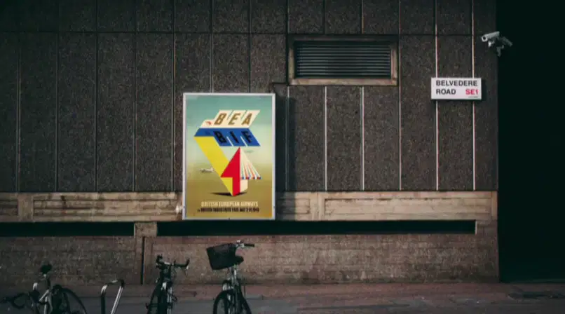
Based on the PPT, this image is most likely trying to talk about...
The consideration of designer
The consideration of ambience
The consideration of placement
The consideration of lighting

If a poster is placed outdoors, on a wall, on the street, or on a billboard, it may be seen fleetingly and thus require a design to be more impactful to work well to attract the eye from a ...
People
Environment
Love
Distance

A billboard is one of the examples of posters. What aspects should be considered to make it visible outdoors and attract people?
Large size elements
Higher color contrast
Busy content
Expensive vendor
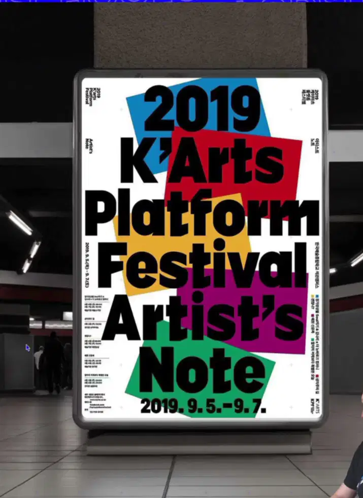
"If a poster is to be placed inside a studio, gallery, office, school space, or train station, then people may be able to spend more time observing it."
Do you agree with this statement?
Yes, sure!
Hmm most likely, yeah
I don't think so
Nah
Which design poster that uses simpler style?
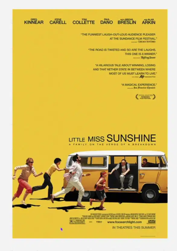

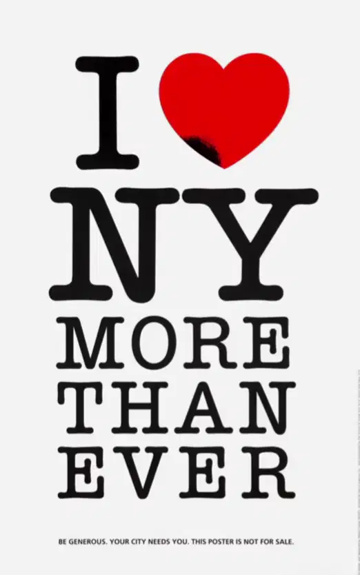
This poster could be categorized as a good poster. What do you think about the reason?
It is simple
use a clear typography
communicate a clear message
Eyecatching enough
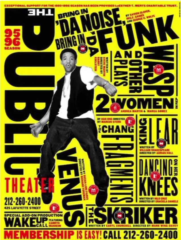
This poster could be categorized as a good poster. Could you explain the reason?
It attempts to use both image and type together to attract attention
It is a simple design
It serves a plain vibe
It communicates a message in a more visual way
"A good poster will elaborate its visual elements, where they don't compete against each other too much, working together to form a cohesive message."
This statement is most likely talking about ...
Ambience
Balance
Chance
Distance

Some posters utilize a combination of some elements to enhance a message and make an impact. What are those elements?
Image
Type
Shape
Color
Texture
The poster has a goal to create a specific impression. Among these poster below, please choose one that give the impression to you most

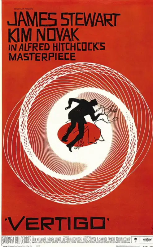



At the end of the day, you guys have learned that there are some key factors to make a good poster design. I believe you also already know about all those factors, which are ...
Clear sense of hierarchy
Consideration of placement
Dynamic use of type, image, shape, & form
Balance between the elements
Create a specific impression
After we reviewed the good poster design in general, let's continue to specific one about the good poster in product design.
First question, what should designers do to make some highlight to their product on a poster?
Showcase the product as the central focus
Emphasize unique selling point
Capture its design, material, etc flawlessly
Display the designer's potray in large size

These two points are categorized to ... aspect.
Typography matters
Consider the branding
Highlight the product visual appeal
Work on simplicity
A good poster has high-quality imagery. What should designers do to provide good-quality image stocks?
Use professional photographers
Use multiple angle up to showcase different aspects of the product
Use multiple close up to showcase different aspects of the product
Highlight details, textures, and finishes
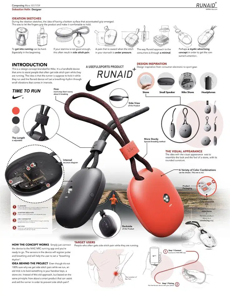
This poster could be categorized as a good poster because...
Good hierarchy
Good luck
Good designer
Good morning
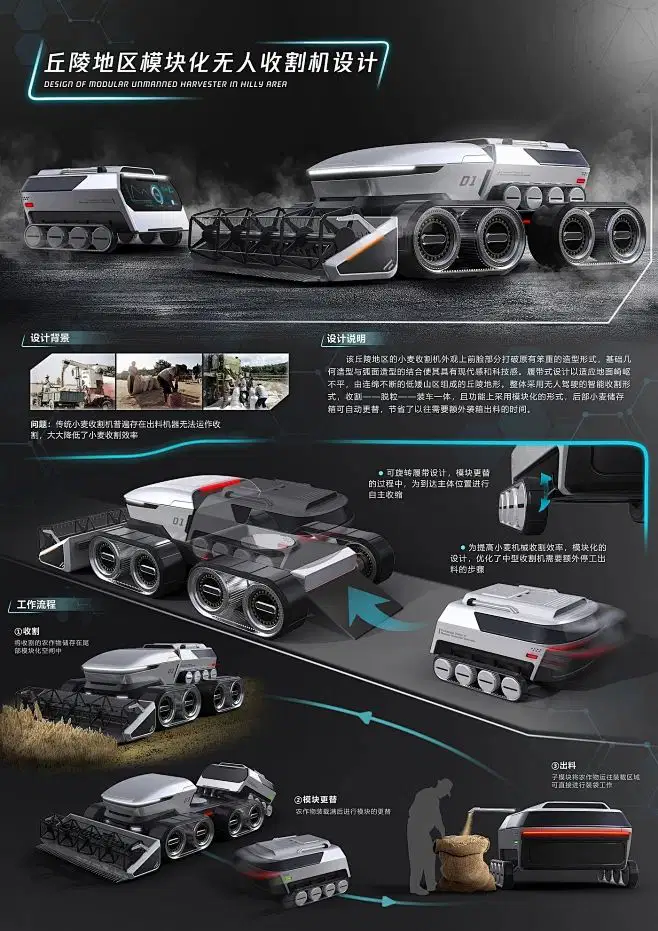
This poster could be categorized as a good poster because it is ...
Visually pleasing
Simple
Famous
Font Explosion
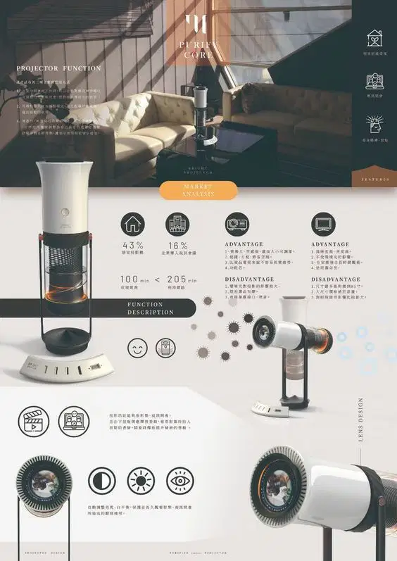
This poster could be categorized as a good poster because it is or has ...
Text Tsunami
Chaos
Visually pleasing
Font Explosion
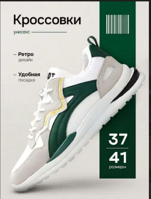
This poster could be categorized as a good poster because it is or has ...
Text Tsunami
Minimalist
Visually pleasing
Font Explosion

This poster could be categorized as a good poster because it has ...
Font Frenzy
Chaotic Flow
Clear Hierarchy
Color combination
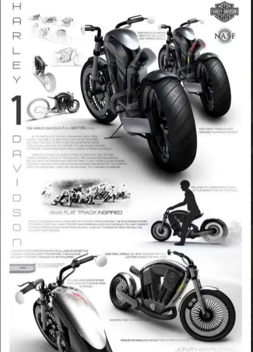
This poster could be categorized as a good poster because it has ...
Font Frenzy
Chaotic Flow
Clear Hierarchy
Color combination
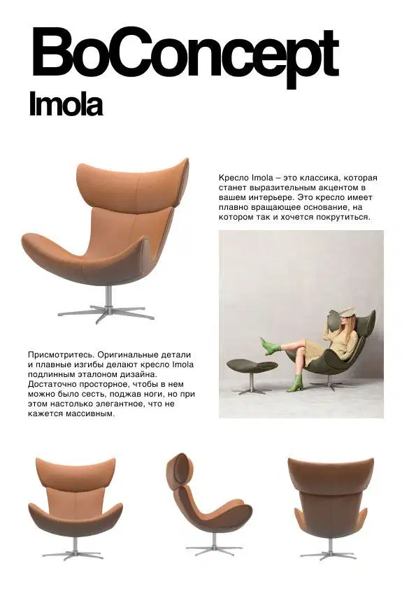
This poster could be categorized as a good poster because it is ...
Color Clash
Looked simple
Visual Headache
Font Explosion
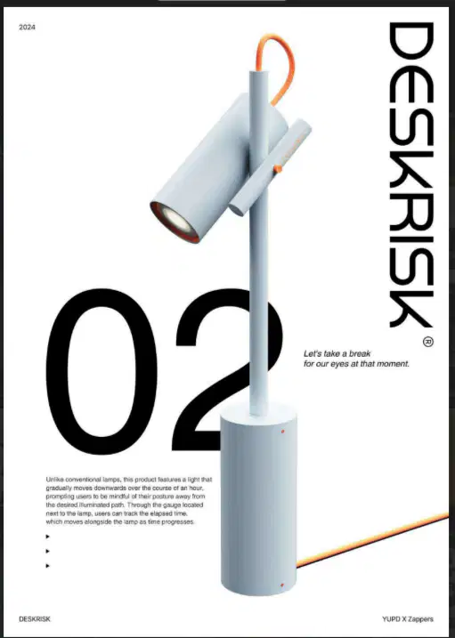
This poster could be categorized as a good poster because it is ...
Color Clash
Looked simple
Visual Headache
Font Explosion
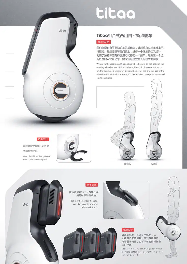
This poster could be categorized as a good poster because it is ...
Informative
Simple
Pleasing
Font Explosion
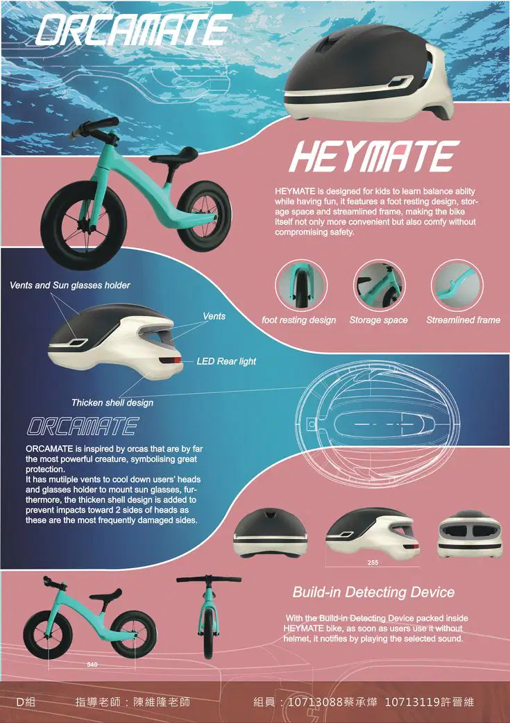
This poster could be improved by changing the ...
Designer
Color
Background
Faith

This poster could be improved by changing the ...
Brand
Paper Type
Text Composition
Situation

The course about good poster design for Tekpres Class was based on this guys's property. Thanks to him!
Anyway, who is this guy? :)
Gareth Gerwig
Gareth David
David Becham
David GatgetIn

