
 Worksheets
Graph and Chart
Total questions: 65
Worksheet time: 2hrs 2mins


How many more people like purple than red?
3
5
7
9


Look at the Bar Graph, "Student Grades". What grade did the most students get?
A
B
C
D
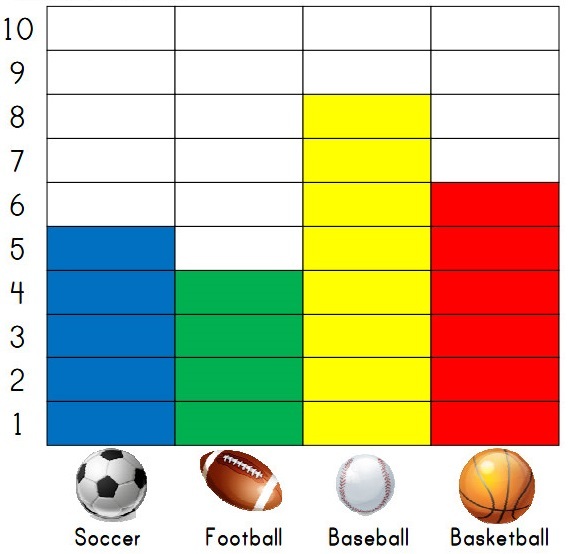

How many chickens does Nate have on his farm?
11
12
9
10

How many horses does Nate have on his farm?
4
3
2
5


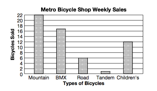
The graph shows the number of each type of bicycle sold in one week at the Metro Bicycle Shop. How many BMX bikes were sold?
22
28
17
6
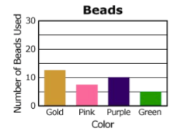
The graph shows the number of colored beads used to make a necklace. How many purple and green beads were used in all?
23
20
18
15

How many birthdays are there in December?
7
6
8
5

Which of these is NOT a cereal on the bar graph?
Kix
Cheerios
Life
Frosted Flakes

How many people prefer sausage on their pizza?
20
10
15
25
Which topping is NOT on this bar graph?
Pepperoni
Cheese
Mushrooms and olizes
Bacon
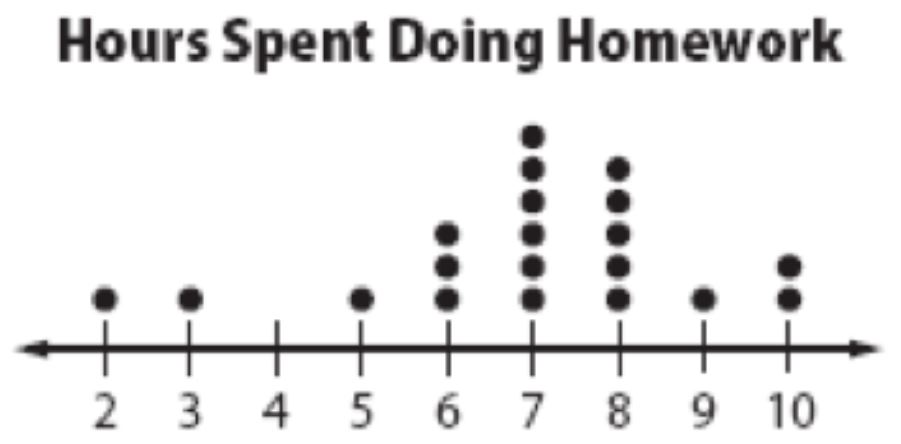

What is the title of this graph?
Number of people
Character
Favorite Cartoon Characters
Sponge Bob
How many people picked Dora as their favourite?
8
10
7
9

What topping is the most favorite?
Cheese
Pepperoni
Mushrooms
Bacon
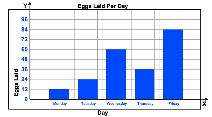
Did the number of eggs laid increase or decrease between Monday and Tuesday?
increase
decrease
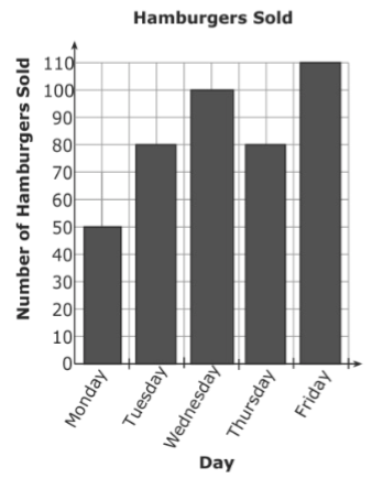
The bar graph shows the number of hamburgers sold at Bob’s Burger Shack. On which days were more than 80 hamburgers sold?
Wednesday and Friday
Tuesday and Thursday
Monday, Tuesday, and Thursday
Tuesday, Wednesday, Thursday, and Friday

The graph shows how employees at Disney World travel to work. How many employees ride bikes or walk to work?
300
450
225
175
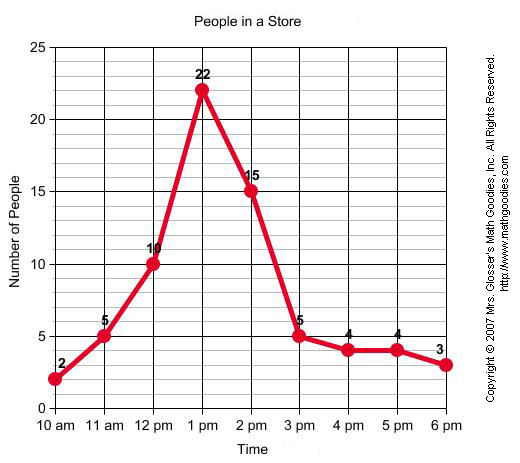
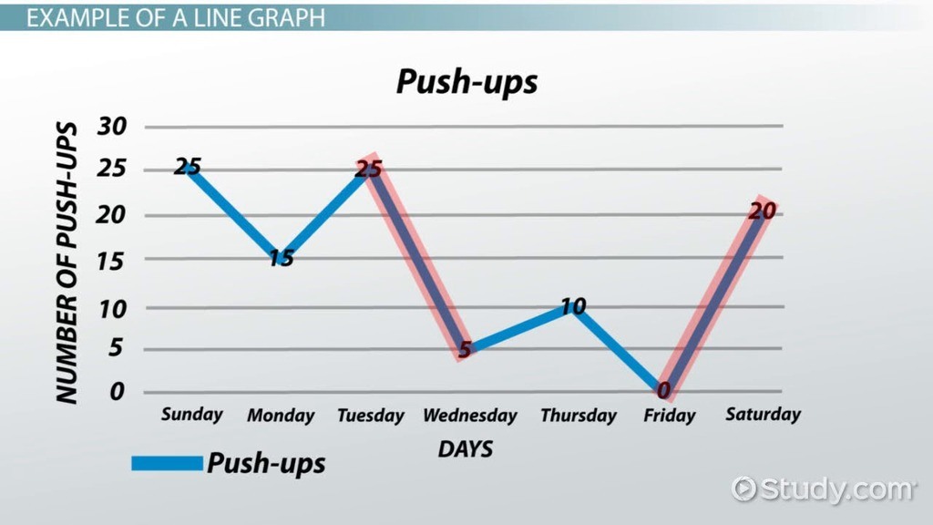
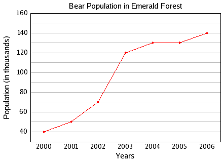
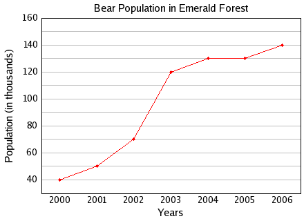
Between which two years did the bear population remain constant or the same?
2004 and 2005
2001 and 2002
2005 and 2006
2000 and 2001
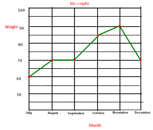
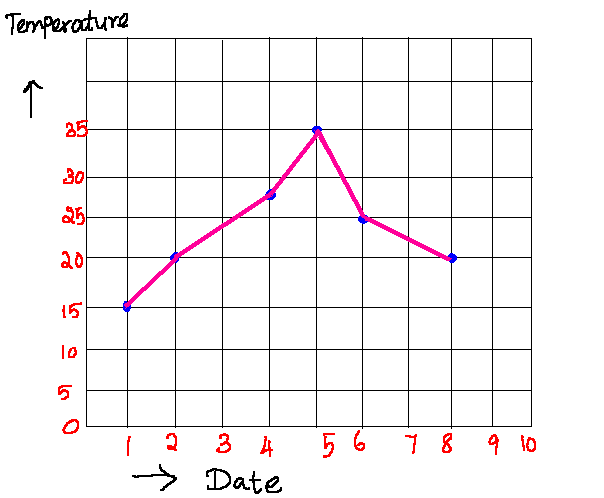
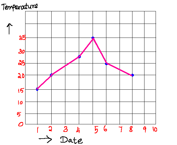
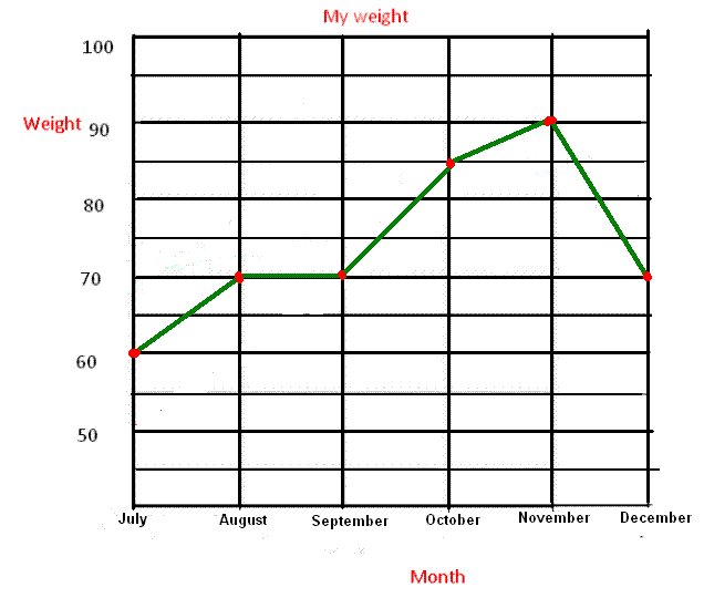
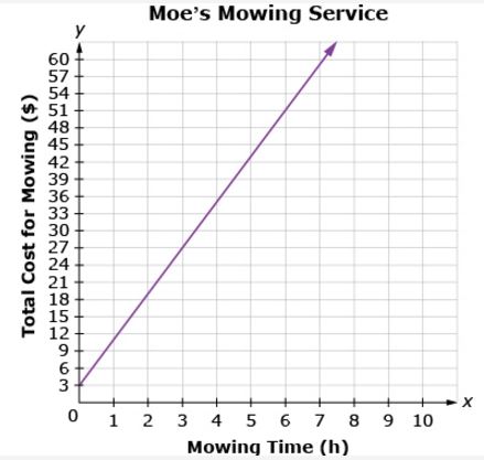
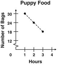
The number of bags of puppy food at a pet store decreases as the number of hours the store is open increases, as shown on the graph. At the fourth hour, how many bags of puppy food are left to sell?
10
12
15
18
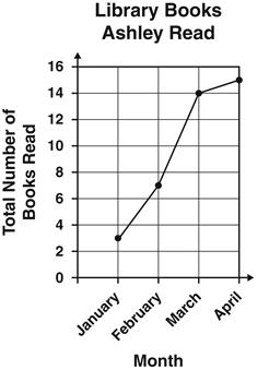
The graph below shows the total number of books Ashley had read by the end of each month for four months. During which month did Ashley read the fewest number of books?
January
February
March
April
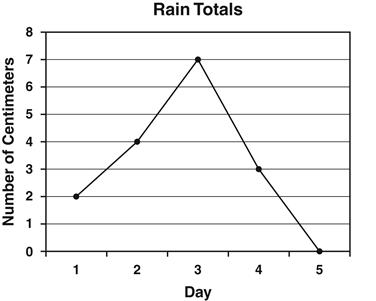
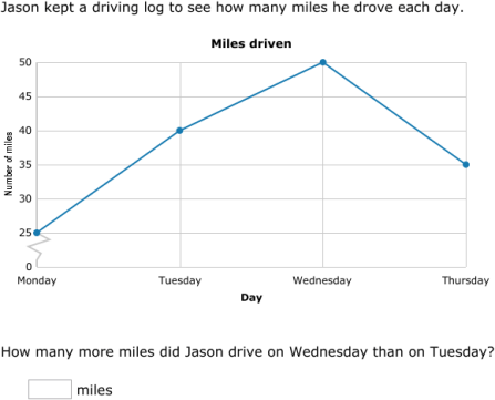
Annie recorded the amount of rain that fell each day. The results are shown in the line graph below. How many centimeters of rain fell on the third day?
2
3
4
7
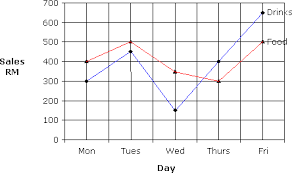
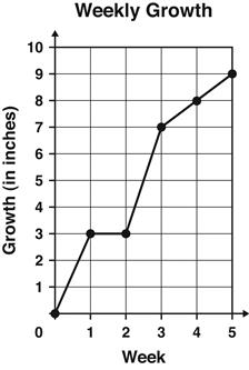
The graph shows the number of inches a plant grew each week.
Between which 2 weeks did the plant grow the MOST?
Week 1 and Week 2
Week 2 and Week 3
Week 3 and Week 4
Week 4 and Week 5
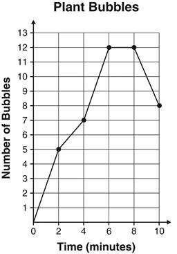
During an experiment, students counted the number of bubbles given off by water plants every 2 minutes during a 10-minute period. The results are graphed below.
At which two times were the same number of bubbles given off?
2 and 4 minutes
4 and 6 minutes
6 and 8 minutes
8 and 10 minutes

A restaurant recorded the number of pizzas sold each month for one year. The data are shown in the graph below. During which month did the restaurant sell 40 pizzas?
March
May
July
August

At what rate did the temperature decrease between the 20th and 25th minutes of the experiment?
10°C in 5 min
10°C in 10 min
5°C in 5 min
5°C in 10 min


The pie chart shows the percentage of boys in a class. What percentage of the class are girls?
42%
68%
58%
38%

The pie chart shows how pupils of River of Praise School travel to school. What percentage of the pupils travel to school by tricycle?
55%
65%
45%
25%
The pie chart shows how pupils of River of Praise School travel to school. What fraction of the pupils travel to school by motorcycle?
54
254
10016
508

The pie chart shows how Mr Yeo spends his monthly salary. Find the percentage for MEALS.
50%
20%
30%
25%

The pie chart shows the mother tongue languages of a class of students. Find the percentage for others.
10%
12%
20%
18%

the pie chart shows the different types of vehicles involved in road accidents in a city last years.
which type of vehicles had the highest number of road accidents last year?
Motorcycle
Cars
Good Vehicles
Buses

About 75% of the Earth's surface is covered by water while the remaining surface is covered by land. Find the percentage of land.
30%
100%
25%
20%

The pie chart shows how Mr Yeo spends his monthly salary. Given that Mr Yeo saves $840 a month, find the amount of money he spends on MEALS.
$600
$1000
$360
$240

The pie chart shows how Mr Yeo spends his monthly salary. Given that Mr Yeo saves $840 a month, find the amount of money he spends on RENT.
$240
$1000
$360
$840
Which month did the restaurant sell 40 pizzas?
March
May
July
August
How many centimeters of rain fell on the third day?
2
3
4
7

Which month had the biggest difference between the high and low temperatures?
January
April
October
November

Which hero was least popular?
Spiderman
Batman
The Hulk
Superman

What is name of the chart pictured below?
Line Graph
Pie Chart
Bar Graph
Line Plot

What is name of the chart pictured below?
Line Graph
Bar Graph
Pie Chart
Line Plot

What is name of the chart pictured below?
Line Graph
Pie Chart
Bar Graph
Line Plot

What is name of the chart pictured below?
Pictograph
Pie Chart
Tally Chart
Line Plot

What percent of people chose ski jumping?
10%
20%
15%
25%

