
 Worksheets
Fourth Quarter - .NET Technology
Total questions: 130
Worksheet time: 1hrs 10mins
Which of the following functionalities does the CSS transform property facilitate for elements?
Rotate, move, skew, and scale elements
Resize and reshape elements
Change element color
Which of the following best describes transformation?
An effect that modifies shape, size, and position
An effect that alters color and texture
A process that only changes shape
Which event typically triggers transforms for an element?
Mouse hover
Key press
Page load
Which types of transformation are supported in CSS3?
Both 2D and 3D transformation
Only 2D transformation
Only 3D transformation
Which direction are composite transforms applied when using transform functions?
Right to left
Left to right
Randomly
Only transformable elements can be transformed
true
false
Which statement accurately describes the numbering convention for CSS vendor prefixes?
Numbers followed by -webkit-, -moz-, or -o- indicate the first version that supported the prefix in respective browsers.
The numbers indicate the frequency of usage of the prefix across different browsers.
Numbers indicate the priority level assigned to the prefix by the browser engine.
Which of the following methods are available for 2D transformations using the CSS transform property? (Select all that applies)
translate3D()
rotateX()
scaleZ()
skewZ()
skew()
Which statement accurately describes the functionality of the translate() method in web development?
translate() repositions an element according to its current position, considering X-axis and Y-axis parameters. D) The translate() me
translate() shifts an element vertically and horizontally based on percentages relative to its parent container.
The translate() method relocates an element based on absolute coordinates provided.
Which statement accurately describes the rotate() method?
Rotation according to given degree.
Clockwise rotation only.
Counter-clockwise rotation only
Which statement accurately describes the effect of using negative values with the rotate() method?
Rotates clockwise
Rotates counterclockwise
Rotates unpredictably
What does the scale() method primarily do?
Adjusts size based on parameters.
Changes dimensions independently.
Increases size proportionally.
Which CSS behavior is observed when using values less than 1?
Decreases <div> element
Expands <div> element
Preserves <div> element size
What does the scaleX() method primarily alter?
Width
Height
Rotation
What does the scaleY() method primarily control?
Height of an element.
Rotation of an element.
Width of an element.
Which statement best describes the action of the skewX() method?
Skews an element along the X-axis.
Rotates an element along the X-axis.
Scales an element along the X-axis.
Which statement best describes the action of the skewY() method?
Skews an element along the Y-axis.
Rotates an element along the Y-axis.
Scales an element along the Y-axis.
Which statement accurately describes the skew() method?
Skews along X and Y-axis by given angles
Translates
Rotates
Which method combines all 2D transform methods into one?
matrix()
translate()
scale()
Which statement best describes the matrix() method?
It takes six parameters, enabling rotation, scaling, translation, and skewing of elements.
It accepts four parameters, facilitating rotation, scaling, and translation of elements.
It requires eight parameters, enabling precise transformation of elements.
What parameters are utilized in the matrix() function?
scaleX, skewY, skewX, scaleY, translateX, translateY
rotateX, rotateY, scaleX, scaleY, translateX, translateY
skewX, skewY, translateX, translateY
CSS also supports 3D transformations..
true
false
Which of the following are 2D transformation methods you can use with CSS transform property?
rotateX()
rotateX()
rotateZ()
rotateA()
Which of the following accurately describes the behavior of the rotateX() method?
Rotates an element around its X-axis.
Rotates an element around its Y-axis.
Rotates an element around its Z-axis.
Which of the following accurately describes the behavior of the rotateY() method?
Rotates an element around its X-axis.
Rotates an element around its Y-axis.
Rotates an element around its Z-axis.
Which of the following accurately describes the behavior of the rotateZ() method?
Rotates an element around its X-axis.
Rotates an element around its Y-axis.
Rotates an element around its Z-axis.
It applies a 2D or 3D transformation to an element.
transform
transform-origin
transform-style
It allows you to change the position on transformed elements
transform
transform-origin
transform-style
It specifies how nested elements are rendered in 3D space
transform
transform-origin
transform-style
It specifies the perspective on how 3D elements are viewed
perspective
perspective-origin
backface-visibility
It specifies the bottom position of 3D elements
perspective
perspective-origin
backface-visibility
It defines whether an element should be visible when not facing screen
perspective
perspective-origin
backface-visibility
It defines a 2D transformation, using a matrix of six values.
matrix(n,n,n,n,n,n)
translate(x,y)
translateX(n)
It defines a 2D translation, moving element along the X- & Y-axis
matrix(n,n,n,n,n,n)
translate(x,y)
translateX(n)
It defines a 2D translation, moving the element along the X-axis
matrix(n,n,n,n,n,n)
translate(x,y)
translateX(n)
It defines a 2D translation, moving the element along the Y-axis
translateY(n)
scale(x,y)
scaleX(n)
It defines a 2D scale transform, changing elements width & height
translateY(n)
scale(x,y)
scaleX(n)
It defines a 2D scale transformation, changing the element's width
translateY(n)
scale(x,y)
scaleX(n)
It defines a 2D scale transformation, changing the element's height
scaleY(n)
rotate(angle)
skew(x-angle,y-angle)
It defines a 2D rotation, the angle is specified in the parameter
scaleY(n)
rotate(angle)
skew(x-angle,y-angle)
It defines a 2D skew transformation along the X- and the Y-axis
scaleY(n)
rotate(angle)
skew(x-angle,y-angle)
It defines a 2D skew transformation along the X-axis
skewX(angle)
rotate(angle)
skew(x-angle,y-angle)
It defines a 2D skew transformation along the Y-axis
skewY(angle)
rotate(angle)
skew(x-angle,y-angle)
It defines a 3D transformation, using a 4x4 matrix of 16 values
matrix3d (n,n,n,n,n,n,n,n,n, n,n,n,n,n,n,n)
translateX(x)
translateX(y)
It defines a 3D translation
translate3d(x,y,z)
translateX(x)
translateX(y)
It defines a 3D translation, using only the value for the X-axis
translate3d(x,y,z)
translateX(x)
translateX(y)
It defines a 3D translation, using only the value for the Y-axis
translateX(z)
translateX(x)
translateX(y)
It defines a 3D translation, using only the value for the Z-axis
translateX(z)
translateX(x)
translateX(y)
It defines a 3D scale transformation
scale3d(x,y,z)
scaleX(x)
scaleY(y)
scaleZ(z)
It defines a 3D scale transformation by giving a value for the X-axis.
scale3d(x,y,z)
scaleX(x)
scaleY(y)
scaleZ(z)
It defines a 3D scale transformation by giving a value for the Y-axis.
scale3d(x,y,z)
scaleX(x)
scaleY(y)
scaleZ(z)
It defines a 3D scale transformation by giving a value for the Z-axis.
scale3d(x,y,z)
scaleX(x)
scaleY(y)
scaleZ(z)
It defines a 3D rotation
rotation3d(x,y,z)
rotateX(angle)
rotateY(angle)
scaleZ(angle)
It defines a 3D rotation along the X-axis
rotation3d(x,y,z)
rotateX(angle)
rotateY(angle)
rotateZ(angle)
It defines a 3D rotation along the Y-axis
rotation3d(x,y,z)
rotateX(angle)
rotateY(angle)
rotateZ(angle)
It defines a 3D rotation along the Z-axis
rotation3d(x,y,z)
rotateX(angle)
rotateY(angle)
rotateZ(angle)
It defines a perspective view for a 3D transformed element
rotation3d(x,y,z)
rotateX(angle)
rotateY(angle)
perspective(n)
Which statement accurately describes the function of CSS transitions?
CSS transitions enable control over animation speed.
CSS transitions manage layout changes.
CSS transitions determine color schemes.
What term describes animations transitioning between two states implicitly defined by the browser?
Implicit transitions
Explicit transitions
Dynamic animations
Which aspect(s) of CSS transitions can be controlled by developers?
Properties, delay, duration, and timing.
Properties to animate, start time, duration, and transition method.
Animation list, delay, time, and method.
What is required to create a transition effect in CSS?
Both the CSS property and the duration
Only the CSS property
Only the duration
If the duration part is not specified, the transition will have no effect, because the default value is 0.
true
false
It specifies transition effect for the width property, with a duration of 2 seconds:
transition: width 2s;
transition: width 2sec;
transition: width 2seconds;
The transitions should be applied to the width.
transition-property: width
transition: width
transition-duration: width
It adds a transition effect for both the width and height property, with a duration of 2 seconds for the width and 4 seconds for the height
transition: width 2s, height 4s;
transition: height 4s, width 2s;
transition: width 2sec, height 4sec;
A shorthand property for setting the four transition properties into a single property
transition
transition-delay
transition-duration
transition-property
transition-timing-function
It specifies a delay (in seconds) for the transition effect
transition
transition-delay
transition-duration
transition-property
transition-timing-function
It specifies how many seconds or milliseconds a transition effect takes to complete
transition
transition-delay
transition-duration
transition-property
transition-timing-function
It specifies the property the transition effect is for
transition
transition-delay
transition-duration
transition-property
transition-timing-function
It specifies the speed curve of the transition effect
transition
transition-delay
transition-duration
transition-property
transition-timing-function
It specifies a transition effect with a slow start, then fast, then end slowly (this is default)
ease
linear
ease-in
ease-out
ease-in-out
It specifies a transition effect with the same speed from start to end
ease
linear
ease-in
ease-out
ease-in-out
It specifies a transition effect with a slow start
ease
linear
ease-in
ease-out
ease-in-out
It lets you define your own values in a cubic-bezier function
cubic-bezier(n,n,n,n)
linear
ease-in
ease-out
ease-in-out
It specifies a transition effect with a slow end
ease
linear
ease-in
ease-out
ease-in-out
It specifies a transition effect with a slow start and end
ease
linear
ease-in
ease-out
ease-in-out
The animation-fill-mode property which is default value
none
forwards
backwards
both
The animation-fill-mode property in which is the element will retain the style values that is set by the last keyframe (depends on animation-direction and animation-iteration-count)
none
forwards
backwards
both
The animation-fill-mode property in which the element will get the style values that is set by the first keyframe (depends on animation-direction), and retain this during the animation-delay period
none
forwards
backwards
both
The animation-fill-mode property in which the animation will follow the rules for both forwards and backwards, extending the animation properties in both directions
none
forwards
backwards
both
Which of the following statements accurately describes an animation?
Animation transitions an element's style gradually.
Animation only changes an element's style abruptly.
Animation only changes an element's style abruptly.
Which components constitute a CSS animation?
Both CSS animation style definition and keyframes defining start and end states.
Only keyframes defining start and end states.
Only a collection of intermediate waypoints.
What is the initial step required to utilize CSS animation?
Define keyframes
Apply styles
Import libraries
Which statement accurately describes the purpose of keyframes in CSS animation?
Keyframes define element styles at different time points.
Keyframes specify element styles at various time intervals.
Keyframes determine element movements over time.
Which of the following is NOT an advantage of CSS animations over conventional script-driven animation techniques?
Requires knowledge of JavaScript for implementation.
Smooth performance even under moderate device load.
Simplified usage without the need for JavaScript.
Improved performance and reliability through browser monitoring.
It specifies the name of the keyframe you want to bind to the selector
animation-name
animation-duration
animation-timing-function
animation-delay
It specifies how many seconds or milliseconds an animation takes to complete
animation-name
animation-duration
animation-timing-function
animation-delay
It specifies the speed curve of the animation
animation-name
animation-duration
animation-timing-function
animation-delay
It specifies a delay before the animation will start
animation-name
animation-duration
animation-timing-function
animation-delay
It specifies how many times an animation should be played
animation-iteration-count
animation-direction
animation-fill-mode
animation-play-state
It specifies whether or not the animation should play in reverse on alternate cycles
animation-iteration-count
animation-direction
animation-fill-mode
animation-play-state
It specifies what values are applied by the animation outside the time it is executing
animation-iteration-count
animation-direction
animation-fill-mode
animation-play-state
It specifies whether the animation is running or paused
animation-iteration-count
animation-direction
animation-fill-mode
animation-play-state
What does a <percentage> signify in keyframes for animations?
Time during animation
Frame rate indicator
Duration of each keyframe
Which percentage represents the initial moment and final state of an animation sequence?
0% for initial, 100% for final.
50% for initial, 100% for final.
0% for initial, 50% for final.
What value can be used to make an animation continue indefinitely?
infinite
continuous
forever
The animation is played as normal (forwards). This is default
normal
reverse
alternate
alternate-reverse
The animation is played in reverse direction (backwards)
normal
reverse
alternate
alternate-reverse
The animation is played forwards first, then backwards
normal
reverse
alternate
alternate-reverse
The animation is played backwards first, then forwards
normal
reverse
alternate
alternate-reverse
Which of the following ways is the correct form of @keyframes example1?
@keyframes example1 {
from {top: 0px;}
to {top: 200px; background-color: blue;}
}
@keyframes example1 {
from {top: 0px;}
}
None of the above
What are the different values for animation-timing function?
ease, ease-in, ease-out, ease-out-in, non-linear
linear, ease, ease-in, ease-out, ease-in-out
linear-in, ease-out, ease-in-out, linear-out, linear
ease, ease-in,ease-out, ease-in-out, ease-linear
John wants to start his animation after a few seconds. Recommend an appropriate property to him?
delay-time
animation-delay
animation-time
delay-animation
John wants to set the animation-direction as alternate-reverse, what value can he give for the property animation-iteration-count ?
50
10
Both a & b
None of the above
John wants his animation to run forever, which property with its value will you suggest to him?
animation-iteration-count:infinite
animation-duration:forever
animation-duration:infinite
animation-iteration-count:forever
The property which is binded with @keyframes is?
animation
animation-duration
animation-name
element-name
Q. Which of the following is an invalid value for animation duration?
2.6ms
5s
1000ms
1m
How can you define a CSS animation using keyframes?
(a) {
}
div { width: 100px; height: 100px; position: relative; background-color: red; animation-name: example; animation-duration: 4s; animation-iteration-count: 3;}
In the example above, the animation will repeat ___
every 4 seconds
every 3 seconds
3 times
4 times
In CSS, It is the punctuation mark that we have to use at the end of every row once the property has been entered.
;
:
.
,
How can you repeat an animation infinitely?
animation-iteration-count: infinite
animation-play: infinite
animation-loop: true
animation-repeat: infinite
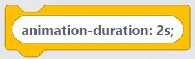
Which block that will make the animation starts slow, accelerates, and then slows down towards the end?



Which CSS property is used to apply animations to an element?
"display"
"margin"
"animation"
"border"
How do you define the duration of an animation in CSS?
"animation-time"
"animation-duration"
"transition-duration"
"duration"
What is the purpose of keyframe animations in CSS?
The purpose of keyframe animations in CSS is to create smooth and dynamic animations with more control and customization.
Keyframe animations in CSS are used to add text effects to web pages.
Keyframe animations in CSS are used to create static and unchanging animations.
Keyframe animations in CSS are used to make web pages load faster.
What is the purpose of transition animations in CSS?
The purpose of transition animations in CSS is to organize and structure the HTML code.
The purpose of transition animations in CSS is to improve website loading speed.
The purpose of transition animations in CSS is to make elements disappear and reappear.
The purpose of transition animations in CSS is to enhance the user experience and add visual effects to elements.
Which CSS property is used to apply a 2D or 3D transformation to an element?
position
animation
transition
transform
What are some common CSS animation properties?
animation-name, animation-duration, animation-timing-function, animation-delay, animation-iteration-count, animation-direction, animation-fill-mode
animation-name, animation-duration, animation-timing-function, animation-iteration-count, animation-direction, animation-fill-mode, animation-play-state
animation-duration, animation-timing-function, animation-delay, animation-iteration-count, animation-direction, animation-fill-mode, animation-play-state
animation-play-state, animation-fill-mode, animation-iteration-count, animation-direction, animation-timing-function, animation-delay, animation-name
Which on is the right property for moving box 300px from top to bottom side ?
from {top:0px;}
to {top:300px;}
from {left:0px;}
to {left:300px;}
from {right:0px;}
to {right:300px;}
Which on is the right property for moving box 300px from left to right side ?
from {left:0px;} to {left:300px;}
from {left:300px;} to {left:0px;}
from {right:0px;} to {right:300px;}
Which property can help me if I want to start my animation after few seconds?
animation-delay:3s;
delay: 3s;
animation: 3s;
Which one is the correct Property for giving time duration of the animation ?
animation-duration:3s;
animation: 3s;
duration: 3s;
How to rotate objects using CSS3?
object-rotation: 30deg;
transform: rotate(30deg);
rotate-object: 30deg;
Which prefix do you need to get CSS3 properties to work on older Mozilla Firefox browsers?
-webkit-
-moz-
-gecko-
In the following code, what effect does the ease value have on the animation?
div { animation-duration: 3s;
animation-delay: 0s;
animation-timing-function: ease; }
div:hover { animation-name: fadeout; }
starts slow then increases the speed of the animation and then slows it down toward the end
decreases the speed of the animation and then speeds it up toward the end
starts the animation at a slow speed and then maintains a steady speed for the duration of the animation
You want to turn an element 30 degrees in the 2D plane. What code do you use?
transform: rotate(30deg)
transform: skewX(30deg)
transform: translate(30deg,30deg)

