
 Worksheets
Design Principles Quiz
Total questions: 20
Worksheet time: 10mins
What is one way to create contrast in a design?
Using similar colors
Using elements like color, tone, and size
Placing elements far apart
Repeating patterns
What does repetition in design help to establish?
Randomness
Cohesiveness/togetherness
Disorganization/messy
Complexity
Which principle of design involves visually connecting every element to another?
Contrast
Repetition
Alignment
Proximity
What does proper alignment in design prevent?
Visual unity
Elements feeling out of place
Consistency
Repetition
What does proximity in design help to minimize?
Visual clutter
Color contrast
Pattern repetition
Element alignment
Which design principle involves using a dotted border or specific typography repeatedly?
Contrast
Alignment
Repetition
Proximity
What is the main purpose of using contrast in design?
To make elements look similar
To allow the viewer's eye to flow naturally
To create visual clutter
To disconnect elements
Which principle of design is described as establishing a style for each element and using it on similar elements?
Contrast
Repetition
Alignment
Proximity
What does proximity in design emphasize?
Disorganization
Randomness
Organization
Complexity
Which principle of design helps to increase viewer comprehension?
Contrast
Repetition
Alignment
Proximity
What is the effect of good alignment in design?
Elements feel disconnected
Elements are visually connected
Elements are randomly placed
Elements are cluttered
Which principle of design involves placing related elements close to each other?
Contrast
Repetition
Alignment
Proximity
What is a key aspect of creating contrast in design?
Using the same size for all elements
Using different directions
Using similar shapes
Using the same tone
What does repetition in design help to establish besides cohesiveness?
Randomness
Consistency
Disconnection
Complexity
What is the result of placing proximity icons on the opposite side of a document?
Increased visual unity
Increased visual clutter
Improved organization
Enhanced viewer comprehension

Google uses _______, which makes the with the two button at the bottom feel connected.
Proximity
Contrast
Shapes
Alignment

The two buttons have a different value, showing _____, which makes them stand out form the page.
repetition
contrast
value
buttons

What 2 principles of design are used incorrectly here?
Alignment
repetition
proximity
contrast

Apple uses _______ in their top menu so the items feel visually connected because they are in an even line.
proximity
alignment
repetition
shape
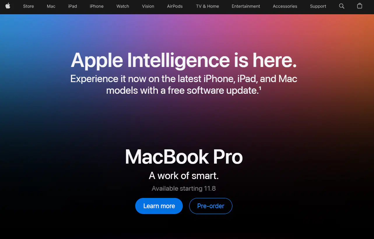
Apple has used _____ with the "Learn More" button so that it stands out and draws more attention.
alignment
proximity
contrast
shape

