
 Worksheets
Module 2 Session 2: Data Displays (Graphs & Plots)
Total questions: 34
Worksheet time: 3hrs 50mins

The circle graph shows the breakdown of US energy consumption for one calendar year (2010). The total energy used was 98 quadrillion Btu (a quadrillion is 10^15). How many quadrillion Btu of energy were consumed in 2010 from renewable energy sources?
7.84
20.09
78.4
98
The circle graph shows the breakdown of US energy consumption for one calendar year (2012). The total energy used was 95 quadrillion Btu (a quadrillion is 10^15). How many quadrillion Btu of energy were consumed in 2012 from coal?
2 quadrillion Btu
5 quadrillion Btu
20 quadrillion Btu
45 quadrillion Btu

Gina worked out a monthly expenses budget plan, and she created the circle graph shown below. Her income is $2,400 per month. What percentage of Gina's income does she spend on food?
12%
24%
50%
576%
Gina worked out a monthly expenses budget plan, and she created the circle graph shown below. Her income is $2,400 per month, but she recently found out her income is going to decrease by $200. She still wants the same percentage of her income to go to savings, how much will she contribute to savings each month?
$200
$220
$240
$260
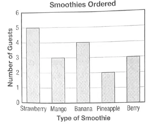
A caterer serves smoothies to the guests at a party. The numbers and types of smoothies ordered by the first 17 guests is shown in the bar graph below. Approximately what percentage of the guests chose a strawberry, mango, banana, or pineapple smoothie?
12%
18%
29%
82%

See the graph shown. Based on these data, estimate the number of strawberry smoothies ordered by the next 10 guests.
1
3
5
10

The annual energy bill for a typical single US home in 2009 was approximately $2,200. The breakdown of the energy costs is shown in the bar graph pictured. What is the percentage of the cost of heating and cooling a typical home, not including water heating?
14%
17%
29%
46%
The annual energy bill for a typical single US home in 2009 was approximately $2,200. The breakdown of the energy costs is shown in the bar graph pictured. Based on these data, estimate the cost for heating a typical home if the annual energy cost is $2,500.
$350
$638
$725
$1150
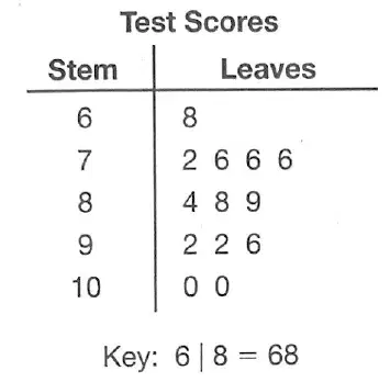
What is the median test score of the data shown in the stem-and-leaf plot?
86
84
88
92
What is the range in the test scores shown in the stem-and-leaf plot?
8
14
28
32
What is the mode of the test scores shown in the stem-and-leaf plot?
76
88
92
100

The box-and-whisker plot pictured shows the number of points scored by the Rams. What was the least number of points the Rams scored?
12
14
18
45
The box-and-whisker plot pictured shows the number of points scored by the Rams. What was the greatest number of points the Rams scored?
18
25
30
45
The box-and-whisker plot pictured shows the number of points scored by the Rams. What was the median number of points the Rams scored?
18
25
30
45
The box-and-whisker plot pictured shows the number of points scored by the Rams. In what percent of the games did the Rams score between 18 and 30 points?
25%
50%
75%
100%
The box-and-whisker plot pictured shows the number of points scored by the Rams. What is the interquartile range?
12
14
25
45

The scatter plot pictured shows the number of goals scored by the Lions and Tigers in their soccer games. The team that scored the most goals wins. Which shows the results of the series between the Tigers and the Lions?
Tigers 5 wins, Lions 4 wins
Lions 5 wins, Tigers 4 wins
Tigers 4 wins, Lions 4 wins, 1 tie
Tigers 5 wins, Lions 3 wins, 1 tie
The scatter plot pictured shows the number of goals scored by the Lions and Tigers in their soccer games. The team that scored the most goals wins. What does the number 7 represent for the Lions?
range
median only
mode only
median and mode, with no other modes

The double-line graph below shows the number of visitors that both the Science and History museums have had each year since 2006. If the pattern continues, how many more visitors will the History Museum have than the Science Museum in 2011?
2,000
4,000
5,000
10,000
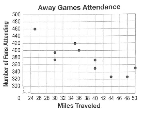
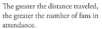
The scatter plot shows the relationship between the number of miles a girls' basketball team has to travel for its away games and the number of fans from school that come to the games. Which describes the relationship between the miles traveled and the number of fans from school?
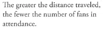

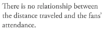
The scatter plot shows the relationship between the number of miles a girls' basketball team has to travel for its away games and the number of fans from school that come to the games. About how many fans attended the game when the team traveled 35 miles?
395
400
420
435

The scatter plot shows the number of calories in various amounts of blueberries. Based on the line of best fit, what is a good estimate of the number of calories in 1 pint (16 ounces) of blueberries?
200 calories
180 calories
160 calories
140 calories

The double-line graph pictured displays the high and low temperature each day for a week. What is the difference, in degrees Fahrenheit, between the median high and median low daily temperatures?
9
10
11
12

The dose size for a particular sheep medication versus the sheep's mass is shown in the scatter plot. What dose should be given to a sheep whose mass is 100 kg?
16 ml
17 ml
19 ml
20 ml
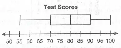
Mr. Kim recorded the test scores for his math class, and he displayed the data in the box-and-whisker plot shown below. About what percent of the students in Mr. Kim's class received a score greater than or equal to 90 on the test?
10%
15%
25%
45%
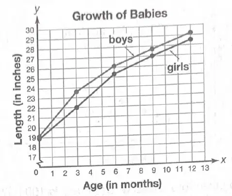
The line graph shows the lengths of male and female babies compared to their ages. Based on the graph, what is the difference in lengths of boys and girls at 2 months of age?
0.5 in
1.5 in
1.0 in
2.0 in

The average reading rate for several grade levels is shown in the scatter plot. Using a line of best fit for the data, at what rate would you expect a twelfth grader to read?
230 words per minute
235 words per minute
240 words per minute
245 words per minute

Shown is a scatter plot of the number of calories in different types of fruit versus grams of sugar. Which statement best describes the general trend of these data?
As the number of calories increases, the number of grams of sugar decreases.
As the number of calories increases, the number of grams of sugar increases.
The grams of sugar remain constant as the number of calories increases.
There is no correlation between the number of calories and the grams of sugar.

Mindy took a poll of her classmates to find out the type of movie each student likes best. The results are shown in the bar graph pictured. Mindy decides to expand her survey to another 80 students. Based on the data, what number of students should Mindy expect to say that they prefer documentaries?
7
10
13
17

The line graph shows the average price of a gallon of gas over the course of several weeks for the West Coast and the East Coast. During which week was the difference in price the greatest?
Week 2
Week 3
Week 8
Week 10
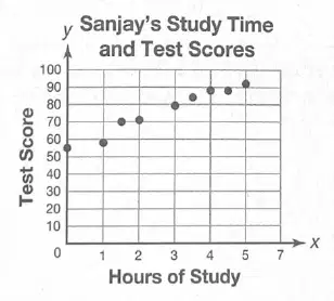
During the school year, Sanjay recorded the number of hours he studied for each math exam and the score he received. The results are pictured in the scatter plot. Based on these data, approximately how many hours would Sanjay need to study if he would like a score of 100 on his next math exam?
4
6
8
9

The manager at a school cafeteria kept track of the number of each of four types of fruit that students purchased in one day. She recorded these data on the bar graph pictured. An additional 50 students did not purchase fruit. If 300 students are in the cafeteria on another day, about how many would be expected to buy oranges, based on these results?
30
35
60
75
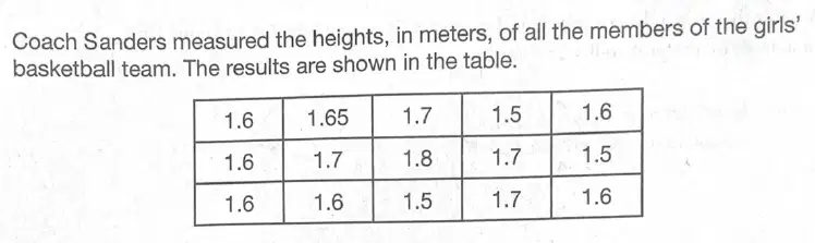
What is the interquartile range of the data pictured?
0.1 m
0.3 m
1.6 m
1.7 m

The circle graph pictured shows Kawika's monthly budget. He makes $1,800 per month. About what percent of his monthly income does he spend on rent and utilities?
7%
41%
34%
51%

