

Wayground logo

Free Printable Worksheets

Font size

S
M
L
XL
Worksheets

Bivariate Statistics

Total questions: 27

Worksheet time: 41mins

Name
Class
Date
1.

A study compared the number of cars a person owns and that person’s average yearly salary. It was determined that the relationship between these two quantities was linear and the correlation was 0.37. Which conclusion can be made on the findings of this study?

a)

There was a weak relationship.

b)

There was a strong relationship.

c)

There was no relationship.

d)

Unpredictable.

2.

Which value of r represents data with a strong negative linear correlation between two variables?

a)

-0.86

b)

-0.50

c)

0.89

d)

0.07

3.

What is another way to say regression line?

a)

Histogram

b)

Boxplot

c)

Line of best fit

d)

Scatterplot

4.

Scatterplots

a)

Are the line of best fit.

b)

Are a numerical measure of the direction and strength of a linear association.

c)

Show the relationship between two quantitative variables measured on the same cases.

d)

Are a point that doesn’t fit the overall pattern.

5.

Correlation coefficients are:

a)

A point that does not fit the overall pattern.

b)

A histogram.

c)

A numerical measure of the direction and strength of a linear association.

d)

A graphical display.

6.

Which correlation coefficient shows the strongest linear relationship between x and y?

a)

0.97

b)

-0.02

c)

0.86

d)

-0.99

7.

A linear regression equation of best fit between how often someone runs and their weight (in kg) is w = 90.21 - 1.14r. The correlation coefficient would be

a)

0<r<1

b)

-1<r<0

c)

r=1

d)

r=-1

8.

Which value of r represents data with a strong positive linear correlation between two variables?

a)

-1.07

b)

1.04

c)

0.86

d)

0.48

9.

The relationship between a, a person’s age, and p, the amount of pets they’ve had, is modeled by the equation p = 0.01a + 4.3. Based on the linear regression model, the correlation coefficient could be:

a)

Between -1 and 0

b)

Between 0 and 1

c)

Equal to 0

d)

Equal to -1

10.
What type of correlation (association)?
The outside temperature and the amount of layers you wear. 
a)
Positive correlation
b)
Negative correlation
c)
No correlation
11.
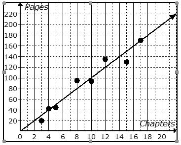
The scatter plot shows the relationship between the number of chapters and the total number of pages for several books.  Use the trend line to predict how many chapters would be in a book with 180 pages. 
a)
12 chapters
b)
15 chapters
c)
18 chapters
d)
21 chapters
12.
a)
A
b)
B
c)
C
d)
D
13.
What relationship is shown in the scatter plot?
a)
As the cost goes down, the number sold goes down.
b)
As the cost goes up, the number sold goes down.
c)
As the cost goes down, the number sold remains the same.
d)
There is not relationship between cost and the number sold.
14.
A keyboarding instructor at a community college collected data comparing a student's age and their typing speed. The equation for the line of best fit is given as:
y = -1.4x + 117.8
If you are 25 years of age (x), what is your typing speed (y)?
a)
153 words per minute
b)
83 words per minute
c)
63 words per minute
d)
102 words per minute
15.
a)
A) y = 1.4x + 55
b)
B) y = 1.4x - 84
c)
C) y = 0.72x + 60
d)
D) y = 0.72x + 56
16.
a)
A) y = 1.4x + 55
b)
B) y = 1.4x - 84
c)
C) y = 0.72x + 60
d)
D) y = 0.72x + 56
17.

Which scatter plot could have a trend line whose equation is y hat= 3x + 10?

a)

A

b)

B

c)

C

d)

D

18.
Which scatter plot shows a linear relationship between x and y?
a)
Graph A
b)
Graph B
c)
Graph C
d)
Graph D
19.

The scatter plot shows the number coffee shops in different cities and the number of violent crimes. Which of the following is NOT true?

a)

A) As the number of coffee shops increase, violent crimes appears to increase.

b)

B) The line of best fit (regression line) shows a positive correlation

c)

C) The data has a positive correlation coefficient

d)

D) An increase in coffee shops causes an increase in violent crimes

20.
Rank these scatter plots according to the intensity of the correlation represented, from weakest to strongest.
a)
1, 2, 3, 4
b)
2, 4, 3, 1
c)
4, 3, 2, 1
d)
1, 3, 4, 2
21.
a)
This residual graph represents a linear fit.
b)
This graph represents a nonlinear fit.
c)
This residual graph represents no fit.
22.
a)
This residual plot represents a linear fit.
b)
This residual plot represents a nonlinear fit.
c)
This residual plot represents no fit.
23.
How do you calculate a residual?
a)
Observed - Predicted
b)
Predicted - Observed
24.
Shown is a residual plot. Would a linear regression model of the data be most appropriate?
a)
YES
b)
NO
25.
After performing analyses on a set of data, Mrs. Schoeneck examined the scatter plot of the residual values for each analysis. Which scatter plot indicated the best linear fit for the data?
a)
A
b)
B
c)
C
26.
Shown is a residual plot. Would a linear regression model of the data be most appropriate?
a)
YES
b)
NO
27.
Estimate the correlation coefficient.
a)
r = -0.8
b)
r = -0.5
c)
r = 0.5
d)
r = 0.8
