
 Worksheets
Types of Graphs Review
Total questions: 27
Worksheet time: 1hrs 10mins

Name the type of graph.
pie chart
tally chart
pictograph
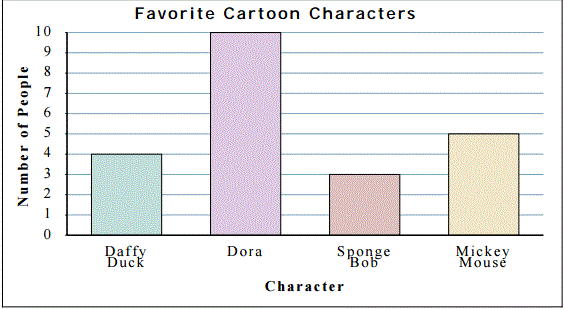
bar graph



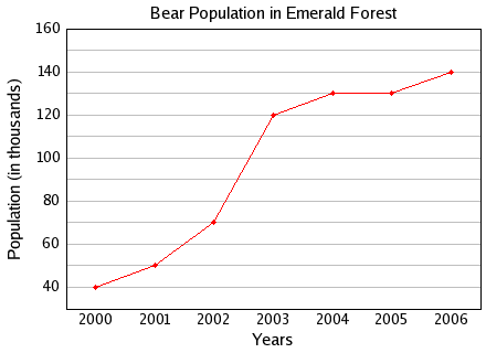
Line Graph
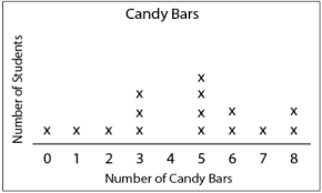
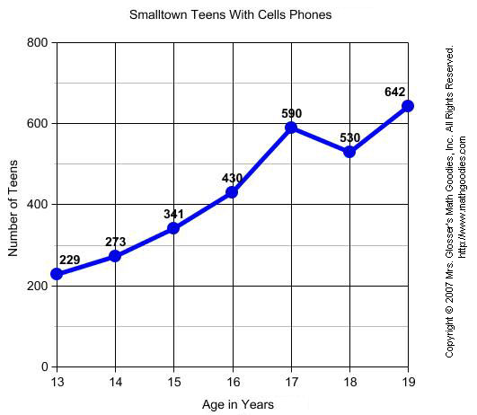
What is the scale of this graph?
0
800
200
100
This point is ( 0 , 0 ) on the coordinate plane, it is also where the X and Y axis intersect. What is it called?
Origin
X axis
Y axis
Scale

What would most likely be the temperature at 2 1/2 minutes?
58
62
78
88

Look at the bar graph. Can you tell what the bar graph measures?
Kilowatts used by appliances per day
Average Hours appliances were used per day
Number of hours each appliance was used per day
Hours appliance used monthly

The bar graph shows data about the pets owned by math students in four classes. One bar is missing from the graph. If the students have a total of 32 dogs, which bar shows the number of dogs Ms. Davalos's class has?


Which month had the greatest number of books read?
November
December
January
February
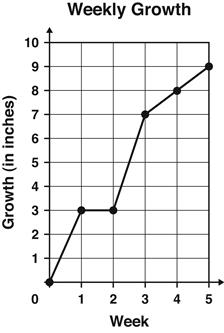
The graph shows the number of inches a plant grew each week.
Between which 2 weeks did the plant grow the MOST?
Week 1 and Week 2
Week 2 and Week 3
Week 3 and Week 4
Week 4 and Week 5
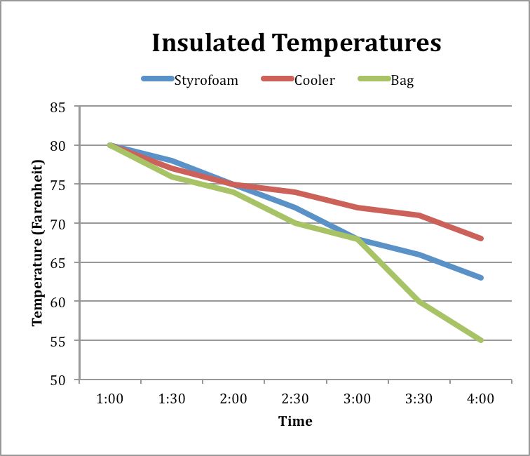
What was the temperature of the liquid in the Styrofoam container at 4:00?
55 degrees
68 degrees
73 degrees
63 degrees
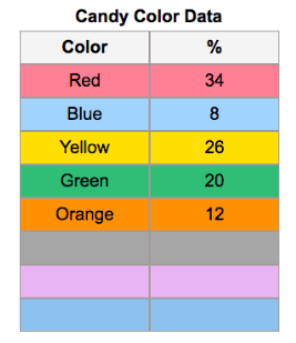
Based on the table provided, which type of graph would be best for the data?
Line graph
Bar Graph
Pie Chart
Scatter Plot
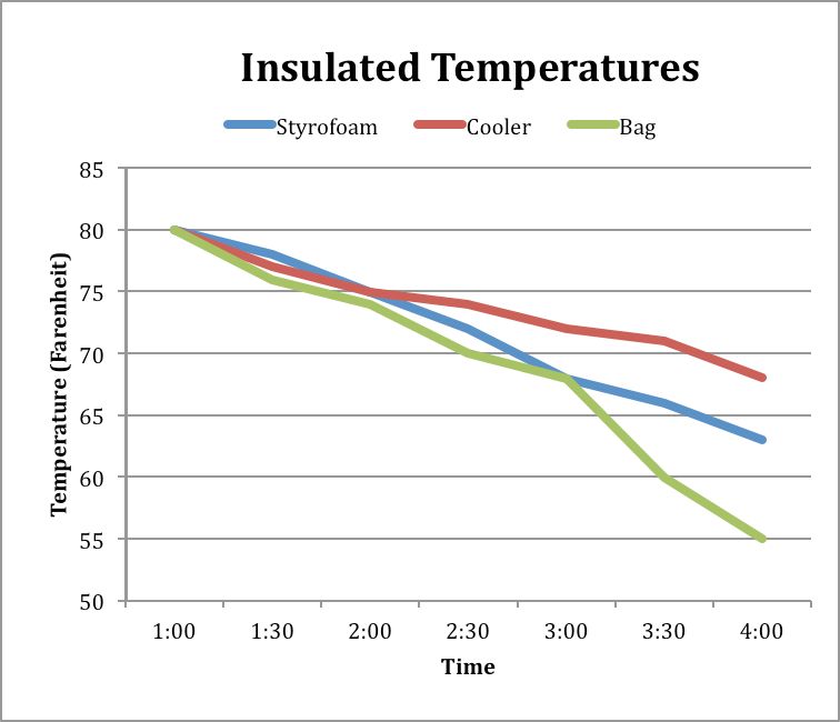
What data does this graph represent?
This graph represents the change in temperature of a liquid over time in 3 different containers.
This graph represents how temperature can change the molecules in a material.
This graph represents the phase changes of a material.
This graph represents what type of container people use the most to store hot liquids.
when you want to compare categories you use ________
Bar graph
Line graph
Pie chart

