
 Worksheets
Interpreting Graphs in Science
Total questions: 15
Worksheet time: 15mins

In which year did exactly 60 students have scholarships?
2014
2010
2012

Between which two times was the greatest increase in number of shoppers?
11 AM to 12 PM
1 PM to 2 PM
12 PM to 1 PM

Assuming that the population growth of the bacteria continues, what would be a good prediction for the number of bacteria cells that will exist in 140 minutes?
0
40
100
2000

According to this graph, you are most likely to make a basket if you shoot...
Closer to the hoop
Farther from the hoop
2 meters from the hoop
4 meters from the hoop

Mrs. Leffler's class grades were graphed as a pie chart (circle graph). Based on this graph, The largest percentage of students received what grade?
A
B
C
D

What percentage does the entire circle graph represent?
100%
50%
25%
15%
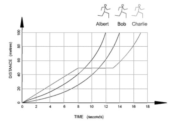
Which runner stopped for a rest?
Albert
Bob
Charlie

Which of the following statements describes how temperature changes in the mesosphere?
Temperature increases as altitude increases.
Temperature decreases as altitude increases.
Temperature decreases as pressure increases.
Temperature does not change as pressure increases.

Look at the line graph. Which statement is consistent with the line graph?
The ability of air to hold moisture increases as temperature increases.
The ability of air to hold moisture decreases as temperature increases.
The ability of air to hold moisture decreases and then increases as temperature increases.
The ability of air to hold moisture stays the same regardless of temperature.
Which type of graph is most suitable for showing the relationship between two continuous variables in a scientific experiment?
Bar graph
Line graph
Pie chart
Histogram
In a graph showing the growth of a plant over time, what does the slope of the line represent?
The type of plant
The rate of growth
The final height of the plant
The amount of sunlight received
When interpreting a scatter plot, what does a positive correlation indicate?
As one variable increases, the other decreases
There is no relationship between the variables
As one variable increases, the other also increases
The variables are unrelated
A graph shows the temperature change of a substance over time. What does a flat line on this graph indicate?
The substance is heating up
The temperature is constant
The substance is cooling down
The experiment is invalid
In a bar graph comparing the population of different species in a habitat, what does the height of each bar represent?
The type of species
The number of individuals in each species
The average size of the species
The habitat size
Which graph would best illustrate the distribution of a single variable, such as test scores, in a science class?
Line graph
Pie chart
Histogram
Scatter plot

