
 Worksheets
Data Analysis Cumulative Practice 2/11
Total questions: 100
Worksheet time: 4hrs 11mins

What does point C on the box plot represent?
First Quartile
Median
Third Quartile
Mean

What do points B and D represent on the box plot?
Mean and Mode
Mean and Median
Least and Greatest Value
First and Third Quartiles
What do points A and E represent on the box plot?
Mean and Mode
Mean and Median
Least and Greatest Value
First and Third Quartiles

What is the median of this data set?
8
12
15
19
What is the range of this data set?
6
12
13
19
What is the range of this data set?
6
12
13
19
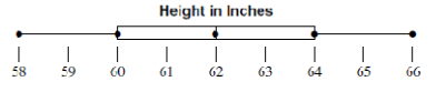
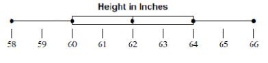
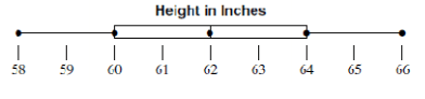

Hint: Look at your notes!

Hint: Look at your notes!

Hint: Look at your notes!


Look at the bar graph and answer the following question:
What does the vertical axis show?
Percentage
The type of allergy
The percentage of children between 0-17 years
Look at the bar graph and answer the following question:
What does the horizontal axis show?
Percentage
The type of allergy
The percentage of children between 0-17 years


Is this an example of a histogram?
a. yes because a histogram is a bar graph
b. no because the bars are not touching
c. no because the data is quantitative
d. no because the data is qualitative
e. Both option b and d are correct


What is the relative frequency for the class of students that spent 31-60 minutes studying for the exam?
33%
18%
9%
25%

Which of the following is represented by the histogram?
Of the 20 riders represented in the graph, over 50% are 30 years of age or older.
One fourth of the riders represented in the graph are younger than 40 years old.
Half the riders represented in the graph are between the ages 10-29.
Six percent of the riders represented in the graph are between the ages 10 and 19.
Which of the following is an example of quantitative data?
High School Graduate or Not
Monthly paycheck amount
Whether or not you are employed
What type of vehicle you drive

What type of Data Display is this?
Line Graph
Histogram
Scatter Plot
Bar Graph

What type of Data Display is this?
Bar Graph
Pie Chart
Stem & Leaf Plot
Scatter Plot

What type of Data Display is this?
Stem & Leaf Plot
Histogram
Line Plot
Bar Graph

Bar graphs are a good data display because...
They make comparisons between different variables very easy to see.
They are good at showing specific values of data, meaning that given one variable the other can easily be determined.

Histograms are good data displays because...
They allow you to group your data values into a range of numbers
They allow you to make a prediction of a future measurement

Scatter plots are a good data display because...
They show the percentage of the whole data set.
They allow you to see a correlation from a set of imperfect data points.

Stem and leaf plots are a good data display because...
They break down large numbers into groupings
They show the correlation of a data set (positive or negative)
Which of the following is an example of a quantitative variable?
Supervising Manager
Hours Worked
Pay Scale Group
Certification


How many MALE students were surveyed?
30
29
50
59

What number goes in the blank?
40
20
13
33

How many children prefer vanilla ice cream?
78
131
26
105

Which age group liked Action movies the least?
18-25
25-49
50+
238

Which of these values below is a marginal frequency?
182
120
46
10

Which of the values below is a joint frequency?
400
200
182
4

The number of people who purchased a hot dog and a soda is an example of ___________.
Marginal Frequency
Joint Frequency
Marginal Relative Frequency
Joint Relative Frequency
Conditional Relative Frequency

Of the 400 people who purchased concessions, 50% of them bought a soda. This is an example of
Joint Frequency
Marginal Frequency
Joint Relative Frequency
Marginal Relative Frequency
Conditional Relative Frequency

Of the 400 total people surveyed, 5% of them bought water and no food. This is an example of_____.
Joint Frequency
Marginal Frequency
Joint Relative Frequency
Marginal Relative Frequency
Conditional Relative Frequency

What type of data does this represent?
Qualitative
Quantitative

What type of data does this represent?
Qualitative
Quantitative

What type of data does this represent?
Qualitative
Quantitative

What type of data does this represent?
Qualitative
Quantitative

Which data set goes with this stem-and-leaf plot?
41,52,57,58,65,66,70,75,78,78,78,80,80,95
41,52,56,58,66,70,75,78,78,78,80,80,95,56
41,52,57,58,65,66,70,75,78,78,78,78,80,80,
52,52,57.58,65,66,70,75,78,78,78,80,80,95

This plot show how many point was scored on a video game. What is the difference between the greatest and least amount of point scored?
48
39
38
84

Which set of data belongs to this stem-and-leaf plot?
8,8,12,17,19,22,23,31,35,40
8,12,17,18,19,22,23,31,35,40
8,12,17,18,19,22,22,23,31,35,40
8,12,17,18,19,22,31,35,40

Looking at this plot. What number appears the most?
47
76
92
98
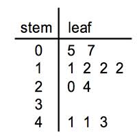
This plot show the ages of people at a birthday party. How many people at the party are 20 years of age or younger ?
7
6
8
5

What is the mode for the stem and leaf? Given 5/3=530
660
600
540
250


What is the highest score in the class?
88%
100%
13
98%

How many students spent 7 hours doing homework that week?
1
3
5
6

How many students scored between 95 and 100?
6
6
9
14

10.)Which of the following best describes the shape of the distribution?
SKEWED LEFT
SKEWED RIGHT
SYMMETRICAL
23, 34, 27, 7, 30, 26, 28, 31, 34


What is the shape of the dot plot shown?
skewed left
skewed right
symmetrical

Name the correlation in this graph
Positive correlation
Negative correlation
No correlation
Lots of correlation


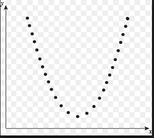
Describe the association for the graph.
Linear and Positive
Linear and Negative
Non-Linear and Negative
Non-Linear and Positive
Non-Linear and No Association


The table shows the attendance at a flag football game for the first 8 games of the season. What is the correlation of the data?
Strong Positive
Strong negative
Weak Postive
Weak Negative
No correlation

The table shows the lengths and corresponding ideal weights of sand sharks. Which r-value is more accurate for the data?
r = 0.99
r = -0.90
r = 0.09
r = -0.099
If the correlation coefficient, r, of a data set is r = -0.95. What type of correlation does the data have?
Strong Positive
Strong negative
Weak Postive
Weak Negative
No correlation
If the correlation coefficient, r, of a data set is r = 0. 32. What type of correlation does the data have?
Strong Positive
Strong negative
Weak Postive
Weak Negative
No correlation


What type of correlation does this scatterplot display?
Positive
Negative
No Correlation

This measures how strong or weak the relationship between 2 quantitative variables are.
Scatter Plot
Causation
Correlation
Line of best fit
Time Spent Watching TV & Grades
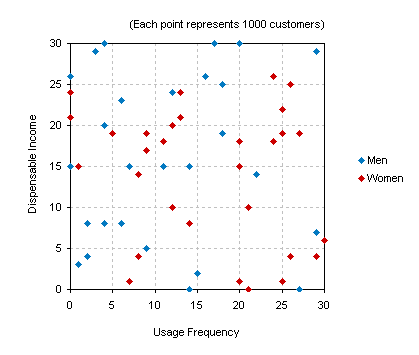
What type of Correlation?
Positive Correlation
Negative Correlation
No Correlation

Jon wants to buy a burrito , he thinks it costs $7.50. But when he goes to taco bell it actually costs $6.25. What is percent error?
20%
16.6%
17.8%
21%
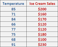
Find the equation of the line of best fit for the given data
y=163.41x + 4.19
y=-163.41x + 4.19
y=-4.19x + 163.41
y= 4.19x - 163.41
There is no linear correlation of the data set

