
 Worksheets
Reading Graphs
Total questions: 41
Worksheet time: 51mins

What is the difference between the number of frogs in the pond when the rainfall was 5cm and when the rainfall was 20cm?
20
40
50
60

Examine the population curves for wolves and moose in the graph below.
Which statement correctly describes the population relationship between the wolves and moose from 1968 to 1973?
As the moose population increased the wolf population increased.
As the moose population increased the wolf population decreased.
As the wolf population decreased the moose population decreased
As the wolf population increased, the moose population decreased.

A scientist wanted to see if the amount of garbage that Americans threw away changed over time. He collected information and then showed his results in the graph below.
Based on this graph, what could the scientist say about the amount of garbage that each person threw away?
It increased over time
it decreased over time
it increased the most in 1980
It decreased the most in 1990


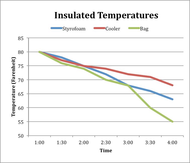
What data does this graph represent?
Change in temperature of a liquid over time in 3 different containers
How temperature can change the molecules in a material
The phase changes of a material
What type of container people use the most to store hot liquids.

Which type of container keeps liquid the hottest for the longest time?
Bag
Cooler
Cooler and bag are tied
Styrofoam
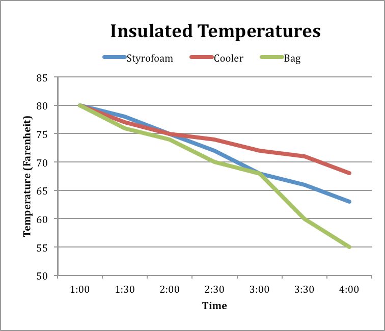
What was the temperature of the liquid in the Styrofoam container at 4:00?
55 degrees
68 degrees
73 degrees
63 degrees

What conclusions can you draw from this graph?
The deer population went down over time.
The deer population went up over time.
The dear population went up quickly, then down, but then stayed the same.
There are less dear because of hunters

What would you use this map for?
to figure out how much rain has fallen in the US in different regions
to figure out how much rain has fallen in the midwest in inches
To figure out how much rainfall has decreased in the US
to figure out the percentage rainfall has increased in the different regions of the US

Which of the following is an accurate observation that you could make based on what this graph shows.
There was no change to the gummy bear after 24 hours of being submerged in water.
The gummy bear changed the most in length from being submerged in vinegar
The gummy bear that has the greatest mass is the one that was submerged in vinegar.
Gummy bears change color when they are submerged in different liquids.


Based on Table 1, assume that 200 mg of each food is being represented. Water comprises over 100mg of mass for which of the foods?
Ham only
Cat food and ham only
Peanuts and cheese only
Peanuts, cheese, and ham only

What is the independent variable?
atomic number
electron volts
first ionization energy
Jim Askew's Graph

As Depth (km) into Earth increases, interior temperature _____
increases
decreases
stays the same
What is the interior temperature at 2,000 km?
4100 *C
6500 *C
3000 *C

During which month does the trend in evaporation change?
September
December
November
February

Which day of the week had the lowest high and low temperature?
Monday
Thursday
Tuesday
Wednesday
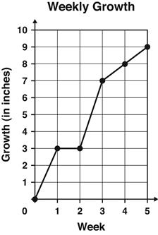
The graph shows the number of inches a plant grew each week.
Between which 2 weeks did the plant grow the MOST?
Week 1 and Week 2
Week 2 and Week 3
Week 3 and Week 4
Week 4 and Week 5
A graph shows the temperature change of a substance over time as it is heated. The graph has a flat section where the temperature remains constant. What does this flat section of the graph most likely represent?
The substance is cooling down.
The substance is undergoing a phase change.
The substance is being heated at a constant rate.
The substance is at its maximum temperature.

What is this graph showing you?
The worlds population has been growing and will continue to grow
The worlds population was growing but now is decreasing
The worlds population is staying the same

What is the highest temperature that this fever reaches?
37
38
39
40

Mr. Swanson's science class used a thermometer to measure the outside temperature each day throughout the school year.
They used their results to make the graph below.
Which month had an average daily temperature of around 41 degrees?
May
April
December
March

What is the dependent variable on the graph (y-axis)?
Metro Bicycle Shop Weekly Sales
Bicycles Sold
Types of Bicycles

What is the general trend of this line graph?
The more you mow, the more money you make
The more you mow, the less money you make
You make the same amount of money regardless of how long you mow
What is the dependent variable on the graph (y-axis)?
Metro Bicycle Shop Weekly Sales
Bicycles Sold
Types of Bicycles

What is the main purpose of a line graph?
to compare two things
to show trends over time
to have an independent variable
so you don't have to read words
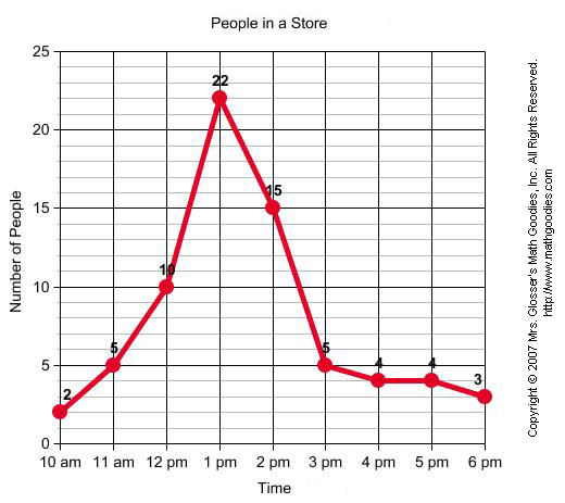
When was the greatest amount of shoppers at the store?
10am
1pm
6pm
2pm
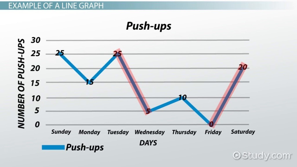
How many push-ups were done on Monday?
5
10
15
20

Assuming that the population growth of the bacteria continues, what would be a good prediction for the number of bacteria cells that will exist in 140 minutes?
0
40
100
2000
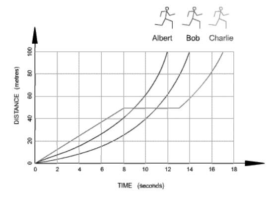
Which runner stopped for a rest?
Albert
Bob
Charlie
What conclusions can you draw from this graph?
The deer population went down over time.
The deer population went up over time.
The dear population went up quickly, then down, but then stayed the same.
There are less dear because of hunters
You want to make a graph for an experiment you did about plant growth over a two week period of time. What type of graph would you use?
bar graph
line graph
pictograph
pie chart



