
 Worksheets
Unit 3: Visualization
Total questions: 15
Worksheet time: 16mins
Which of the following statements corresponds to a frequency distribution?
a table that shows the number of times a data entry appears in a data set.
a data set that shows the number of data entries that appear in a time.
a conclusion drawn from a sample.
the boundaries between two consecutive bars.

Observe the frequency distribution:
What is the relative frequency of the first class?
0.139 or 13.9%
0.5 or 5%
1-5
5

Observe the frequency distribution:
How many classes are there?
6
30
1-5
1-30

How many variables are there in the graph?
4
3
5
7

Interpret the given graph.
The sales of chocolate dropped drastically followed by another notable drop to 10%. It then skyrocketed in April at 50% before dropping moderately to 40%
Chocolate sales took a nosedive in February from 70% to 20% and it decreased yet again quite reasonably before plunging significantly in April. However, the sales dwindled again to 40% in the last month
The sales of chocolate descended substantially to 20% in February. This is followed by another moderate reduction of 10% before the sales boomed to 50% and went down slightly again in the last month.
The percentage of chocolate sales plunged considerably in the first 2 months and suffered another substantial fall in the next month. It then recovered with a steady climb before it dipped slightly to 40% in May

Interpret the given graph.
In the 14-18 age group, the preference for biscuits, chocolate and ice cream all ranged below 55%. The difference between potato chip and biscuits preference was quite small at 20% compared to with ice cream at a large percentage of 40%.
In the 9-13 age group, those who prefer chocolate showed the highest percentage at 50% which the lowest was potato chips at only 30%. The percentage of those who preferred chocolate in this age group was the same as in the 4-8 age group at 50%
In the 4-8 age group,those liking potato chips recorded the lowest percentage at 20% while those who preferred ice cream triumphed with the highest percentage of 70%. The range of preference for biscuits and potato chips was lower than 35%

Which Continent has the smallest portion of wild cats?
Asia
Europe
North America
South America

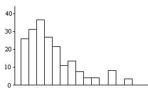
Observe the histogram and choose the frequency distribution that corresponds to it.


Bar graphs are more appropriate than pie charts for displaying a large number of categories.
Histograms and bar graphs can be used interchangeably for the same purpose.
Classify whether the following statement is TRUE or FALSE.
'If a histogram is positively skewed, there are outliers towards the right-side of the histogram.'
True
False
Line graphs can have multiple lines on the same graph to compare trends.

Identify the type of graph.
Radar (Spider) Chart
Pie Chart
Segmented Bar Chart
Line chart
23, 34, 27, 7, 30, 26, 28, 31, 34

