
 Worksheets
Assignment 30 - Data Displays
Total questions: 121
Worksheet time: 5hrs 15mins

What is the class width of the histogram displayed?
60
10
9
6
Which charts and/or graphs are BEST for comparing qualitative (categorical) data? (Select all that apply)
Pie Charts
Stem and Leaf Plots
Line Plots (aka "dot plots")
Histograms
Bar Graphs

Based on the following pie chart, what does this household spend the LEAST amount of money on each month?
Housing
Gas
Insurance
Entertainment

Based on the following time series charts, what statement(s) are true? (Select all that apply)
time intervals go on the horizontal axis
time series charts tell us how quantitative data performs over time
time intervals go on the vertical axis
time series charts are a line graph

The histogram shows the ages of people in a community chorus. How many people in the chorus are younger than 40 years old?
31
14
35
3


Prices of vehicles sold last month at a local dealership are going to be tallied into these classes. If a car was sold for $24,000 which category would the tally belong?
$15,000 up to $18,000
$21,000 up to $24,000
$24,000 up to $27,000
$27,000 up to $30,000

How many classes are there in this table?
51
4
10
2
Which is the modal class?
140 ≤ h < 150
150 ≤ h < 160
160 ≤ h < 170
170 ≤ h < 180
To estimate the mean, we should use
each class' lower bound
each class' upper bound
each class
each class' middle value
For this data, how many data points are there?
4 children
51 children
180 cm
140 cm
For the median, the middle child would be:
25th in line
26th in line
160cm tall
the forgotten child

Estimate the mean height of these 25 trees (using your calculator)
100cm
116cm
118cm
119cm

Estimate the mean height of these 123 students (using your calculator)
166cm
167cm
168cm
169cm
Which is the 1st class?
140 ≤ h < 150
150 ≤ h < 160
160 ≤ h < 170
170 ≤ h < 180
Which is the modal class?
140 ≤ h < 150
150 ≤ h < 160
160 ≤ h < 170
170 ≤ h < 180
What is each class width?
140 – 180
51
6 – 21
10


For how many weeks was the data collected?
48
50
52
54
What is the mode for this data set? Remember the mode is the most common or most frequent data.
3
4
5
6


Which of the following is represented by the histogram?
Of the 20 riders represented in the graph, over 50% are 30 years of age or older.
One fourth of the riders represented in the graph are younger than 40 years old.
Half the riders represented in the graph are between the ages 10-29.
Six percent of the riders represented in the graph are between the ages 10 and 19.

True or False? Over 50% of the students watch between 5 and 14 hours of television on the weekend?
TRUE
FALSE
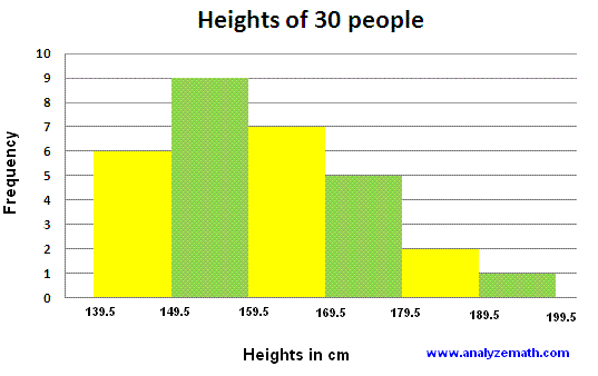


A histogram shows numerical data and has bars that touch.
True
False

During which 3 month interval were the most houses sold?
Jan - Mar
Apr - Jun
Jul - Sep
Oct - Dec

How many total homes did Really Real Realty sell in 2009?
49 homes
25 homes
63 homes
unknown

Which of the statements below is true?
Exactly half of the homes were sold between Jan - Jun
There were more two story than one story homes sold
14.5 homes were sold in Apr - Jun
More homes were sold in the first half of the year than the second.

How many veterans had exactly 3 years of service?
25
5
1
unknown

How many veterans had more than 15 years of service?
3
1
6
unknown

Which statement about the data is true?
The average years of service is 10 years.
Majority of the veterans serve less than 10 years
The same number of veterans serve between 11-15 years as serve 1-5 years
Navy veterans are nice guys and good swimmers.

Which age group represents the mode?
40-49
50-59
60-69
70-79
80-89

Can we determine the range of U.S senators using the histogram?
Yes
No
Maybe

Which of the statements is true?
The same number of senators are 40-49 as are 80-89
There are the more senators over the age of 70 than under.
There are exactly 100 US senators.
Over half of the senators are between the ages of 60-69.

What percent of the annual sales were washers?
20%
30%
25%
0.20%

If a fisherman caught 1000 kilograms of fish, how many kilograms of catfish did he catch?
20 kg
200 kg
25 kg
50 kg

If a nursery has 200 plants, how many MORE biennials than perennials does it have?
10
20
30
45
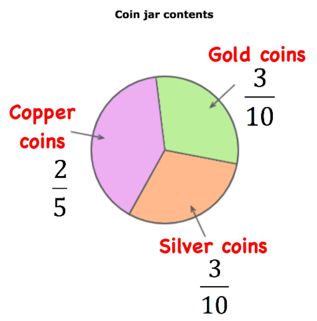
If there were 70 coins in the jar, how many of the coins are gold?
2
233
21
10

Which lists places the programmers in order from least productive to most productive?
Damon, Vince, Philippe, Travis
Philippe, Vince Damon Travis
Vince, Travis, Philippe, Damon
Damon, Philippe, Vince, Travis

What percent of people chose ski jumping?
10%
20%
15%
25%

What percent of advertising expenditures were spent on on-line advertising?
15%
20%
25%
35%
What angle would you use to represent 40 red cars out of 90 cars in total on a pie chart?
40 degrees
160 degrees
4 degrees
90 degrees

The pie chart shows the colours of 32 beads. How many green beads are there?
90
8
11
9

These pie charts show how people travel to work in 2 towns. In which town do more people travel to work by bike?
town A
town B
both the same
impossible to say
25% of a circle is equal to:
one-fifth
a quarter
a half
two fifth


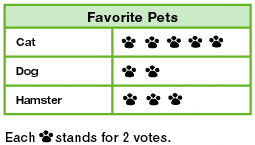
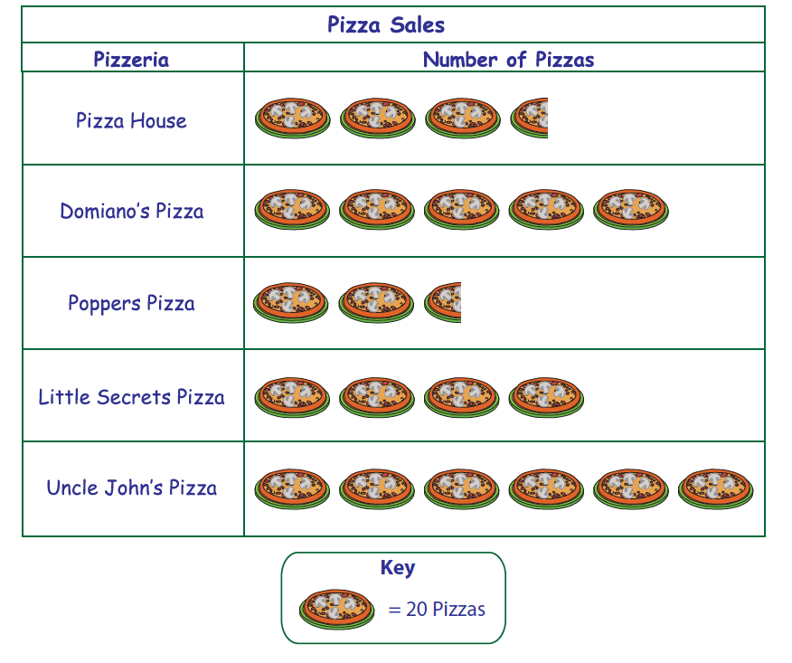
What angle would you use to represent 40 red cars out of 90 cars in total on a pie chart?
40 degrees
160 degrees
4 degrees
90 degrees
The pie chart shows the colours of 32 beads. How many green beads are there?
90
8
11
9

The under 13's played 28 matches.
The under 15's played 18 matches.
Which team won more matches?
Under 13's
Under 15's

How many degrees are there in a half turn (semicircle)?
90
120
45
180
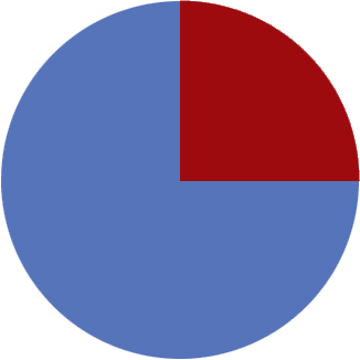
How many degrees are there in a quarter turn?
45
90
65
120
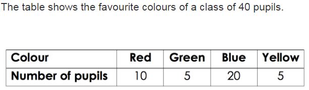
Which pie chart represents the same data as the table?
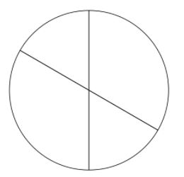
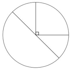
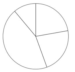
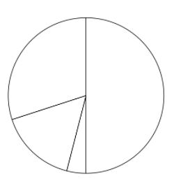
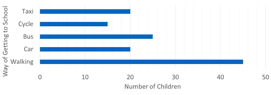
How many more children walk than take a taxi to school?
45
20
25
35
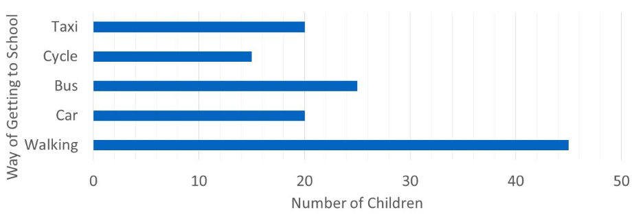
In total, how many children take a taxi or cycle to school?
5
35
20
15
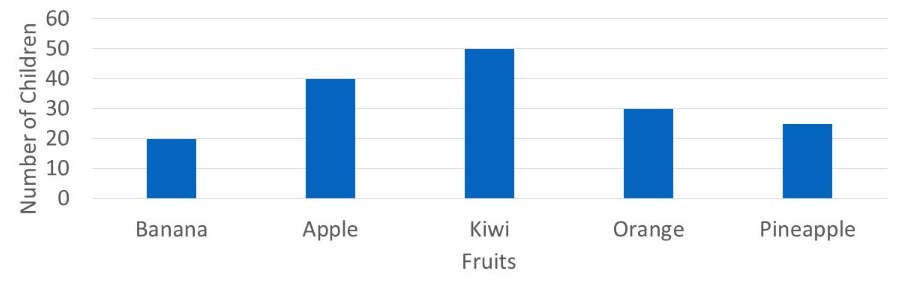
Which of the following statements is true?
banana is the most popular fruit
only pineapple is liked less than oranges
kiwi is the most popular fruit
apple is the third most popular fruit
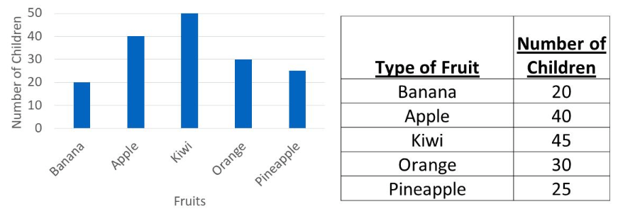
Which fruit's bar is displayed correctly?
banana
orange
apple
kiwi
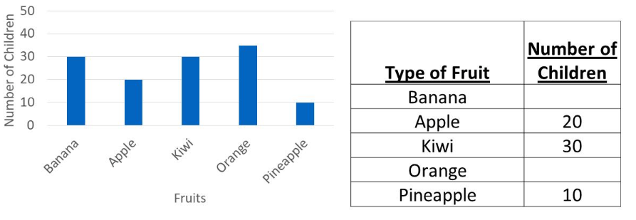
using the bar chart, what 2 numbers are missing from the table?
30 and 35
30 and 40
pineapple, banana
35 and 40
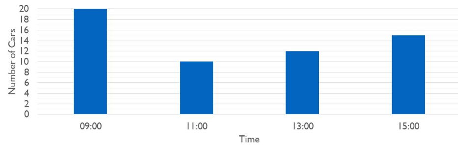
How many more cars pass at 15:00 than at 13:00?
4
10
2
3
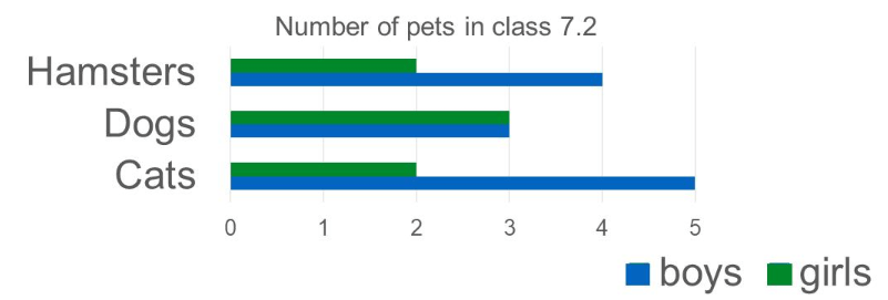
From the bar chart, how many pets do the girls in the class have?
19
12
7
you can't tell
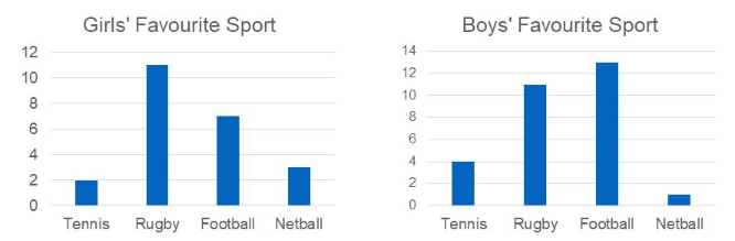
Which sport was picked by the same number of girls and boys?
tennis
football
netball
rugby
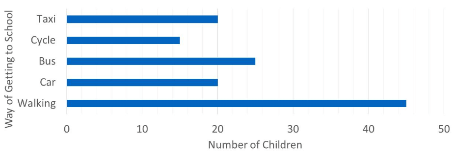
How many more children walk than take the bus to school?
45
20
25
10
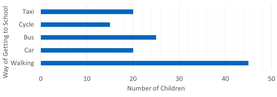
In total, how many children cycle or walk to school?
15
20
45
60
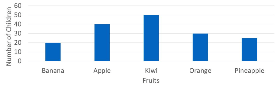
Which of the following statements is true?
pineapple is the most popular
only apple is liked more than orange
kiwi is the least popular fruit
apple is the second most popular fruit
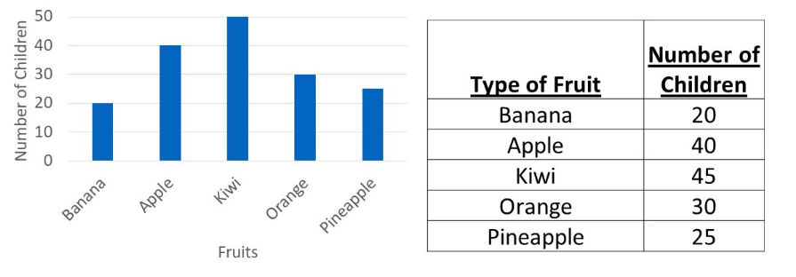
Which fruit's bar is displayed incorrectly?
banana
pineapple
apple
kiwi
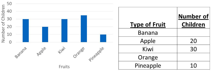
Using the bar chart, what two numbers are missing from the table?
20 and 30
30 and 35
orange, apple
20 and 35
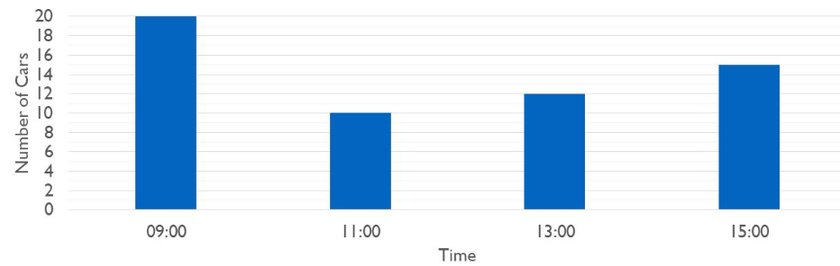
How many more cars pass at 15:00 than at 11:00?
10
5
4
3
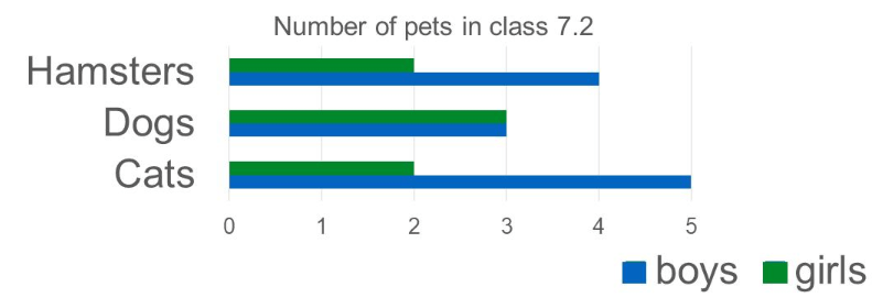
From the bar chart, how many pets do the boys in the class have?
19
12
7
you cannot tell
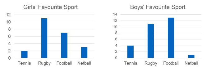
Which sport was picked by 2 more girls than boys?
tennis
football
netball
rugby
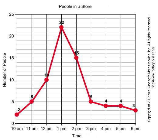
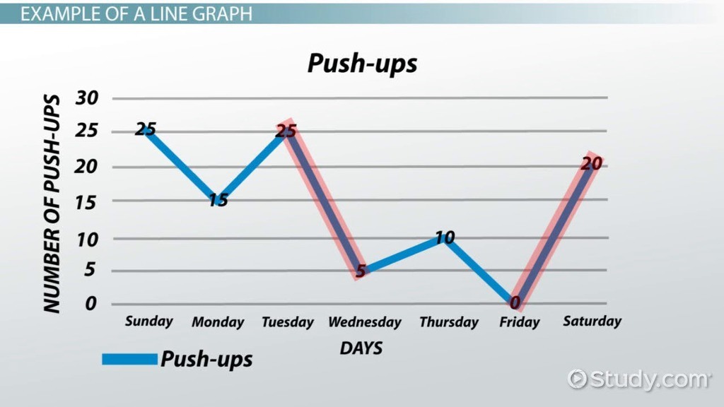
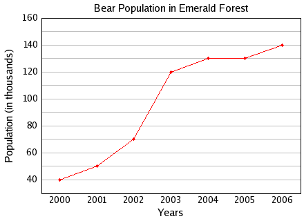
Between which two years did the bear population remain constant or the same?
2004 and 2005
2001 and 2002
2005 and 2006
2000 and 2001
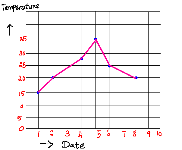
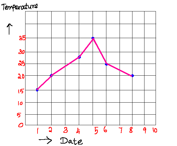
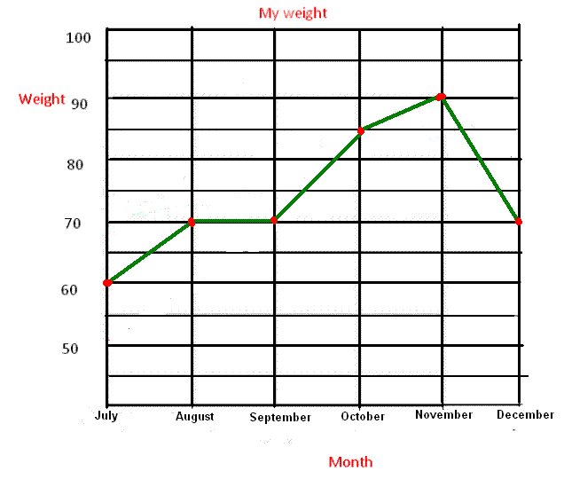
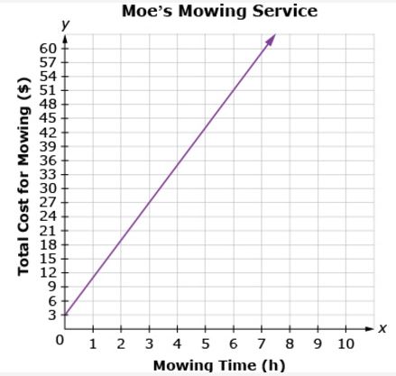
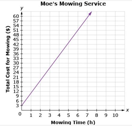
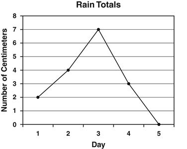
Annie recorded the amount of rain that fell each day. The results are shown in the line graph below. How many centimeters of rain fell on the third day?
2
3
4
7
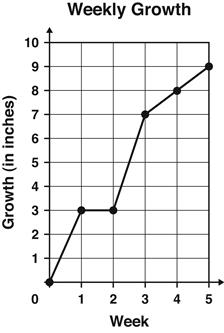
The graph shows the number of inches a plant grew each week.
Between which 2 weeks did the plant grow the MOST?
Week 1 and Week 2
Week 2 and Week 3
Week 3 and Week 4
Week 4 and Week 5
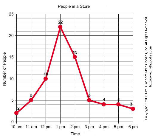
What kind of graph shows change over time?
bar graph
line graph
line plot
pie graph
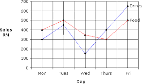
Graphs help us represent data
True
False

What happened on Thursday?
Cookie sales went up
Cookie sales went down
Cookie sales stayed the same
6 boxes were sold
How many boxes of cookies were sold this week?
27
26
28
22

What kind of graph is this?
Color
Bar
Line
Pie


A restaurant recorded the number of pizzas sold each month for one year. The data are shown in the graph below. During which month did the restaurant sell 40 pizzas?
March
May
July
August

At what rate did the temperature decrease between the 20th and 25th minutes of the experiment?
10°C in 5 min
10°C in 10 min
5°C in 5 min
5°C in 10 min

Which month had the biggest difference between the high and low temperatures?
January
April
October
November
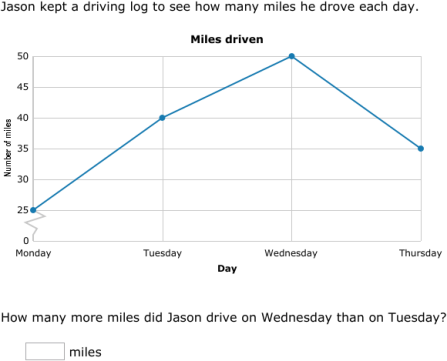
This double line graph shows average rainfall in two cities. What is the greatest difference between the two cities?
4 feet
5 inches
3 inches
4 inches

