
 Worksheets
Chapter 15 Designing with Purpose
Total questions: 40
Worksheet time: 20mins
In the eye-tracking research, what did readers wear to track their eye movements while they read?
Headphones
Glasses
Wristbands
Hats
What did scientists learn from eye-tracking research?
Select ALL that apply:
Alternative story forms draw attention and help readers remember facts
Headlines and photos are not looked at first
Small headlines are read before large ones
Packaged stories attract more attention
Aiming for smart design: What is considered 'king' in smart design, aiming to get the audience to read the story?
Content
Color scheme
Font size
Layout
What should you look for when creating a headline?
Plays on words
Long and complex sentences
Irrelevant details
Unclear messages
What should you do to make online infographics more engaging according to the guidelines for alternative story forms?
Make online infographics interactive
Use only static images
Add lengthy paragraphs of text
Avoid using any visuals
Which of the following is NOT considered an alternative story form?
Quote reel
Bio Box
Weather update
Glossary
Teaser
Which of the following is NOT considered an alternative story form?
Checklist
Interview
Map
Diagram
Pull Quote
Which of these are good sources for finding design inspiration?
Magazines and newspapers
Design Annuals
Online Image Boards
Everyday Life
All of these
Which element of page design involves font, weight, and color?
Type
Layout
Spacing
Imagery
What does the element 'Scale' refer to in page design?
Relative size of elements
Color scheme of the page
Font style used in text
Alignment of images
Which element of page design involves creating a color palette and custom swatches to ensure cohesive design?
Color and shade
Typography and fonts
Layout and grids
Navigation and menus
In page design, what is the purpose of a line (actual or implied)?
To guide readers’ eyes, divide content, and provide emphasis.
To increase the font size of the text.
To add color to the background only.
To replace images with text.
What does 'Value' refer to in page design?
The cost of the design
The degree of light or dark
The number of images used
The amount of text on the page
In the context of page design, why is a white headline used with a dark image?
To make the page look colorful
To provide balance while maintaining an overall dark design concept
To distract the reader
To reduce printing costs
What is the meaning of 'Leading' in typography?
Space between lines
Font size
Boldness of text
Color of text
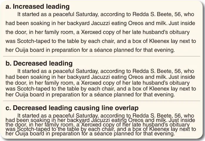
Which of the following best describes 'Increased leading'?
More space between lines
Less space between lines
Overlapping lines
Space between letters
What is the meaning of 'Kerning' in typography?
Space between letters
Font size adjustment
Line spacing
Boldness of text
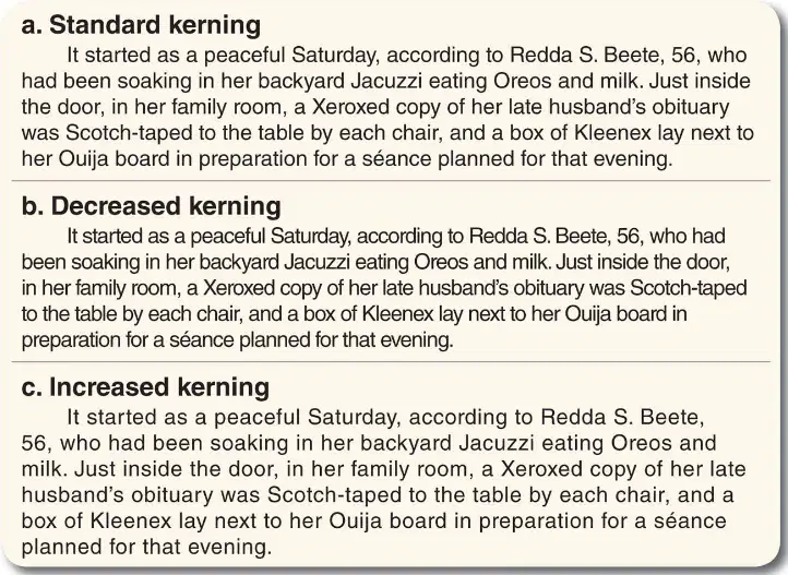
Which of the following best describes 'Decreased kerning'?
More space between letters
Less space between letters
More space between lines
Overlapping lines
What are ascenders and descenders in typography?
A) Portions of letters that extend above or below the baseline
B) The spaces between words
C) The color of the text
D) The size of the font

Refer to the diagram of the word 'lapdog'. Which part of the letter 'l' is considered an ascender?
The part of the letter 'l' that extends above the median line is considered an ascender.
The bottom curve of the letter 'l' is considered an ascender.
The dot above the letter 'l' is considered an ascender.
The part of the letter 'l' that descends below the baseline is considered an ascender.
Fill in the blank: If everything is important, ______ is important. (Refer to the slide on Emphasis.)
nothing
everything
something
anything
Which of the following is a way to use emphasis to create visual hierarchy?
A) Move important concepts to top of page
B) Ignore important elements
C) Use only black and white
D) Keep everything the same size
Fill in the blank: To create visual hierarchy, you can make the important element _______.
bigger
smaller
darker
hidden
Fill in the blank: One way to create visual hierarchy is to utilize _______.
color
weight
distance
texture
What does proportion refer to in design?
The color of elements
The relative size of elements on a page and how well they work together
The font style used
The number of images used
Fill in the blank: In photo spreads, run the best photo at least ______ as large as the next largest image.
twice
half
one-third
equal
Fill in the blank: Proximity in design means to ______ like things together.
group
separate
ignore
highlight
Alignment guides the audience’s eye in the order you want the _______ seen.
elements
colors
fonts
slides
What effect does repetition have on design choices? Fill in the blank: Repetition makes design choices feel _______.
intentional
random
confusing
temporary
According to the concept of ________ in design, some design elements guide the reader’s eye in a certain direction. For example, the neck of a guitar or a runner facing left can be used to move the reader’s eye into the story. What is this principle called?
Balance
Rhythm
Contrast
Emphasis
Fill in the blank: Effective placement and sizing of elements creates ______ in a design.
balance
chaos
confusion
disorder
What should you avoid when executing design to prevent breaking modular design?
Dollar bill rule
Dime rule
Armpits and doglegs
Orphans and widows
Fill in the blank: According to the dollar bill rule, you should not be able to place a dollar bill anywhere on the page without touching a ______ element.
design
text
color
border
In photos, what is the 'dime rule'?
No subject’s face should be smaller than a dime
No photo should be larger than a dime
Only use dimes as props
Faces should be the size of a dollar bill
What should you avoid when executing design? Fill in the blank: ________ headlines - Two placed side-by-side on the same line with little contrast create confusion.
Tombstoned
Stacked
Floating
Mirrored
What should you avoid when executing design? Fill in the blank: ________ white space - Awkward when trapped between elements; OK on the perimeter.
Trapped
Open
Balanced
Central
What should you avoid when executing design? Fill in the blank: ________ photos - Best when horizontal or vertical.
Square
Panoramic
Circular
Diagonal
What should you avoid when executing design? Fill in the blank: ________ - Place photos to lead audience’s eye toward text, not off the page.
Eyeline
Contrast
Balance
Alignment
What should you avoid when executing design? Fill in the blank: ________ images - Make sure text placed over images is easily readable.
Screened
Blurry
Transparent
Dark
What should you avoid when executing design? Fill in the blank: ________ - Clipart, borders, stock images are amateurish.
Decoration
Typography
Alignment
Contrast

