
 Worksheets
Surveys and Charts Criterion C and D
Total questions: 150
Worksheet time: 7hrs 10mins

A ........... of the students like blue as their favourite colour.
quarter
half
three quarters

Half of the students chose .............as their favourite game.
chess
video games
puzzles
Survey Instruments can be in the form of
Paper Questionnaire
In Person Interview
Online (survey monkey, google form)
All of the above
Why do we use survey samples (instead of asking the entire population)?
Population is too large
It's not reasonable or practical to ask population
A sample is more manageable
All of the above
A quiz or trivia questionnaire would be considered a survey.
True
False
The number of people who complete the entire survey
Completion Rate
Response Rate
Finish Rate
Outcome

The pie chart represents 18 people.
How many chose purple?
9
18
6
3

The pie chart represents 50 people.
How many chose purple?
0
50
100
25

The pie chart represents 42 people.
How many chose pink?
0
50
100
42

The pie chart represents 20 people.
How many chose green?
20
10
15
5

The pie chart represents 56 people.
How many chose black?
20
21
22
23

How many people are represented by the pie chart?
8
16
24
32

The pie chart represents 39 people.
How many chose red?
7
13
26
15

The pie chart represents 72 people.
How many chose black?
7
72
9
63

How many people are represented by the pie chart?
11
22
33
44

How many people are represented by the pie chart?
9
27
18
36

What percent of the annual sales were washers?
20%
30%
25%
0.20%

If a fisherman caught 1000 kilograms of fish, how many kilograms of catfish did he catch?
20 kg
200 kg
25 kg
50 kg

If a nursery has 200 plants, how many MORE biennials than perennials does it have?
10
20
30
45
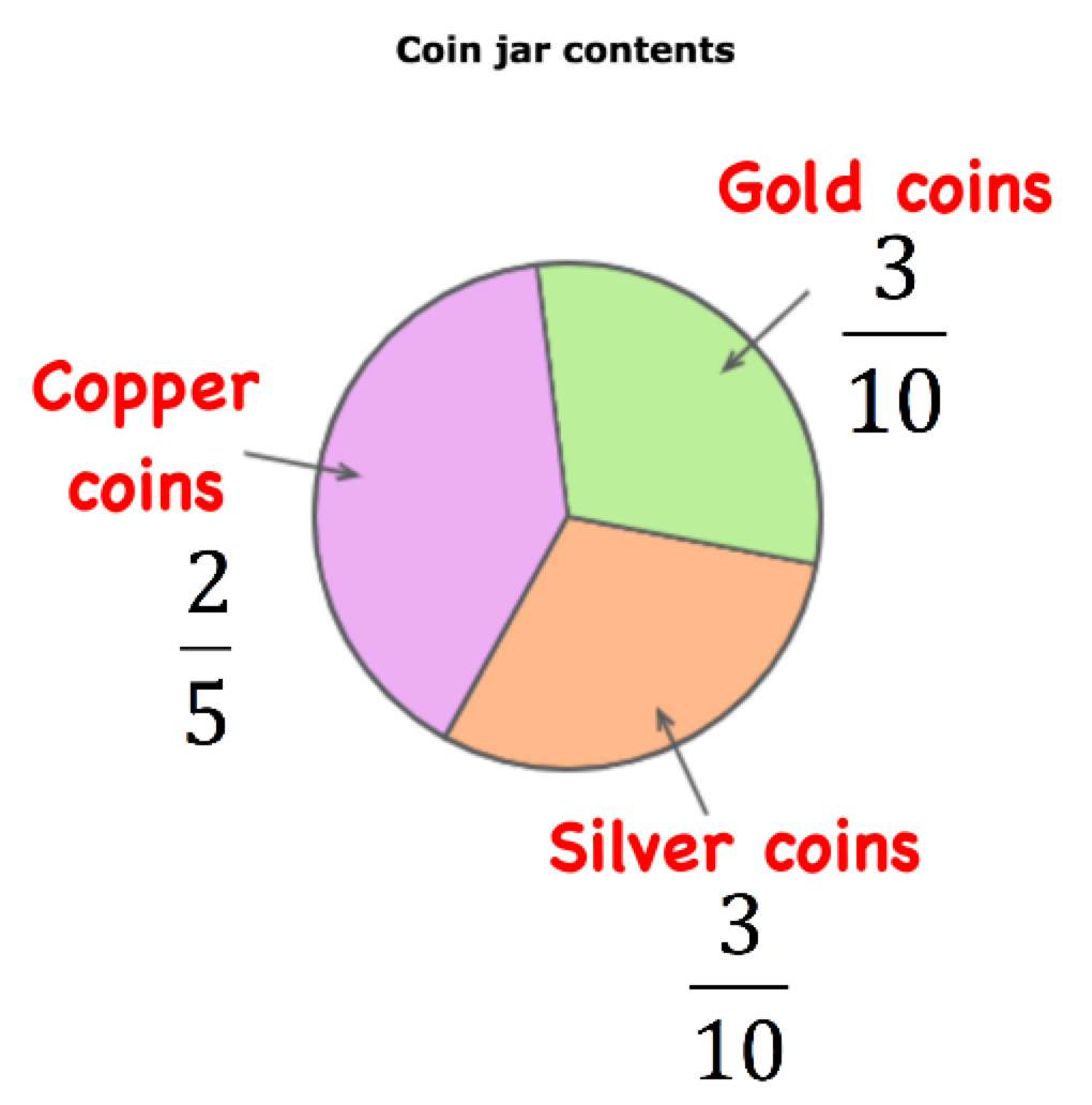
If there were 70 coins in the jar, how many of the coins are gold?
2
233
21
10

Which lists places the programmers in order from least productive to most productive?
Damon, Vince, Philippe, Travis
Philippe, Vince Damon Travis
Vince, Travis, Philippe, Damon
Damon, Philippe, Vince, Travis

What percent of people chose ski jumping?
10%
20%
15%
25%

What percent of advertising expenditures were spent on on-line advertising?
15%
20%
25%
35%
What angle would you use to represent 40 red cars out of 90 cars in total on a pie chart?
40 degrees
160 degrees
4 degrees
90 degrees

The pie chart shows the colours of 32 beads. How many green beads are there?
90
8
11
9

These pie charts show how people travel to work in 2 towns. In which town do more people travel to work by bike?
town A
town B
both the same
impossible to say

42%
58%
68%
48%

$15
$7,50
$30
$45

27%
45%
12%
16%

800
1000
1200
1400

Badminton = 30
Soccer = 18
Table Tennis =42
Badminton = 42
Soccer = 30
Table Tennis =18
Badminton = 30
Soccer = 42
Table Tennis =18
Badminton = 42
Soccer = 18
Table Tennis =30

70
80
90
100

What is the ratio of the number of residents who like movies to the number of residents who like picnics?
2:1
1:2
3:1
1:3

53
256
51
259

How much did Helen spend on Lunch?
$12
$10
$24
$18

350
280
180
150

There are 42 fewer lilies than roses. How many lilies are there at the florist?
36
47
63
75

What fraction of the flowers at the florist are chrysanthemums?
253
72
86
257

25%
18%
35%
45%

How many pupils took part in the survey?
210
180
320
240

20 000
18 000
19 000
21 000

Express the number of people travelled to each region as a percentage of the total number of people who travelled
Asia Pacific = 20%
Japan = 20%
Europe = 35%
USA = 25%
Asia Pacific = 20%
Japan = 35%
Europe = 35%
USA = 25%
Asia Pacific = 25%
Japan = 20%
Europe = 35%
USA = 25%
Asia Pacific = 25%
Japan = 35%
Europe = 20%
USA = 20%

35%
25%
45%
55%
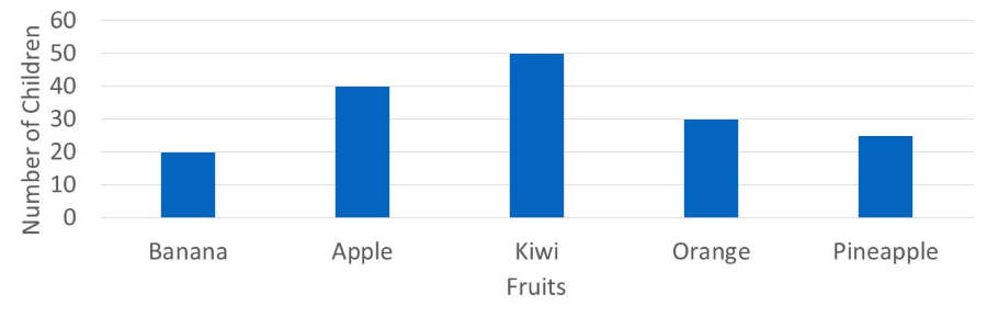
Which of the following statements is true?
banana is the most popular fruit
only pineapple is liked less than oranges
kiwi is the most popular fruit
apple is the third most popular fruit
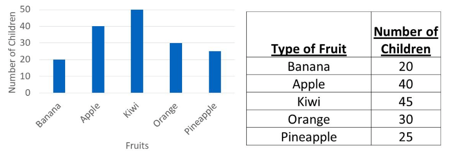
Which fruit's bar is displayed incorrectly?
banana
orange
apple
kiwi
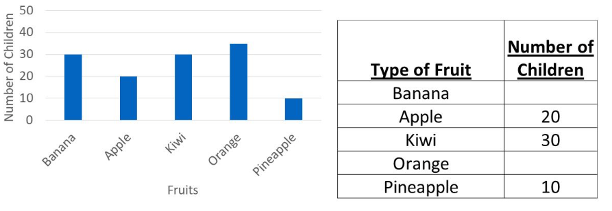
Using the bar chart to help you, which two numbers are missing from the table?
30 and 35
30 and 40
pineapple, banana
35 and 40
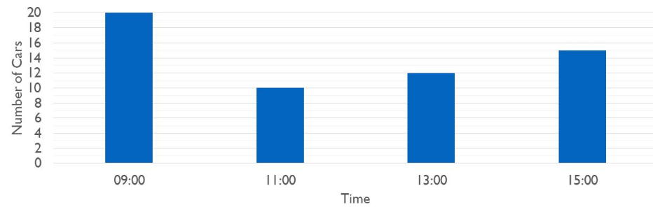
How many more cars pass at 15:00 than at 13:00?
4
10
2
3
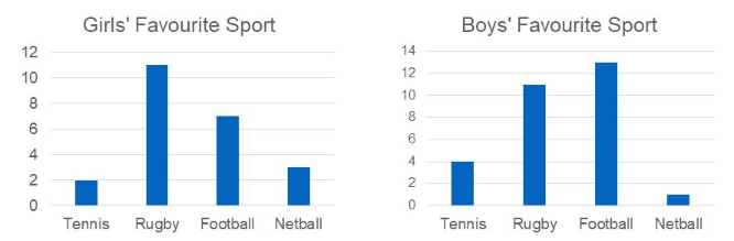
Which sport was picked by the same number of girls and boys?
tennis
football
netball
rugby
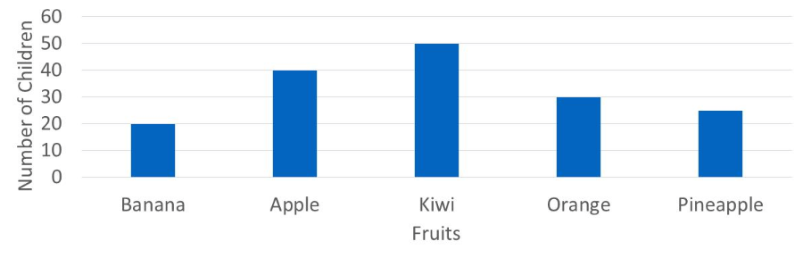
Which of the following statements is true?
pineapple is the most popular
only apple is liked more than orange
kiwi is the least popular fruit
apple is the second most popular fruit
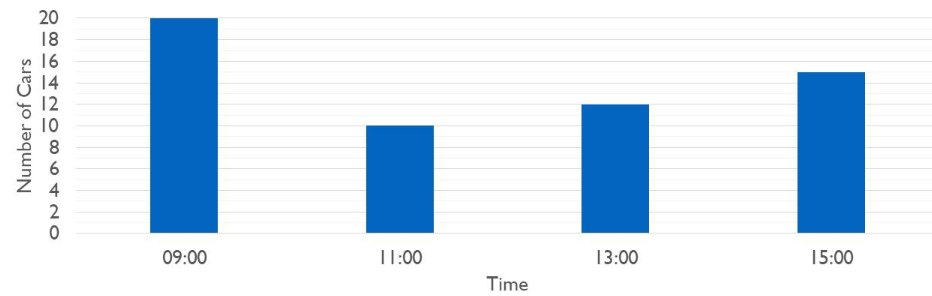
How many fewer cars pass at 11:00 than at 15:00?
10
5
4
3
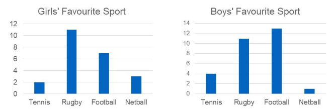
Which sport was picked by 2 more girls than boys?
tennis
football
netball
rugby

How many students take the bus to school?
35
20
10
15
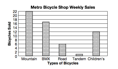
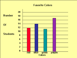
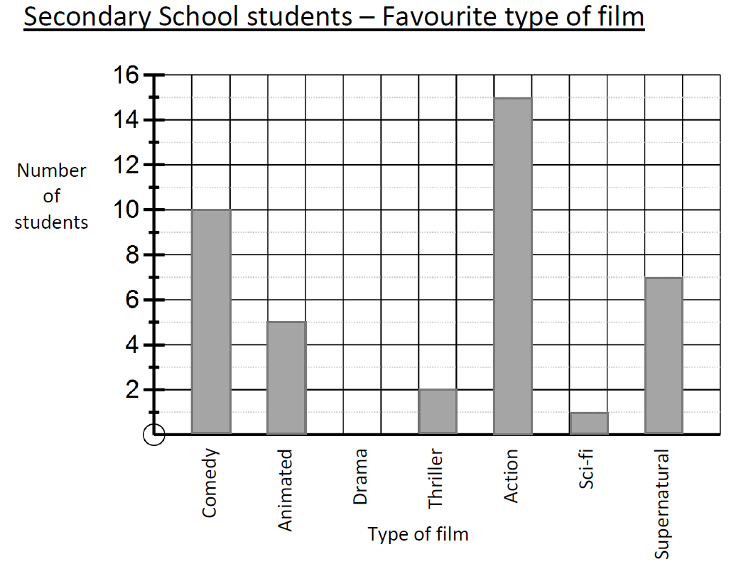
How many people said Drama was their favourite type of film?
0
2
1
7
What was the most popular type of film?
Action
Comedy
Supernatural
Animated
How many more people said Action than Supernatural as their favourite type of film?
2
5
8
10

How many employees travelled by bus to work?
22
8
10
12
How many more employees walked to work rather than cycled?
14
8
10
12

How many more people play football than play tennis?
1
7
6
9

How many children like to eat apple or oranges?
27
16
13
11
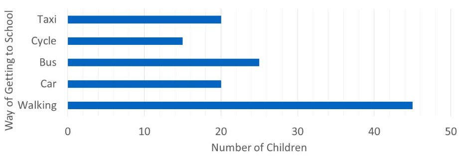
In total, how many children take a taxi or cycle to school?
5
35
20
15
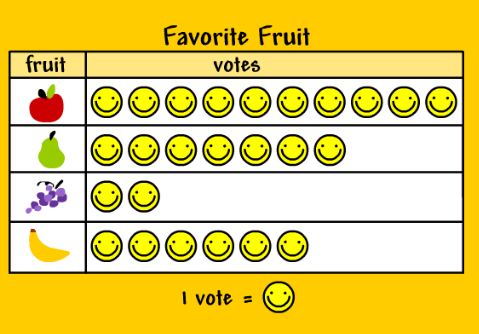
How many students like banana and grape?
5
6
7
8
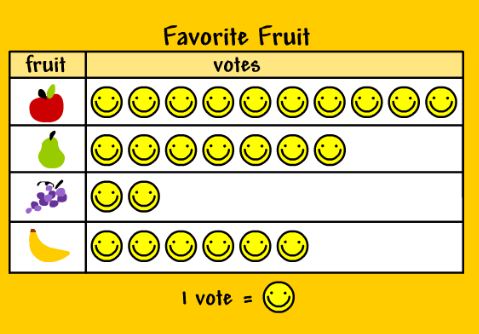
Based on this pictogram, what is the most favourite fruit?
Apple
Guava
Grape
Banana

What is the least favourite fruit in this pictogram?
Apple
Guava
Grape
Banana

Ms Ani will buy some ice cream for her students. She choose the most favourite ice cream flavor in the class. So, which ice cream flavor that choosen?
Vanilla
Strawberry
Chocolate
Peach

How many students are there in the class altogether?
25
20
19
18

Based on this bar chart, how many elephant toys in the Andy's toy shop?
9
6
7
8
Which toys sold the least number on Monday?
Car
Elephant
Duck
Drum
How many toys were sold altogether on Monday at Andy's Toy Shop?
25
23
26
24

There are ..... more students who like English than Math.
1
2
3
4
There are .... fewer students who like Art than Science.
1
2
3
4

I can use a bar graph when I want to represent values (vertical axis) for different categories (horizontal axis).
True
False

What is the vertical axis also called?
The y-axis
The x-axis
The main axis
The important axis

The (a) axis is also called the x-axis.

Only the vertical should be labelled?
True
False

Each bar should have the same length.
True
False

Each bar should have the same width.
True
False

Bars should be right next to each others.
True
False

There should always be the same space between bars.
True
False

The vertical axis starts at 0 and is divided into equal intervals.
True
False

When choosing a scale for the vertical axis you should consider ...
... the smallest value in your data.
... the biggest value in your data.

A bar graph should always include a title.
True
False

Which was the most frequent marble colour?
Blue
Black
Green
Red

Which was the LEAST popular?
Chocolate
Vanilla
Mint
Strawberry

Which subject is MOST popular?
Cooking
Art
English
Maths
History

How many MORE people like Owls than Dogs?
10
6
1
3

Which is the most popular meal?
Chicken Dinner
Pizza
Burger
Salad
Select the TWO MOST POPULAR colours
Red
Blue
Green
Purple
Which was the LEAST popular game console?
Playstation
Xbox
Wii
Computer
Nintendo DS

How many fewer people prefer Vanilla to Mint?
7
5
2
10

How many marbles are Green?
1
5
3
4

What value does this mean on a tally?
lots
5
6
16
How confident do you feel about scatter graphs?
Very confident
Confident
Unconfident
A little scared

The scatter graph shows the relationship between the age of a car and its value.
Describe the correlation shown on the diagram
Positive
Negative
No Correlation

What type of correlation is shown?
Positive correlation
Negative correlation
No correlation

What type of correlation is shown?
Positive correlation
Negative correlation
No correlation


Describe the correlation in the graph shown.
Strong Negative
Strong Positive
Weak Negative
Weak Positive

Which scatter plot show a positive relationship?
Graph A
Graph B
Graph C
Graph D
What is a line of best fit used for?
To connect the points
To make predictions
To make the graph look pretty
To make it look like you know what you are doing

The scatter graph shows the relationship between the amount of rainfall and the number of umbrellas sold each day.
Which statements are true?
The greater the amount of rainfall, the fewer umbrellas sold
The greater the amount of rainfall, the more umbrellas sold
The smaller the amount of rainfall, the fewer umbrellas sold
The smaller the amount of rainfall, the more umbrellas sold
The scatter graph shows the relationship between the age of a car and its value.
Which statements are true?
The younger the car, the higher its value
The older the car, the lower its value
As the car gets older, the cheaper it gets
The car is most expensive in the first few years


The line of best fit _____. Check all that apply.
should include outliers.
must pass through multiple points.
should have about the same number of points above and below.
can be used to make predictions.
The scatter graph shows the relationship between the amount of rainfall and the number of umbrellas sold each day.
On another day, there was 8.5mm of rainfall. Estimate the number of umbrellas sold on that day.
80
40
120
30
What is a line of best fit used for?
To make predictions
To connect the points
To make the graph look pretty
To make it look like you know what you are doing
Which line best fits the scattered plot?


The scatter graph shows the relationship between the age of a car and its value.
Describe the correlation shown on the diagram.
Positive
Negative
No Correlation

The scatter graph shows the relationship between the age of a car and its value.
Another car is 6 years old. Estimate the value of this car.
£6000
£2000
£4000
£3000

The scatter graph shows the relationship between the height and arm span of some students.
Describe the correlation shown on the diagram.
Positive
Negative
No Correlation

The scatter graph shows the relationship between the height and arm span of some students.
Another student has a height of 145 cm. Use the graph to estimate their arm span.
140 cm
120 cm
110 cm
180 cm

The scatter graph shows the relationship between two test scores of some students.
Describe the correlation shown on the diagram.
Positive
Negative
No Correlation

The scatter graph shows the relationship between the test score and the time spent revising for a group of students.
Describe the correlation shown on the diagram.
Positive
Negative
No Correlation

The scatter graph shows the relationship between the amount of rainfall and the number of umbrellas sold each day.
On another day, 30 umbrellas were sold. Estimate the amount of rainfall for that day.
5
10
12
8

The scatter graph shows the relationship between the amount of rainfall and the number of umbrellas sold each day.
On another day, there was 8.5 mm of rainfall. Estimate the number of umbrellas sold on that day.
75 umbrellas
40 umbrellas
120 umbrellas
30 umbrellas

Using the line of best fit. If a student had a handspan of 20.5 cm, the estimation height will be 160 cm. True or False?
True
False

Using the line of best fit. If a student had a height of 146 cm, the estimated handspan will be 17 cm. True or False?
True
False

What type of correlation is shown?
Positive correlation
Negative correlation
No correlation
What type of correlation is shown?
Positive correlation
Negative correlation
No correlation

What type of correlation is shown?
Positive correlation
Negative correlation
No correlation

What type of correlation is shown?
Positive correlation
Negative correlation
No correlation

What type of correlation is shown?
Positive correlation
Negative correlation
No correlation
What type of correlation is shown?
Positive correlation
Negative correlation
No correlation
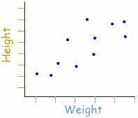
What type of correlation?
Positive Correlation
Negative Correlation
No Correlation

What type of Correlation?
Positive Correlation
Negative Correlation
No Correlation
Which scatter plot show a positive relationship?
Graph A
Graph B
Graph C
Graph D
The line of best fit _____. Check all that apply.
should include outliers.
must pass through multiple points.
should have about the same number of points above and below.
can be used to make predictions.
The scatter graph shows the relationship between the age of a car and its value.
Another car is 6 years old. Estimate the value of this car.
£6000
£4000
£2000
£3000

The scatter graph shows the relationship between the height and arm span of some students.
Another student has a height of 145cm. Use the graph to estimate their arm span.
140cm
110cm
120cm
180cm

The dual bar chart shows information about the number of hours Viv and Alfie worked on each day from Monday to Friday last week.
Alfie worked more hours, in total, than Viv from Monday to Friday last week.
Work out how many more hours.
(a)

The following frequency graph shows the number of adult visitors and child visitors to a park.
What fraction of all visitors were children that visited the park in April?
52
292
71
152

The following bar chart shows year 5 children's favourite sports.
Which sport was chosen by the same amount of girls as boys?
(a)
The following bar chart shows year 5 children's favourite sports.
How many more boys chose tennis rather than basketball?
(a)
The following bar chart shows year 5 children's favourite sports.
How many boys took part in the survey?
(a)

The scatter graph shows the height and weight of twenty babies aged 12 months.
Describe the relationship between the height and weight of the twenty babies.
(a)
The scatter graph shows the height and weight of twenty babies aged 12 months.
The height and weight of one of the babies is not typical for babies aged 12 months.
Give the coordinates of this point.
(a)
The scatter graph shows the height and weight of twenty babies aged 12 months.
Josie has a baby who is 15 months old.
Her baby has a height of 82 cm.
Josie is going to use the line of best fit to estimate what her baby’s weight should be.
Explain why it may not be sensible for Josie to do this.
(a)

