
 Worksheets
U8 Sub 1 Review
Total questions: 150
Worksheet time: 8hrs 28mins

The data in the table show sales for a certain department store (in billions of dollars). Find the line of best fit.
y=16.4571x−32598
y=16.4571x+32598
y=32598x−16.4571
y=16.4571x

Using the line of best fit, estimate the stores sales (in dollars) in 2018.

The data in the table to the left gives the weight, in pounds and BMI (body mass index) for six people of the same height. Find the line of best fit.
y=0.14x + 0.25
y=0.25x −0.14
y=0.14x −0.25
y=0.25x + 0.14

Using your line of best fit, estimate Sam's weight since he has a BMI of 25.
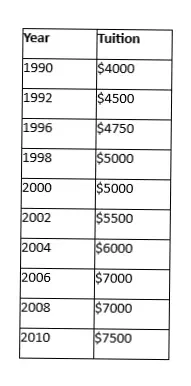
The table shows the annual tuition, in thousands, at a public four-year college from 1990 to 2010. Find the line of best fit.
y=340x − 172.95
y=172.95x−340383
y=340383x + 172.95
y=172.95x + 340383
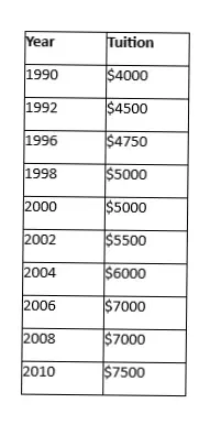
Using your line of best fit, estimate the year in which the annual tuition will reach $10,000.

The table shows the value of a car based on the number of miles displayed on its odometer. Find the line of best fit.
y=26000x − 0.1
y=0.1x + 26000
y=26000x + 0.1
y=−0.1x + 26000

The table shows the value of a car based on the number of miles displayed on its odometer. Estimate the value of the car if its odometer reads 95,000 miles.

The table shows the number of rabbits at a petting farm each year since 2008. Find the line of best fit.
y=8.2x − 16451
y=8.2x + 16451
y=16451x − 8.2
y=16451x +8.2

Using your line of best fit, estimate the number of rabbits at the farm in 2016.

The table shows the population of a city in millions of people since 1950. Find the line of best fit.
y=35.946x +0.0175
y=−0.0175x + 35.946
y=0.0175x + 35.946
y=35.946x − 0.0175

The tables shows the population of a city, in millions of people, since 1950. Estimate the population of the city in 2020.

This table show the average price of a movie ticket at the theater. Find the line of best fit.
y=0.1868x+367.952
y=367.52x −0.1868
y=0.1868x−367.952
y=−367.952x + 0.1868

The table shows the average price of movie ticket at a theater. In what year will the average price of movie ticket reach $15?

The table shows the number of people, in millions, who voted in US Presidential Elections. Find the line of best fit.
y=1.45x −2780.9
y=1.45x+2780.9
y=−2780.9x + 1.45
y=2780.9x−1.45

Using your line of best fit, estimate the number of voters in 2020 election.
To determine the zeros of the function.
To determine the average of the y-value.

According to the trend line, if someone runs 3 miles each week, what % body fat might they have?
24
21
18
15
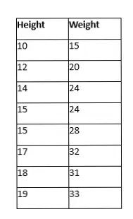
The table represents the height and weight of cats. Find the line of best fit.
y=4.59x−2.03
y=2.03x−4.59
y=2.03x+4.59
y=−4.59x + 2.03
What does the equation of line of best fit look like?
Quadratic Equation
ax2+bx+c=0
Standard Equation
Ax+By = C
Slope Intercept Form
y=mx+b
Cubic Equation
ax3+bx2+cx+d=0

What is the trend for this scatter plot
Negative
Positive
None


If the line of best fit is given, y = 31.45x - 242.3, where x represents hours and y represents income...
Determine the predicted income if 22 hours were worked on an assembly job.
$207.30
$449.60
$691.90
$543.30

Is this line an accurate line estimate of best fit for the data?
Yes
No

What type of Correlation?
Positive Correlation
Negative Correlation
No Correlation
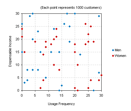
What type of Correlation?
Positive Correlation
Negative Correlation
No Correlation

The table shows the height of a tree for various years after it was planted. Calculate the line of best fit where x = age and y = height.
y = .89x - 3.42
y = .96x + 8.47
y = .78x + 5.35
y = .56x + 6.23
The table shows the height of a tree for various years after it was planted. Using the line of best fit, how tall would the tree be 30 years after it was planted?
22 feet
23 feet
36 feet
37 feet

The line of best fit for the height of a tree for various years after it was planted is
y = .96x + 8.47
Predict the height of a tree 30 years after it was planted.
22 feet
23 feet
36 feet
37 feet
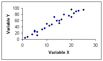
(a)

What type of association does this graph have?
(a)
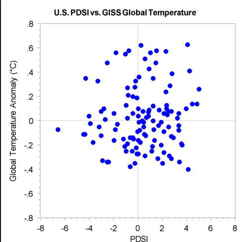
(a)

Label the type of association:
(a)

Label they type of association:
(a)

Label they type of association:
(a)

Label they type of association: (a)
What is another term for trend line? (a)

Which graph shows the best trend line for the scatter plot?
Graph A
Graph B
Graph C
Graph D


The scatterplot shows the results of study comparing the length of a person's foot to the width.
How can you describe the correlation of the within the context of the situation?
There is no correlation.
As the length of a person's foot increases, the width increases.
As the length of the person's foot increases, the width decreases.
The tall a person is, the bigger their shoe size will be.

Which scatter plot(s) could be used to show the relationship between a person's age and a person's height?
3
4
5
6
Which scatter plot(s) could be used to show the relationship between a person's age and the number of syllables in a person's first and last name?
3
4
5
6
When scatter plots demonstrate a linear relationship, a(n) (a) can be used to show the general pattern of the data.
What is the slope - intercept form?
y = mx + b
x2−x1y2−y1
How do I determine the slope of the trend line from a graph?
RunRise
look where the line crosses the y-axis
use the slope formula
How do I determine the y-intercept of the trend line from a graph?
RunRise
look where the line crosses the y-axis
use the slope formula

Write the equation of the trend line in slope-intercept form.
y=−21x+6
y=21x−6
y=6x+21
y=−6x+21

Write an equation of the trend line in slope-intercept form.
y = −2x−155
y=25x+150
y= 150x+200
y=−30x+150

Write an equation of the trend line in slope-intercept form.
y = 10x
y=3x+250
y=25x
y=50x

A group of hikers is descending, and the elevation of several of the hikers after a certain number of minutes is shown in the scatter plot.
True or False:
The group of hikers descends about 250 feet every minute.
Hint: What's the unit rate, slope?
True
False
A group of hikers is descending, and the elevation of several of the hikers after a certain number of minutes is shown in the scatter plot.
True or False:
As time increases, the elevation increases.
True
False
A group of hikers is descending, and the elevation of several of the hikers after a certain number of minutes is shown in the scatter plot.
The hikers began at an elevation of (a) feet.
A group of hikers is descending, and the elevation of several of the hikers after a certain number of minutes is shown in the scatter plot.
As time increases, the elevation (a)
A group of hikers is descending, and the elevation of several of the hikers after a certain number of minutes is shown in the scatter plot.
The graph shows a (a) association.
A group of hikers is descending, and the elevation of several of the hikers after a certain number of minutes is shown in the scatter plot.
True or False:
There are several outliers in the scatter plot.
True
False


About how many male math teachers were there in 2006?
(a)
About how many male math teachers were there in 2011?
(a)
What is the association between the school year (x) and the number of male teachers (y).
(a)

The scatter plot shows the relationship between the number of chapters and the total number of pages for several books. Use the trend line to predict how many pages would be in a book with 19 chapters.
150 pages
170 pages
190 pages
210 pages


Jules conducted a survey and asked 100 people how many years of education they have and what their annual income is. She used the results to make a scatter plot.
What type of association should she expect to see in the scatter plot?
Positive Association
Negative Association
No Association
Hector surveyed 500 people and asked them how far they drive to work and what the last digit of their phone number is. He used the results to make a scatter plot.
What type of association should he expect to see in the scatter plot?
Positive Association
Negative Association
No Association
The height of students and their scores on a test. (a)
(a)


How many more girls chose track as the favourite sport than boys?
3
999
9
1
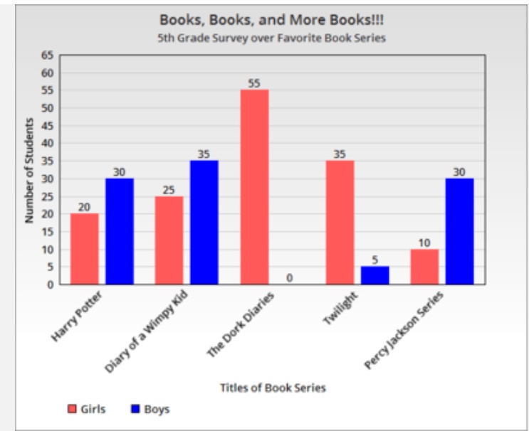
What graph is this ?
Pie chart
Double Bar Graph
Bar graph
Coordinate Grid

Based on this graph , how many more sunny days than rainy days did the city have during the months of April, May and June ?
21
-1
I Don’t know
23
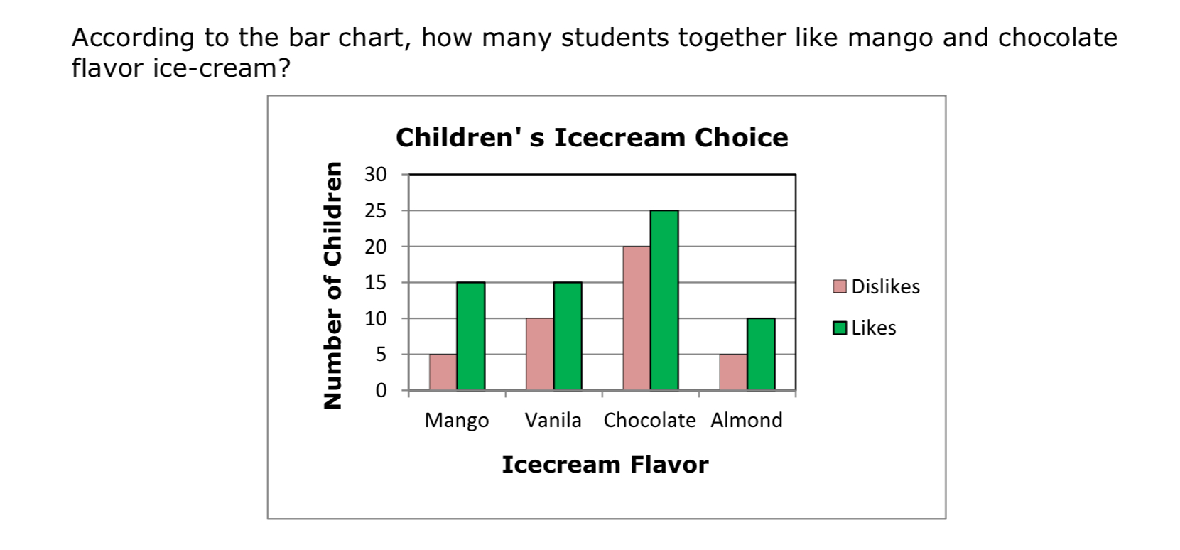
According to the double bar graph , how many students together like mango and chocolate ice - cream ?
2
1
90
40

What is the total number of medals THE FRENCH won ?
123
2346
16
12
what is a double bar graph ?
It is a double bar graph
it is a graphical display of information using two bars besides each other at various heights.
It is a graphical display of data using bars of different heights.
I honestly don’t know 😩
Who created double bar graphs ?
Issac Newton
Neil Raina
Albert Einstein
William playfair

Look at the figure and answer the questions .
i) Maths ii) Hindi
None of the above
i) Hindi ii) English
i) Maths ii) Maths

What information does the bar graph represents?
Different days of week
Number of T.V. sold
Number of T.V. sold from Monday to Saturday
Number of T.V. sold from January to June

In the following bar graph, on which day of the week maximum sale was observed?
Wednesday
Saturday
Thursday
Tuesday

Observe the following graph and find the average sale of TVs from Monday to Saturday.
51.66
44.2
77.5
155

Observe the following data for the number of students who visited the library from January to May. Which bar graph represents this data incorrectly?


In the following graph, what is the difference in the cost of onions in both the towns?
₹ 20 / kg
₹ 15/ kg
₹ 10/ kg
₹ 5/kg

How many people were surveyed?
60
180
240
156

How many students can bike?
16
7
29
11

How many girls have brown hair?
8
10
5
6

Do more students skip breakfast or eat breakfast?
Skip Breakfast
Eat Breakfast
How many students are ages 10-13?
40
14
54
90
How many people drive sports cars?
39
45
84
60

How many middle schoolers play an instrument, but do not play a sport?
3
7
11
8
How many boys can't bike?
4
11
14
7


How many people attended the basketball game and the school play?
63
55
143
118


What number should go in the blue box?
21
135
19
22

Which age group liked Action movies the least? (a)


How many people did not attend the school play?
How many people attended the basketball game but did not attend the school play?
What number should go in the blue box?


How many females were surveyed? (Be careful - This table is missing the totals.)
45
73
16
12

How many males were surveyed? (Be careful - This table is missing the totals.)
77
15
150
52


How many females studied Spanish?
13
30
24
17

How many Males studied a language in total?
41
72
31
41

How many students were in the survey all together?
30
42
62
72

How many male students studied French?
18
13
24
17
How many students studied French?
31
41
30
42
How many female students studied a language?
31
41
30
42

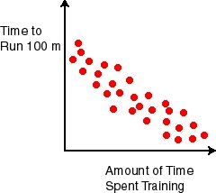


The outside temperature and the amount of layers of clothing you wear.

What are Adrian's highest and lowest homework grades?
7 and 10
73 and 100
3 and 9
What is the range of Adrian's homework grades?
73
10
27
100
What is(are) the mode(s) of Adrian's homework grades?
0
95
78
78 and 95

What was the most and least goals scored by teammates?
5 and 1
8 and 0
1 and 6
1 and 8
What is the range of goals scored by teammates?
8
5
3
1
What is the mode of the data?
0
1
2
8
What is the shape of the data distribution?
Centered
Left Skewed
Right Skewed
Uniform

What is the outlier of the data?
There is no outlier
-5
6
0

What was the lowest and highest attendance?
0 and 36
4 and 32
8 and 28
0 and 28

