
 Worksheets
Creating Data Displays
Total questions: 103
Worksheet time: 2hrs 19mins
A science of collection, presentation of data.
Population
Statistics
Analysis of Data
None of the above
Statistics which is concerned with summarizing values to describe group characteristics of the data.
Descriptive
Inferential
Parametric
Non Parametric
Each and every element of a large group of data.
Population
Sample
Variable
Data
You conduct a poll in which you randomly select 1000 registered voters from Texas and ask if they approve of the job their governor is doing. 48% of registered voters polled approved of the governor's job.
Identify the population.
1000 registered voters from Texas
48% of registered voters approve
Registered voters from Texas
Percent of registered voters that approve
Determine whether the given data is Qualitative or Quantitative.
Data: Glass size for Milk tea
Qualitative Data
Quantitative Data
A small representative of a population
variable
measurement
sample
summation
Determine whether the given data is Qualitative or Quantitative.
Data: Monthly salary
Qualitative Data
Quantitative Data
To determine the average length of trout in a lake, researchers catch 20 trout and measure them. The average length of the trout was 14.7 inches.
State the sample statistic.
20 fish
trout in a lake
Average length of trout in the lake
Average length of trout in the lake is 14.7 inches
You asked a class of third graders if they like vanilla ice cream, and 90% of the class raise their hands. Why is this an example of a parameter?
because the data came from the entire population of the class
because 90% of an entire class is too large to be just a statistic
because data taken from a class of students is always categorized as a parameter
because there are many third graders
Is $68,000 a parameter or a statistic?
The average annual salary for 35 of a company's 1200 accountants is $68,000.
parameter
statistic
Anthony opened a new store and wants to conduct a survey to determine the best store hours. Which is the best representative sample?
A group of randomly selected people who come to the store in one week.
A group of randomly selected people who visit his website on one night.
Every person he meets at his health club one night.
The first 20 people who walk into his store one day.
True or false:
The costs of items in a shopper’s grocery cart represent quantitative data.
A. TRUE
B. FALSE
True or false:
The social security numbers of students in a class represent quantitative data.
A. TRUE
B. FALSE
Descriptive statistics involves estimation and hypothesis testing
True
False
Parameter is use for
statistics
population
sample
measurement
80 7th graders at CMS were asked what their favorite season was.
Does this represent a population or a sample?
(a)
A beverage company wanted to see if people in the United States liked their new logo. Which choice best represents a population?
A selection of logo artists.
Every person in the United States.
A selection of shoppers from different states.
3,800 children age 5 - 15
Population or Sample?
A recent survey of 2625 elementary school children found that 28% of the children could be classified obese.
Population
Sample
Surveyors in a mall choose shoppers to ask about products they prefer.
These are the two types of statistics:
Discrete and Continuous
Population and Sample
Descriptive and Inferential
Mean and Standard deviation
Determine whether the data is qualitative or quantitative:
Weight of dogs at an animal rescue facility.
Qualitative
Quantitative
Which of the following data are qualitative.
May Favorite Summer Sports
Number of Tourist Spot
Number of Math Teacher in the School
Blood Type of the Class
The Address of your Teacher
Determine whether the data is qualitative or quantitative:
Student ID numbers
Qualitative
Quantitative
Inferential vs descriptive statistics:
Draws educated conclusions about a population that is likely too large to sample completely
Descriptive
Inferential
Determine whether the data is qualitative or quantitative:
Weight of dogs at an animal rescue facility.
Qualitative
Quantitative
Determine whether the data is qualitative or quantitative:
Carrying capacities of flatbed trucks.
Qualitative
Quantitative
Determine whether the data is qualitative or quantitative:
Hair colors of classmates.
Qualitative
Quantitative
Determine whether the data is qualitative or quantitative:
Student ID numbers
Qualitative
Quantitative
Determine whether the data is qualitative or quantitative:
Heights of infants in a maternity ward.
Qualitative
Quantitative
Determine whether the data is qualitative or quantitative:
Species of mammals in a rain forest.
Qualitative
Quantitative
Determine whether the data is qualitative or quantitative:
Responses on an opinion poll.
Qualitative
Quantitative
Determine whether the data is qualitative or quantitative:
Wait times at the Department of Motor Vehicles
Qualitative
Quantitative
Determine the level of measurement of the data set.
The years that a television show on ABC won the Emmy for best comedy series are listed:
1955, 1979, 1980, 1981, 1982, 1988, 2010, 2011, 2013, 2014
Nominal
Ordinal
Interval
Ratio
Determine the level of measurement of the data set.
The top five business schools in the US for a recent year according to Forbes are listed:
- Standford
- Harvard
- Northwestern
- Columbia
- Dartmouth
Nominal
Ordinal
Interval
Ratio
Determine the level of measurement of the data set.
The flight numbers of 6 departing flights from Chicago O'Hare International Airport on an afternoon in October of 2016 are listed:
1785
5159
4509
3458
334
2110
Nominal
Ordinal
Interval
Ratio
Determine the level of measurement of the data set.
The temperatures on a physician's intake form.
Nominal
Ordinal
Interval
Ratio
Determine the level of measurement of the data set.
The allergies on a physician's intake form.
Nominal
Ordinal
Interval
Ratio
Determine the level of measurement of the data set.
The Pain Level (scale 0 to 10) on a physician's intake form.
Nominal
Ordinal
Interval
Ratio
Determine the level of measurement of the data set.
The weight on a physician's intake form.
Nominal
Ordinal
Interval
Ratio
Determine the level of measurement of the data set.
The gender on an employment application.
Nominal
Ordinal
Interval
Ratio
Determine the level of measurement of the data set.
The Highest Grade level Completed on an employment application.
Nominal
Ordinal
Interval
Ratio
Determine the level of measurement of the data set.
The Number of Years at Last Job on an employment application.
Nominal
Ordinal
Interval
Ratio
Determine the level of measurement of the data set.
The Year of College Graduation on an employment application.
Nominal
Ordinal
Interval
Ratio
Grade point average
Nominal
Ordinal
Interval
Ratio

What type of graph should be used to show percent (%) of a whole, like how much money is coming in through all my incomes
Line graph
Bar graph
Chart graph
Pie graph

A bar graph is used for
comparing distinct categories
used for showing trends over time
illustrate parts of a whole
showing how many degrees are in a circle
Which type of data is represented by the statement, "the color of cars in a parking lot"?
Qualitative
Quantitative
Both
Circle Graph
what type of data is involved in the statement, "the number of books a student read over the break"?
Qualitative
Quantitative
Both
Circle Graph
Which of the following graphs is not used to represent qualitative data?
Pie chart
Bar chart
Histogram
Pareto chart
Which of the following is a pareto chart?


A survey of 1000 adults uncovered some interesting housekeeping secrets. When unexpected company comes, where do we hide the mess? The survey showed that 64 % of the adults toss their mess in the closet, 24 % shove things under bed, 8 % put things in the bathtub, and 4 % put the mess in the freezer. Make a circle graph to display this information.


How many people were polled in this survey?
5 people
40 people
100 people
145 people

Which bar graph is the same as the data in the circle graph if 20 people were surveyed?


The graph shows how employees at Disney World travel to work. How many employees ride bikes, ride the bus, or walk to work?
300
450
325
375


The table shows the results of a survey about favorite types of stores. Determine the relative frequency for each store.
clothing: 38%
electronics: 22%
pet: 10%
candy: 30%
clothing: 19%
electronics: 11%
pet: 5%
candy: 15%
clothing: 50%
electronics: 25%
pet: 5%
candy: 20%
clothing: 35%
electronics: 23%
pet: 15%
candy: 27%

Which statement about the graph is true?
There are more male tertiary school teachers than male secondary school teachers.
The percent of secondary school male teachers is greater than the percent of primary school male teachers.
There are more female secondary school teachers than tertiary school female teachers.
The percent of female tertiary school teachers is greater than the percent fof female primary school teachers.

Match the following types of data displays:

Dot Plot

Histogram

Frequency Table

Scatter Plot

Box and Whisker Plot
The bin sizes in a (a) must be (b) .
You do not know that exact values of the individual data points with this type of display:
Frequency Table
Dot Plot
Histogram
Scatter Plot
Match the following:
Dot Plot
Stack multiples across a row.
Scatter Plot
Two pieces of data are compared on a graph.
Histogram
Touching bars that show how many in a bin.
Box and Whisker Plot
Breaks data into quarters.
Frequency Table
Tallying up results to count occurrences.
Match the following:
Mean
Average
Mode
Most Often
Median
Middle Number
Range
Difference between Highest and Lowest Points.
A (a) can be used to make several other data displays.
What type of data display can you find the exact values of the points? (pick all that are correct)
Histogram
Dot Plot
Scatter Plot
Box and Whisker Plot

Which dot plot shows the same data as this histogram?


Which bin shows the greatest number of pets?
15-19
0-4
5-9
10-14
A (a) is a graphical display of data using dots.
A (b) is a graphical display where the data is grouped into ranges.
The (a) is the difference between the lowest and highest values.
The (a) is the number which appears most often in a set of numbers.
The (a) is the average of the numbers.
The (a) is the middle number (in a sorted list of numbers).
Choose from the following: mean // median // mode // range
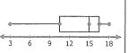
Which of the following best describes the shape of the distribution?
skewed left
skewed right
uniform
symmetrical
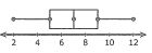
Which of the following best describes the shape of the distribution?
skewed left
skewed right
uniform
symmetrical

Which describes the shape of the distribution?
skewed right
skewed left
symmetric
uniform
What is the mean and median
Median=54
Median=50
Median=54
Median=49
3, 4, 8, 12, 7, 5, 4, 12, 3, 9, 11, 4, 14, 8, 2, 10, 3, 10, 9, 7
What is the Interquartile Range.
Which type of graph can be used for quantitative data?
Histogram
Bar graph
Pie Chart
Quantitative Data
Categorical Data

It is a table that shows classes or intervals of data entries with a count of the number of entries in each class.
Statistics
Data
Frequency
Frequency Distribution Table

What data display is the best to show the price of gas over the past year?
Bar Graph
Histogram
Stem-Leaf Plot
Line Graph
What data display is the best to show the variability of students' test scores?
Dot Plot
Scatter Plot
Box and Whisker Plot
Circle Graph
What data display is the best to show the population of the United States divided into age groups?
Histogram
Dot Plot
Scatter Plot
Box Whisker Plot
What data display is the best to show the percent of students at LMS that Speak Spanish, Chinese and German?
Bar Graph
Box-Whisker Plot
Scatter Plot
Dot Plot
Blood type
Categorical
Quantitative
Waiting time in a waiting room
Categorical
Quantitative

Identify the type of statistical display
Histogram
Bar Graph
Line Graph
Pie Chart

Identify this type statistical display.
Histogram
Bar graph
Line graph
Pie chart

How many drivers were interviewed regarding their preferred vehicle?
156
84
240
180

How may this graph be misleading?
The elevation starts at 16,500 feet rather than zero
The bars are different widths
The numbers aren't consistent

Mr Smith wants to convince everyone that the lunch prices are going up a lot. What graph should he use?
Graph A
Graph B

A consumer group wants to show that the price of gasoline has “skyrocketed” over the past five years. The group made this line graph. How can it be misleading?
The numbers aren't consistent
The y-axis starts at $1.20 instead of 0.

A politician wants to convince people that the cost of gas hasn't gone up that much. Which graph should he use?
Graph A - the line doesn't look like it goes up that much
Graph B - the points look like they go up a lot

The bar graph shows the heights that students were able to clear on the pole vault. Which statement best tells why the graph could be misleading?
The inverals on the vertical axis are not equal.
The graph title is misleading
The intervals on the y-axis make it appear that the heights are nearly the same.


**choose the best answer


