
 Worksheets
Quiz 1 - Application of Design Principles
Total questions: 30
Worksheet time: 15mins
According to the American Institute of Graphic Arts, graphics design is the ____ and ____ of planning and projecting ideas and experiences with visual and textual content.
art and practice
science and art
art and design
science and practice
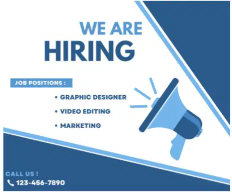
What design principle do you need to apply to improve the design of this graphic poster?
Color
Layout and composition
Typography
All of the above
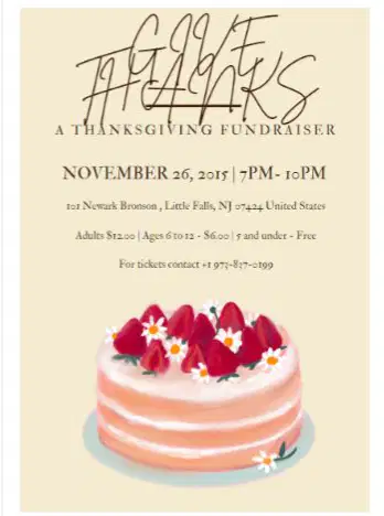
What design principle do you need to apply to improve the design of this graphic poster?
Color
Layout and composition
Typography
All of the above

What design principle do you need to apply to improve the design of this graphic poster?
Color
Layout and composition
Typography
All of the above
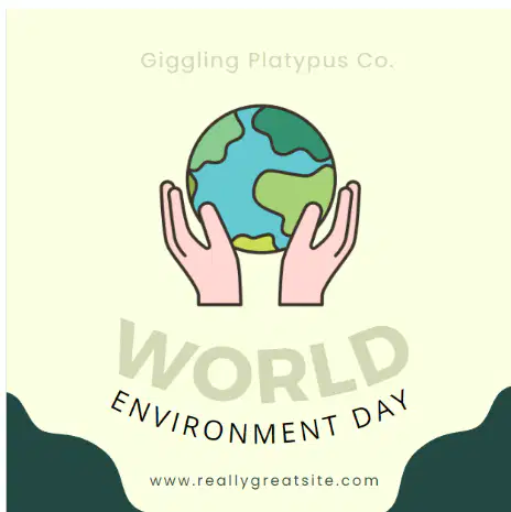
What design principle do you need to apply to improve the design of this graphic poster?
Color
Layout and composition
Typography
All of the above
According to the Power and Symbolism of Colors by Jacob Olesen, what is the meaning of the color yellow?
enthusiasm and emotion
passion and energy
harmony and health
happiness and optimism
According to the Power and Symbolism of Colors by Jacob Olesen, what is the meaning of the color red?
enthusiasm and emotion
passion and energy
harmony and health
happiness and optimism
According to the Power and Symbolism of Colors by Jacob Olesen, what is the meaning of the color orange?
enthusiasm and emotion
passion and energy
harmony and health
happiness and optimism
According to the Power and Symbolism of Colors by Jacob Olesen, what is the meaning of the color green?
enthusiasm and emotion
passion and energy
harmony and health
happiness and optimism
This is the art of arranging letters and text in a way that makes the copy legible, clear, and visually appealing to the reader.
Color
Typography
Layout and composition
Balance
Typeface
True or False. It is best to use more than two font types in designing a graphic poster.
True
False
True or False. Keeping your typefaces consistent is key to avoiding a confusing and messy interface.
True
False
This refers to the distribution of the graphic design elements, such as shapes, text boxes and images, of a design evenly throughout a certain layout.
Rhythm
Balance
Alignment
Proximity
Hierarchy
This method combines two aspects, dominance and priority, giving extra weight to certain elements of a design over others.
Rhythm
Balance
Alignment
Proximity
Hierarchy
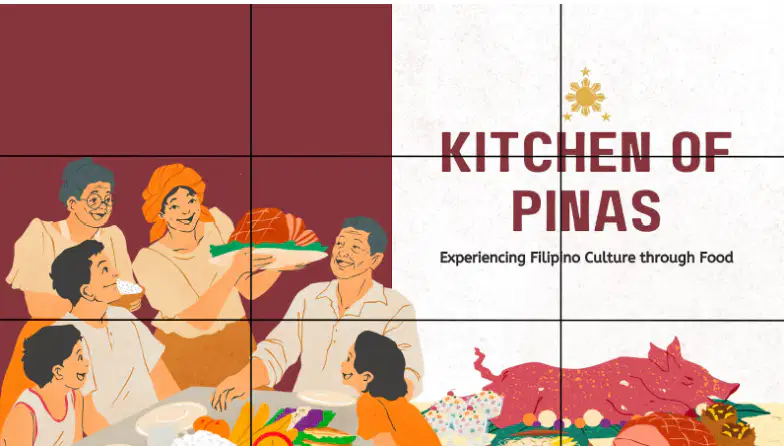
What rule of design in composition and layout is being exemplified in this graphic design:
The Grid
Rule of Thirds
Rule of Odds
Balance
Emphasis and scale
If you have no choice but to use colors that difficulty for color blind people to see, you have to ____.
Use high contrasting color combinations
Use your art app and apply the image fixer
Use pastel colors on every element
None of the above
What are the stages that include the design process?
Request, Creation, Final Output
Creative Brief, Research, Creation and Revisions, Final Output
Draft, Revision, Final Output, Another round of revisions
Research, Creative Brief, Creation and Revisions, Final Output
In which stage do you need to look for inspiration for your design?
Creative Brief
Research
Creation and Revision
Final Output
In which stage does your design become ready for publication?
Creative Brief
Research
Creation and Revision
Final Output
In which stage do you study the requestor’s request and inquire for more details on the request?
Creative Brief
Research
Creation and Revision
Final Output
In which stage do you create your design and submit a draft for revisions?
Creative Brief
Research
Creation and Revision
Final Output
True or False? The designer creates the creative brief.
True
False
Which of the following can still have good quality when resized, small to large or vice versa?
A raster image
A vector image
A .jpg image
A .png image
None of the above
According to Colorado State University, what is the recommended resolution for printing?
150-200 dpi
75-100 dpi
150-155 dpi
300-600 dpi
This is an image that is based on pixels.
Raster image
Vector image
SVG
EPS
True or False? Raster images can be scaled to any size without losing quality.
True
False
When you want to design a big poster to be printed in a tarpaulin, what image type should you used?
Raster
Vector
PNG
GIF
Which of the following is not an application you can use for graphics design?
Canva
GIMP
Photopea
Inkscape
JPEG
True or False? The higher the resolution the more pixelated it will get.
True
False
The higher the resolution ________.
The more pixels there is in an inch
The less pixels there is in an inch
The more smaller the image gets
None of the above

